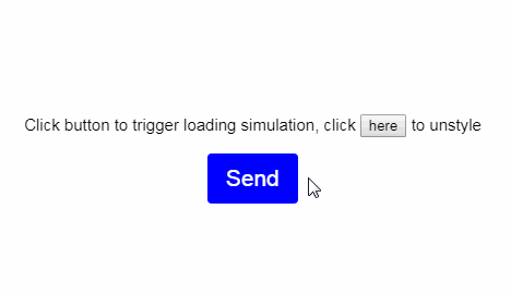
vue-loading-button
Straightforward Vue button with slideout loading indicator.

Props
| Prop | Type | Required | Default | Description |
|---|---|---|---|---|
| loading | boolean | false | false | Controls loading indicator animation |
| styled | boolean | false | true | Disables inessential default styles |
Installation
Install the package from npm by running:
$ npm i vue-loading-button
or
$ yarn add vue-loading-button
Usage
Import, register and place the component in your Vue app.
<template>
  <VueLoadingButton />
</template>
import VueLoadingButton from 'vue-loading-button'

export default {
  components: {
    VueLoadingButton,
  }
}
Accessibility
Apply attributes, such as aria-label, directly on the element to apply them to the button.
<template>
  <VueLoadingButton aria-label='Send message' />
</template>
Dev
Running example script requires @vue/cli and @vue/cli-service-global to be installed.
Install globally by running npm i --g @vue/cli @vue/cli-service-global or yarn add global vue/cli @vue/cli-service-global.