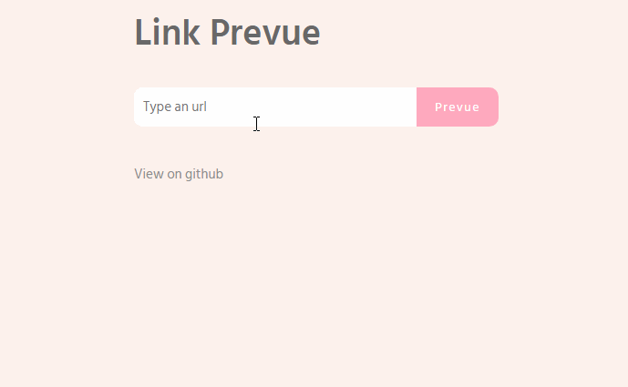
link-prevue
A flexible component for generate a link preview.
Intallation
npm install link-prevue
Basic usage
Javascript
import LinkPrevue from 'link-prevue'

new Vue({
  el: '#app',
  components: {
    LinkPrevue
  }
})
HTML
<div id="app">
  <link-prevue url="https://vuejs.org/"></link-prevue>
</div>
:+1:
Custom card
To use a custom card, set your own html code between the aperture tag and the close tag of component. Using the scoped slot.
<div id="app">
  <link-prevue url="https://vuejs.org/">
    <template slot-scope="props">
      <div class="card" style="width: 20rem;">
        <img class="card-img-top" :src="props.image" :alt="props.title">
        <div class="card-block">
          <h4 class="card-title">{{props.title}}</h4>
          <p class="card-text">{{props.description}}</p>
          <a v-bind:href="props.url" class="btn btn-primary">More</a>
        </div>
      </div>
    </template>
  </link-prevue>
</div>
Custom loading indicator
To use a custom loading indicator, use the loading slot.
<div id="app">
  <link-prevue url="https://vuejs.org/">
    <template slot="loading">
      <!-- set your custom loading -->
      <h1>Loading...</h1>
    </template>
  </link-prevue>
</div>
Custom button handler
For custom button handler use the onButtonClick property, like.
HTML
<div id="app">
  <link-prevue url="https://vuejs.org/" :onButtonClick="onClick"></link-prevue>
</div>
Javascript
import LinkPrevue from 'link-prevue'

export default {
  components:{
    LinkPrevue
  },
  methods: {
    onClick(prevue) {
      console.log('click', prevue.images, prevue.title, prevue.url, prevue.description)
    }
  }
}