vue-owl-carousel
The VueJS wrapper for Owl Carousel.
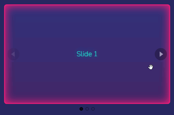
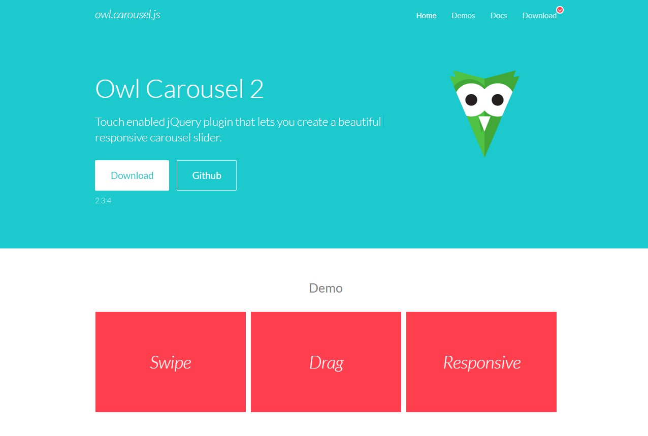
Owl Carousel is touch enabled jQuery plugin that lets you create a beautiful responsive carousel slider.
Installation
npm i -s vue-owl-carousel or yarn add vue-owl-carousel
Usage
<script>

import carousel from 'vue-owl-carousel'

export default {
    components: { carousel },
}

</script>
Basic Usage
<carousel>

    <img src="https://placeimg.com/200/200/any?1">

    <img src="https://placeimg.com/200/200/any?2">

    <img src="https://placeimg.com/200/200/any?3">

    <img src="https://placeimg.com/200/200/any?4">

</carousel>
Custom prev and next buttons using slot, the buttons will be hidden while start and end in non-loop mode
<carousel>

    <template slot="prev"><span class="prev">prev</span></template>

    //

    <template slot="next"><span class="next">next</span></template>

</carousel>
Set options,
<carousel :autoplay="true" :nav="false">

//

</carousel>
Set events,
<carousel @changed="changed" @updated="updated">

//

</carousel>
Available options
Currently following options are available.
-
items
type : number
default : 3
The number of items you want to see on the screen.
-
margin
type : number
default : 0
Margin-right (px) on item.
-
loop
type : boolean
default : false
Infinity loop. Duplicate last and first items to get loop illusion.
-
center
Type: Boolean
Default: false
Center item. Works well with even an odd number of items.
-
nav
Type: Boolean
Default: false
Show next/prev buttons.
-
autoplay
Type: Boolean
Default: false
Autoplay.
-
autoplaySpeed
Type: Number/Boolean
Default: false
Autoplay speed.
-
rewind
Type: Boolean
Default: true
Go backwards when the boundary has reached.
-
mouseDrag
Type: Boolean
Default: true
Mouse drag enabled.
-
touchDrag
Type: Boolean
Default: true
Touch drag enabled.
-
pullDrag
Type: Boolean
Default: true
Stage pull to edge.
-
freeDrag
Type: Boolean
Default: false
Item pull to edge.
-
stagePadding
Type: Number
Default: 0
Padding left and right on stage (can see neighbours).
-
autoWidth
Type: Boolean
Default: false
Set non grid content. Try using width style on divs.
-
autoHeight
Type: Boolean
Default: false
Set non grid content. Try using height style on divs.
-
dots
Type: Boolean
Default: true
Show dots navigation.
-
autoplayTimeout
Type: Number
Default: 5000
Autoplay interval timeout.
-
autoplayHoverPause
Type: Boolean
Default: false
Pause on mouse hover.
-
responsive
Type: Object
Default: {}
Example : :responsive="{0:{items:1,nav:false},600:{items:3,nav:true}}"
Object containing responsive options. Can be set to false to remove responsive capabilities.