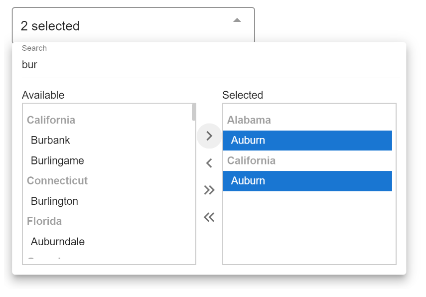
vue-listbox-multiselect
Vue Dual list-box multi-select drop-down component for enterprise applications.
Motivation
There are several good multi-select components available for Vue. However, none are suitable for enterprise app development. In a typical enterprise app, you are often challenged offering a simple drop-down which allows the user to filter through thousands of categorized items from the server, and allows the user to select hundreds. At Banner Edge Media, we have been using a similar component for multiple years. As we migrate to Vue, we wanted to share this component with the Vue community, and together make it even better.
Setup
Install:
# NPM
npm install @banneredge/vue-listbox-multiselect
Usage:
<script lang="ts">
import Vue from 'vue';
import VueListboxMultiselect from '@banneredge/vue-listbox-multiselect';
import dataSet from './usCities';

export default Vue.extend({
  name: 'ServeDev',
  components: {
    VueListboxMultiselect
  },
  data() {
    return {
      selectedList: [] as any[],
    };
  },
  methods: {
    async search(query: string): Promise<any[]> {
      const ids = this.selectedList.map((x) => x.id);
      let subset = dataSet.filter((x) => !ids.includes(`${x.state}-${x.city}`));

      if (!query) {
        subset = subset.slice(0, 100);
      } else {
        const q = query.toLowerCase();
        subset = subset.filter((x) => x.city.toLowerCase().includes(q) || x.state.toLowerCase().includes(q));
        subset = subset.slice(0, 100);
      }

      return subset.map((x: any) => {
        return {
          id: `${x.state}-${x.city}`,
          value: x.city,
          group: x.state
        }
      });
    },
  },
});
</script>

<template>
  <v-app id="app">
    <link href="https://cdn.jsdelivr.net/npm/@mdi/[email protected]/css/materialdesignicons.min.css" rel="stylesheet">
    <vue-listbox-multiselect
        v-model="selectedList"
        :search-function="search"
        placeholder="Search Items"
        style="width: 300px; margin: 20px auto"
        size="medium"
        :hide-search="false"
    />
  </v-app>
</template>
Notes:
- The current version is heavily dependent on Vuetify with mdi icons for the arrows
- There is no direct way to pass in the items, everything must go through the async search function. The function will get called with a blank query on load.
- You must implement your own limit, filtering and excluding selected items (See examples). This is set up because we assume most use-cases will be calling the server for data and that will need to be handled on the server.
- There is lots of room for improvement, so please check out the Roadmap and contribute!
- Current recommendation is to pull 100 results with each query. Users do not need to scroll through more, they can just search to get what they need.
Props
| Prop | Description |
|---|---|
| v-model | Model to bind output to. You can set it initially to pre-select items. Note: you will need to exclude selected items from each query. Type: {id: string, value: string, group?: string}. The component will NOT watch for changes on the model and re-fresh the list. |
| :search-function | Function that will get called when the component needs data. It should be async or return a Promise. A string query will be passed in as the only parameter. While the promise is not fulfilled, a loading indicator will show. |
| placeholder | Text to show in the select field when no items are selected. Defaults to 'None' |
| size | How wide to expand the menu. Options are, null, medium, large, x-large. They will fall back on a size that fits. Default size is 366px wide, it will look good in most modern mobile devices. |
| hide-search | Hides the search bar. Search is on by default. If you have a small list and still want to use this component, you have the option to turn it off. You can also turn it off dynamically if items < 10 for example. |
Roadmap:
- Add demo and documentation static site.
- Clean up the code a bit and add comments.
- Add interfaces for parameters
- We should add a few more features before making contracts
- Speed it up
- It gets a little slow when you have 1000 items, and you have to group and sort them
- Keeping the limit to 100 makes it work well.
- Test browser compatibility.
- Seems to work well in Chrome, Firefox, Edge
- We should establish what we support.
- Remove Vuetify dependency
- Vuetify provides some very cool pre-made components, but we want this to be usable with any library.
Figure out a smart way to do widths.Sometimes if we have a large monitor and long item names, we want to stretch it very wide. If the item names are not long it does not look good.
Add a prop to Hide Search (May want to keep it for all use-cases?)Sometimes we want to use this with a very small list and don't need the search box.
- Add test coverage?
- Add a way to reset it to original state dynamically
- Reset selected list
- Re-run blank query
- Through Emitter?
- Add slots to make it fully customizable
- Add more input interactions
- Currently Supported:
- Click (Select)
- Ctrl-Click (Select Multiple)
- Double-Click (Move Item)
- Needed:
- Shift-Click
- Ctrl-A ?
- Move with arrow keys?
- Shift-arrow keys?
- Currently Supported: