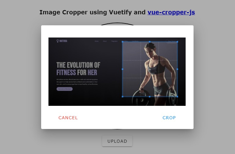
vuejs-clipper
Vue.js image clipping components using Vue-Rx.
- Add image clipping components to your Vue application in nothing flat.
- Touch devices supported and fully responsive.
Notice
Before using the plugin & components, here's something you should know :
- It's based on vue-rx.
- Use vuejs-clipper plugin also add vue-rx plugin to vue.
- Components are responsive base on width instead of height, see Component Layout.
- You can clip your own images (local uploaded images or images served on your site), but you cannot clip a cross-origin image unless the image server set the CORS headers.
- Components' input is an image URL, output is a canvas element, they only help you clip images to canvas, you need to handle other things like transform file input to image URL or transform output canvas to image by yourself.
Installation
NPM & ESM
install vuejs-clipper
$npm install vuejs-clipper --save
need css loader, ex: sass-loader, if you haven't installed :
$npm install -D sass-loader node-sass
(1) use vuejs-clipper plugin
Use vuejs-clipper plugin also add vue-rx plugin to Vue.
By default it will register all components to Vue global scope.
import Vue from 'vue'
import VuejsClipper from 'vuejs-clipper'
// install
Vue.use(VuejsClipper)
register some components to global with default component name
Vue.use(VuejsClipper, {
 components: {
    clipperBasic: true,
    clipperPreview: true
 }
})
with customized component name
Vue.use(VuejsClipper, {
 components: {
  clipperBasic: 'image-clipper-basic',
  clipperPreview: 'my-preview'
 }
})
not register any components, but with some plugin options
Vue.use(VuejsClipper, {
  components: null,
 parentPropName: 'myCustomerName'
  /*
   parentPropName:
    Add property to Vue instance to store `clipper-preview` list.
    You can change the property name
    default: '_imgPreviewLists'
  */
})
(2) separately import components
install vue-rx and it's peer dependency rxjs
$npm install --save vue-rx rx-js
use vue-rx
import Vue from 'vue'
import VueRx from 'vue-rx'
// install vue-rx
Vue.use(VueRx)
then import in your components (SFC)
import { clipperBasic, clipperPreview } from 'vuejs-clipper'

export default {
  components: {
    clipperBasic,
    clipperPreview
  }
}
Script
Include vuejs-clipper umd script after Vue.js.
<script src="https://cdn.jsdelivr.net/npm/[email protected]/dist/vue.js"></script>
<script src="./dist/vuejs-clipper.umd.min.js"></script>
<link rel="stylesheet" href="./dist/vuejs-clipper.css">
Use in html/template
<clipper-basic src="example.jpg"></clipper-basic>
Components
See detail examples.
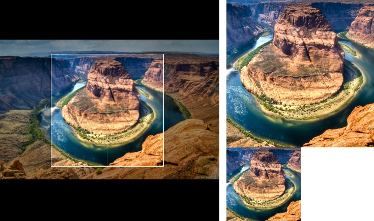
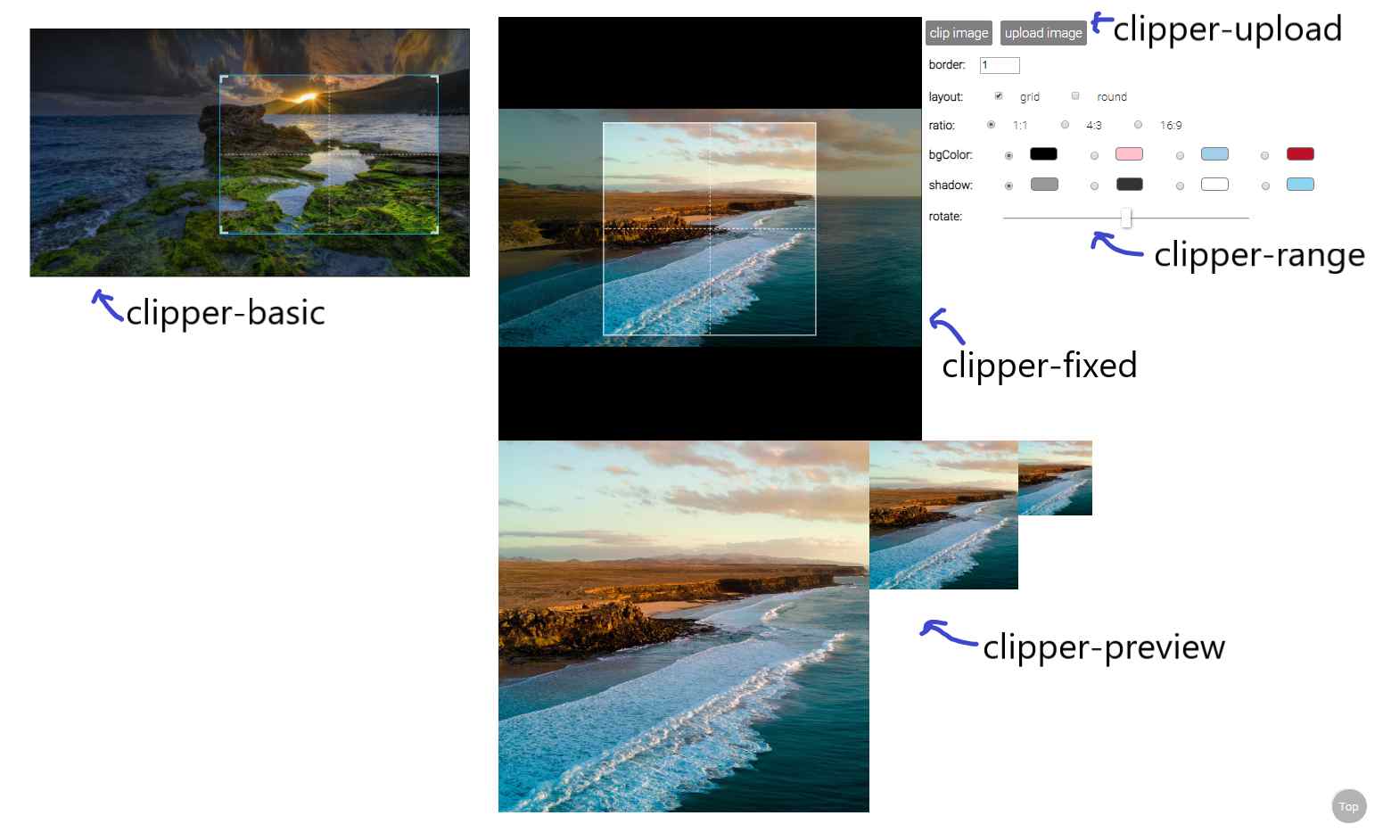
clipper-basic
an image clipping component
import { clipperBasic } from 'vuejs-clipper'
- Props
| Prop | Type | default | description |
|---|---|---|---|
| src | string | image src | |
| preview | string | matches clipper-preview's name to show preview image. |
|
| border | number | 1 | border width |
| outline | number | 6 | outlines near by the border to help user zooming. |
| corner | boolean | true | show corner layout |
| grid | boolean | true | show grid layout |
| ratio | number | ratio of clipping area (width/height). ex: 1, 4/3 . |
|
| wrap-ratio | number | NaN | ratio of clipping container (width/height). ex: 1, 4/3 . |
| mode | 'normal'/'switch' | 'normal' | if ratio is set, this prop will affect how clipping area zoom. |
| bg-color | string | 'white' | background color |
| shadow | string | 'rgba(0,0,0,0.4)' | shadow color |
| rotate | number | 0 | rotate degree |
| scale | number | 1 | transform scale |
| min-width | number | 1 | minimum width(%) of clipping box related to clipping component's width |
| min-height | number | 1 | minimum height(%) of clipping box related to clipping component's height. |
| init-width | number | 50 | clipping area's width(%) when the image loaded. |
| init-height | number | 50 | clipping area's height(%) when the image loaded. |
| touch-create | boolean | true | enable/disable create new clipping area on touch device |
| cross-origin | string | undefined | crossorigin attribute of <img /> inside clipper. ex: anonymous |
For more detail about the layout settings, pleases see Component layout in depth.
- Methods
| method | argument | return | description |
|---|---|---|---|
| clip | options | canvas element | get clipping canvas element |
| getDrawPos | {pos, translate}: positions and transformation |
get result canvas information |
clip() arguments
| name | type | default | description |
|---|---|---|---|
| options.wPixel | number | undefined | Set the the width (pixel) of result canvas. |
| options.maxWPixel | number | undefined | Set the the maximum width (pixel) of result canvas. |
set ref to use component methods
<clipper-basic ref="clipper" />
in your Vue instance methods
const canvas = this.$refs.clipper.clip()
- Event
| event | parameters | description |
|---|---|---|
| load | $event | image onload |
| error | $error | image onerror |
usage :
<clipper-basic @error="errorCb" @load="loadCb" />
- Data
| data | type | default | description |
|---|---|---|---|
| imgRatio | number | NaN | upload image's ratio (image naturalWidth/natrualHeight). Default value is NaN, after the load event the value will be set. |
| zoomTL$ | object | clipping area's position(%), can be top/bottom and left/right. | |
| zoomWH$ | object | clipping area's width and height(%) |
usage :
this.$refs.clipper.imgRatio
this.$refs.clipper.zoomWH$.width
- Slot
| slot | description |
|---|---|
| placeholder | if no src provided, show placeholder |
<clipper-basic src="">
  <div slot="placeholder">No image</div>
</clipper-basic>
- rxjs Subject
| subject | description |
|---|---|
| setTL$ | Set the position of the zooming area. |
| setWH$ | Set the width and height of the zooming area. |
| onChange$ | Subject that subscribe to zooming, moving and rotating subjects. |
usage:
this.$refs.clipper.setTL$.next({ left: 0, top: 0 }) // percentage 0%
this.$refs.clipper.setTL$.next({ right: 0, bottom: 10 })
this.$refs.clipper.setWH$.next({ width: 100, height: 100 }) // percentage 100%

this.$refs.clipper.onChange$.subscribe(() => {
  // This happens whenever zooming, moving and rotating occur.
})
clipper-fixed
an image clipping component
import { clipperFixed } from 'vuejs-clipper'
- Props
| Prop | Type | default | description |
|---|---|---|---|
| src | string | image src | |
| preview | string | matches clipper-preview's name to show preview image. |
|
| ratio | number | 1 | ratio of clipping area (width/height). ex: 1, 4/3 . |
| zoom-rate | number | 0.04 | zooming faster if this value is larger |
| min-scale | number | 0.1 | minimum transform scale |
| border | number | 1 | border width |
| border-color | string | 'white' | border color |
| grid | boolean | true | show grid layout |
| round | boolean | false | Use a round clipping area, this only effect the component layout, clipping results are still rectangular. |
| bg-color | string | 'white' | background color |
| shadow | string | 'rgba(0,0,0,0.4)' | shadow color |
| rotate | number | 0 | rotate degree |
| area | number | 50 | width or height (%) of clipping box(depends on ratio). |
| cross-origin | string | undefined | crossorigin attribute of <img /> inside clipper. ex: anonymous |
- Method
| method | argument | return | description |
|---|---|---|---|
| clip | options | canvas element | get clipping canvas element. |
| getDrawPos | {pos, translate}: positions and transformation |
get result canvas information |
clip() arguments
| name | type | default | description |
|---|---|---|---|
| options.wPixel | number | undefined | Set the the width (pixel) of result canvas. |
| options.maxWPixel | number | undefined | Set the the maximum width (pixel) of result canvas. |
- Event
| event | parameters | description |
|---|---|---|
| load | $event | image onload |
| error | $error | image onerror |
- Data
| data | type | default | description |
|---|---|---|---|
| imgRatio | number | NaN | upload image's ratio (image naturalWidth/natrualHeight). Default value is NaN, after the load event the value will be set. |
| bgTL$ | object | image's translate(X,Y) | |
| bgWH$ | number | image's scaling |
- Slot
| slot | description |
|---|---|
| placeholder | if no src provided, show placeholder |
- rxjs Subject
| subject | description |
|---|---|
| setTL$ | Set the top and left of the image. |
| setWH$ | Set the sizing(scaling) of the image. |
| onChange$ | Subject that subscribe to zooming, moving and rotating subjects. |
usage:
this.$refs.clipper.setTL$.next({ left: 50, top: 50 }) // percentage 0%
this.$refs.clipper.setWH$.next(0.6) // transform scale(0.6)

this.$refs.clipper.onChange$.subscribe(() => {
  // This happens whenever zooming, moving and rotating occur.
})
clipper-preview
preview clipping result
import { clipperPreview } from 'vuejs-clipper'
- Props
| Prop | Type | default | description |
|---|---|---|---|
| name | string | name that matches clipper component's preview property |
- Slot
| slot | description |
|---|---|
| placeholder | if no src provided, show placeholder |
clipper-range
a simple input range component
import { clipperRange } from 'vuejs-clipper'
use v-model binding data with clipper-range
- Props
| Prop | Type | default | description |
|---|---|---|---|
| max | number | 10 | maximum value of range |
| min | number | 0 | minimum value of range |
clipper-upload
a new component in 0.2.0
an upload button that transform image files to URL
import { clipperUpload } from 'vuejs-clipper'
use v-model binding data with clipper-upload
- Props
| Prop | Type | default | description |
|---|---|---|---|
| check | boolean | true | Check if upload file is an image. If set to true, when upload files that are not images, it will do nothing, so you will not get an error event on clipping component. |
| accept | string | '*' | Bind accept attribute to file input tag. |
| exif | boolean | true | Transform EXIF image to correct orientation when uploading. |
- Event
| event | parameters | description |
|---|---|---|
| input | $event | Result domgstring on change |
- Data
| data | type | default | description |
|---|---|---|---|
| file | File Object | null | Uploaded file's original File Object. |