vue-ellipsis
Customize ellipsis-like support for Vue2.
Install
yarn add @hyjiacan/vue-ellipsis
or
npm install @hyjiacan/vue-ellipsis
Usage
import ellipsis from '@hyjiacan/vue-ellipsis'
Vue.use(ellipsis)
or
import {ellipsisDirective, ellipsisComponent} from '@hyjiacan/vue-ellipsis'
Vue.directive(ellipsisDirective.name, ellipsisDirective)
Vue.component(ellipsisComponent.name, ellipsisComponent)
You should specify the width via CSS.
.ellipsis-style{
    width: 200px;
}
.ellipsis-style{
    max-width: 200px;
}
or STYLE
<div style="width: 200px"></div>
<ellipsis style="width: 200px"></ellipsis>
Directive
- The value of directive
v-ellipsisis the rows, default value:1
Modifiers
| name | description |
|---|---|
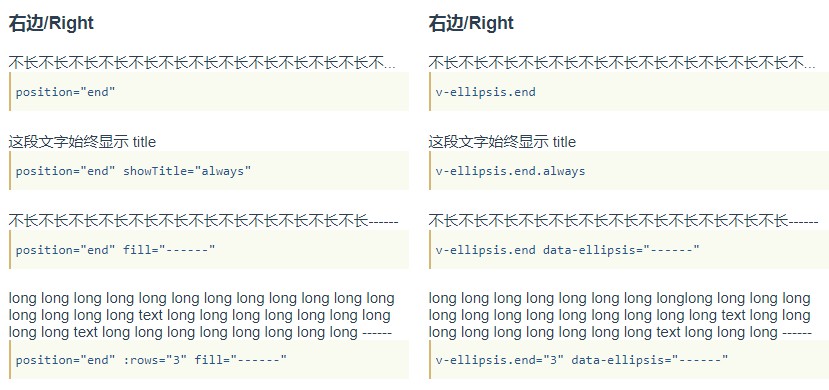
| start | Show ellipsis as prefix |
| middle | Show ellipsis in the middle |
| end | Show ellipsis as suffix |
| always | ALWAYS show title while text overflow |
| none | DO NOT show title while text overflow |
| scale | Auto scale (font-size) text to fit container width, WON'T ellipsis |
- Modifiers
start,middle,endare mutex, you should specify only one of them (default:end). - Modifiers
always,noneare mutex, you should specify only one of them,
or leave it empty(Settitlewhen there is an ellipsis).
Attributes
| name | default | description |
|---|---|---|
| data-ellipsis | ... |
Default fill text (ellipsis like text) |
| data-delay | 200 |
the delay(milliseconds) for making ellipsis |
Component
Props
| name | type | default | description |
|---|---|---|---|
| fill | String | ... |
Default fill text (ellipsis like text) |
| position | String | end | Ellipsis position, options: start, middle, end |
| show-title | String | - | options: always, none |
| rows | Number | 1 |
Number of rows |
| scale | Boolean | false | Auto scale (font-size) text to fit container width, DO NOT ellipsis |
| content | String | end | The content, makes the slot default ignored |
Slots
| name | description |
|---|---|
| default | The content |
FAQ
- Q: I have an element with padding by percentage, got unexpected display ?
A: Padding by percentage is not supported for now.