vue-picture-swipe-control
the forked version vue-picture-swipe with the new events, additional control of vue instance and changed props with dynamic control inside the modal (using ‘is’ attribute – the feature will be realized a bit later). Original link: https://github.com/rap2hpoutre/vue-picture-swipe
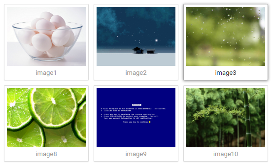
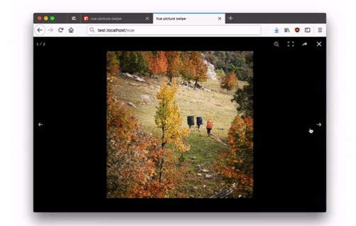
Vue Picture Swipe Gallery


This component is a simple wrapper for the awesome Photoswipe.
It’s a Vue plugin that displays a gallery of image with swipe function (and more).
Includes lazy (smart) loading (mobile friendly) and thumbnails.
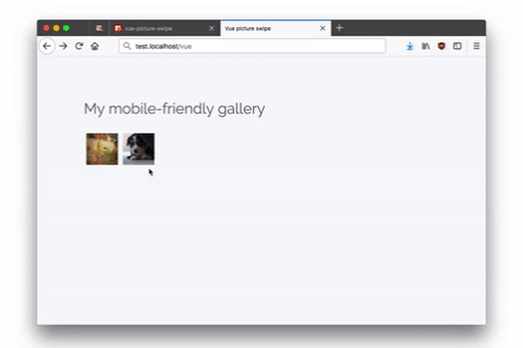
Demo
Install
npm i @itadori/vue-picture-swipe-control
Usage
You can use it as you want. Here are some examples if you want to use it inline, or in a .vue file component or even with Laravel.
Inline usage
You can using it inline:
<vue-picture-swipe :items="[
    {src: 'http://example.org/xl.jpg',thumbnail: 'http://example.org/sm1.jpg',w: 600,h: 400, title: 'Will be used for caption'},
    {src: 'http://example.org/xxl.jpg',thumbnail: 'http://example.org/sm2.jpg',w: 1200,h: 900}
  ]"></vue-picture-swipe>
Just remember to register the component:
import VuePictureSwipe from '@itadori/vue-picture-swipe-control';
Vue.component('vue-picture-swipe', VuePictureSwipe);

new Vue({
  el: '#app'
})
Usage in another component
Create a component Example.vue. Then paste this:
<template>
  <vue-picture-swipe :items="items"></vue-picture-swipe>
</template>
<script>
  import VuePictureSwipe from '@itadori/vue-picture-swipe-control';
  export default {
    data() {
      return {
        items: [{
          src: 'http://via.placeholder.com/600x400',
          thumbnail: 'http://via.placeholder.com/64x64',
          w: 600, // now is not required in this version (0 by default)
          h: 400, //  now is not required (0 by default)
          alt: 'some numbers on a grey background' // optional alt attribute for thumbnail image
        },
        {
          src: 'http://via.placeholder.com/1200x900',
          thumbnail: 'http://via.placeholder.com/64x64',
          w: 1200, // now is not required in this version (0 by default)
          h: 900 // now is not required (0 by default)
        }
      ]};
    }
  }
</script>
The attrs ‘w’ and ‘h’ are not required now (Hooray!!!) (default w = 0; h = 0)
Usage with Laravel
Edit resources/assets/js/app.js and add this just before the new Vue lines.
import VuePictureSwipe from '@itadori/vue-picture-swipe-control';
Vue.component('vue-picture-swipe', VuePictureSwipe);
Then run your watcher:
npm run watch
Advanced usage
PhotoSwipe options
Use options for Photoswipe options.
<!-- Disable "share" buttons. -->
<vue-picture-swipe :options="{shareEl: false}"></vue-picture-swipe>
PhotoSwipe instance
You can access the PhotoSwipe instance via setting a ref, the instance object is exposed as pswp.
<vue-picture-swipe ref="pictureSwipe"></vue-picture-swipe>
// active only after the slide has opened.
// This behavior is inherited from the parent library and will be fixed a little later
this.$refs.pictureSwipe.pswp
Events (the list will be upgraded a bit later)
| open | Attributes | Listen to | Description |
|---|---|---|---|
| Open | none | @open | Emitted after gallery opens |
| Close | none | @close | Emitted after gallery closes |
| beforeChange | none | @before-change | Emitted before the content is changed, but after navigation |
| afterChange | none | @after-change | Emitted after slides changed |
| Item removed | none | @removed | Emitted after slides has been removed. The event returns a removed index |
Why?
The original version did not have enough events and programmable methods for my project, even though the original library supports them. I decided that it would be easier to slightly update the already unsupported library for myself. I will be glad if it comes in handy too ? I will try to supplement it with my own features and features of the original library