Vs
Vue Visualisation Package using d3.js and leaflet. Package used in Ubudu. See also:
LayoutGrid : Creating a powerful dashboard using Vs and vue-grid-layout
Installation
npm i -S d3-vs
Usage
import Vs from 'd3-vs';

// install globally all components
Vue.use(Vs);

// import only the components that you need and register it manually
import {
    // Flow transition
    d3SankeyCircular,

    // Time Serie
    d3Timelion,
    d3Timeline,

    // Basic
    d3Pie,
    d3Line,
    d3Metric,
    d3MultiLine,
    d3HorizontalBar,
    d3VerticalBar,
    d3Area,

    // Functional
    d3Tracker,
    d3Slider,
    d3ProgressArc,

    // Layout
    d3Sunburst,
    d3Tree,
    d3Pack,
    d3Cluster,
    d3ICicleVertical,
    d3ICicleHorizontal,

    // Leaflet
    d3LChoropleth,
    d3LHeat
} from 'd3-vs';
Basic
###d3Metric
This component is for showing simple scientific data. It accepts the type Number as data.

template
<d3-metric
    :data="data"
    :options="options"
    :margin="margin"
    width="100%"
    height="400px">
</d3-metric>
options
| key | description | type | default |
|---|---|---|---|
axisXLabel |
label of horizontally which will be put above the data |
string OR null |
null |
axisLabelFontSize |
label font size |
number |
12 |
axisLabelFontWeight |
label font weight |
number |
400 |
axisLabelFontOpacity |
label font opacity |
number ([0, 1]) |
0.5 |
metricLabelColor |
metric color |
string (rgb, hex, rgba, hsl...) |
black |
metricLabelFontSize |
metric font size |
number |
120 |
metricLabelFontWeight |
metric font weight |
number |
900 |
metricLabelFontOpacity |
metric font opacity |
number ([0, 1]) |
0.5 |
metricTitle |
metric tooltip |
function |
d => d |
metricPrecision |
metric precision |
number |
2 |
###d3Circle
This component is for showing a simple percentage data. It accepts the type Number as data. The data must be in the range [0, 1].

template
<d3-circle
    :data="data"
    :options="options"
    :margin="margin"
    width="100%"
    height="400px">
</d3-circle>
options
| key | description | type | default |
|---|---|---|---|
innerRadiusRatio |
innerRadius / outerRadius |
number |
0.8 |
circleBackground |
circle background color |
string (rgb, hex, rgba, hsl...) |
rgb(230, 237, 244) |
circleForeground |
circle foreground color |
string (rgb, hex, rgba, hsl...) |
rgb(0, 181, 241) |
labelColor |
label color |
string (rgb, hex, rgba, hsl...) |
rgb(0, 181, 241) |
labelFontSize |
label font size |
number |
50 |
labelFontWeight |
label font weight |
number |
900 |
labelFontOpacity |
label font opacity |
number |
0.5 |
precision |
precision of data |
number |
2 |
animationDuration |
duration of animation |
number |
1000 |
delay |
delay of animation (milliseconds) |
number |
50 |
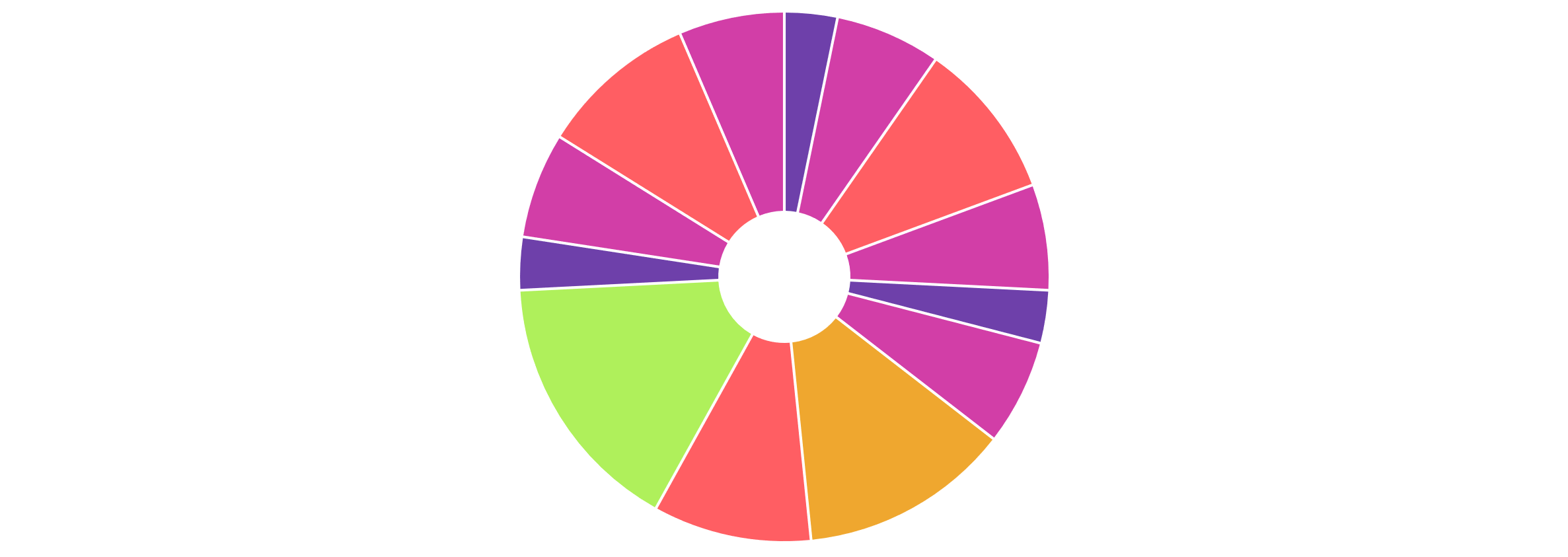
###d3Pie
This component can be a pie chart or a donut chart. It takes an array of elements like {key : 'String|Date|Number', value : 'Number'}. key will be used
in tooltip, value will be used to calculate the angle needed.

template
<d3-pie
    :data="data"
    :options="options"
    :margin="margin"
    width="100%"
    height="400px">
</d3-pie>
options
| key | description | type | default |
|---|---|---|---|
innerRadius |
inner radius |
number |
50 |
cornerRadius |
corner radius |
number |
0 |
padAngle |
pad angle (percentage) |
number |
0.01 |
arcTitle |
tooltip |
function |
d => d.data.key + '<br>' + d.data.value |
arcLabel |
label will be shown in arcs |
string OR null |
null |
axisXLabel |
label of axis x |
string OR null |
null |
axisLabelFontSize |
label font size |
number |
12 |
axisLabelFontWeight |
abel font weight |
number |
400 |
axisLabelFontOpacity |
label font opacity |
number ([0, 1]) |
0.5 |
arcLabelFontSize |
label font size of arcs |
number |
9 |
arcLabelFontWeight |
abel font weight of arcs |
number |
400 |
arcLabelFontOpacity |
label font opacity of arcs |
number ([0, 1]) |
0.5 |
animationDuration |
duration of animation |
number |
1000 |
delay |
delay of animation (milliseconds) |
number |
50 |
defaultColor |
color will be used when there is only one item in array |
string (rgb, hex, rgba, hsl...) |
rgb(175, 240, 91) |
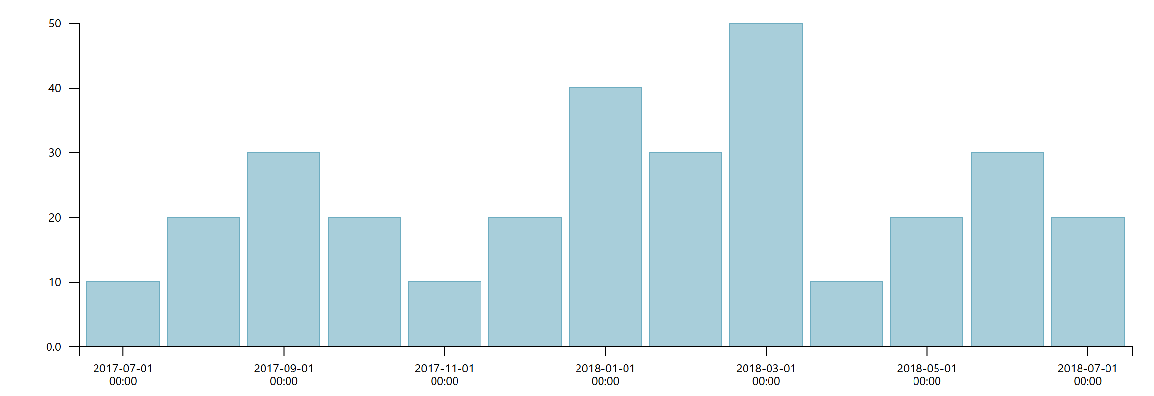
###d3VerticalBar
This component is for showing scientific data in vertical bar chart. It takes an array of elements like {key : 'String|Date|Number', value : 'Number'}, key will be
used in tooltip, value will be used to calculate the height needed. By default when every key is of type date, brush will be enabled. You can chose a new range
by using the brush or by clicking a bar if options.axisXTimeInterval has been settled.
template
<d3-vertical-bar
    :data="data"
    :options="options"
    :margin="margin"
    width="100%"
    @range-updated="(dateTimeStart, dateTimeEnd) => fetchDataWithCurrentInterval(dateTimeStart, dateTimeEnd)"
    height="400px">
</d3-vertical-bar>
options
| key | description | type | default |
|---|---|---|---|
fill |
bar internal color |
string (rgb, hex, hsl...) |
#6eadc1 |
stroke |
bar edge color |
string (rgb, hex, hsl...) |
#6eadc1 |
fillOpacity |
bar internal color opacity |
number |
0.6 |
strokeOpacity |
bar edge color opacity |
number |
1 |
barTitle |
tooltip |
function |
d => d.value |
tickSize |
tick height/width of axis |
number |
10 |
tickPadding |
tick padding |
number |
8 |
axisFontSize |
axis text font size |
number |
12 |
axisFontWeight |
axis text font weight |
number |
400 |
axisFontOpacity |
axis text font opacity |
number ([0, 1]) |
0.5 |
axisXLabel |
label of axis x |
string or null |
null |
axisYLabel |
label of axis y |
string or null |
null |
axisLabelFontSize |
label font size |
number |
12 |
axisLabelFontWeight |
label font weight |
number |
400 |
axisLabelFontOpacity |
label font opacity |
number |
0.5 |
axisXLaneHeight |
lane height of axis x |
number |
60 |
axisYLaneWidth |
lane width of axis y |
number |
60 |
axisXTimeInterval |
used when data is of type date_histogram, it will be used to decide the date format of axis x |
number OR null |
null |
isAxisPathShow |
if the axis path will be shown |
boolean |
true |
animationDuration |
duration of animation |
number |
1000 |
delay |
delay of animation (milliseconds) |
number |
50 |
axisYTickFormat |
d3-format support |
string |
.2s |
negative |
the axis y should start at 0 or not |
boolean |
false |
nice |
the tick number of axis should be rounded or not |
false |
events
| name | description | arguments |
|---|---|---|
range-updated |
new range has been chosen by using the brush or by clicking a bar |
(dateTimeStart, dateTimeEnd) |
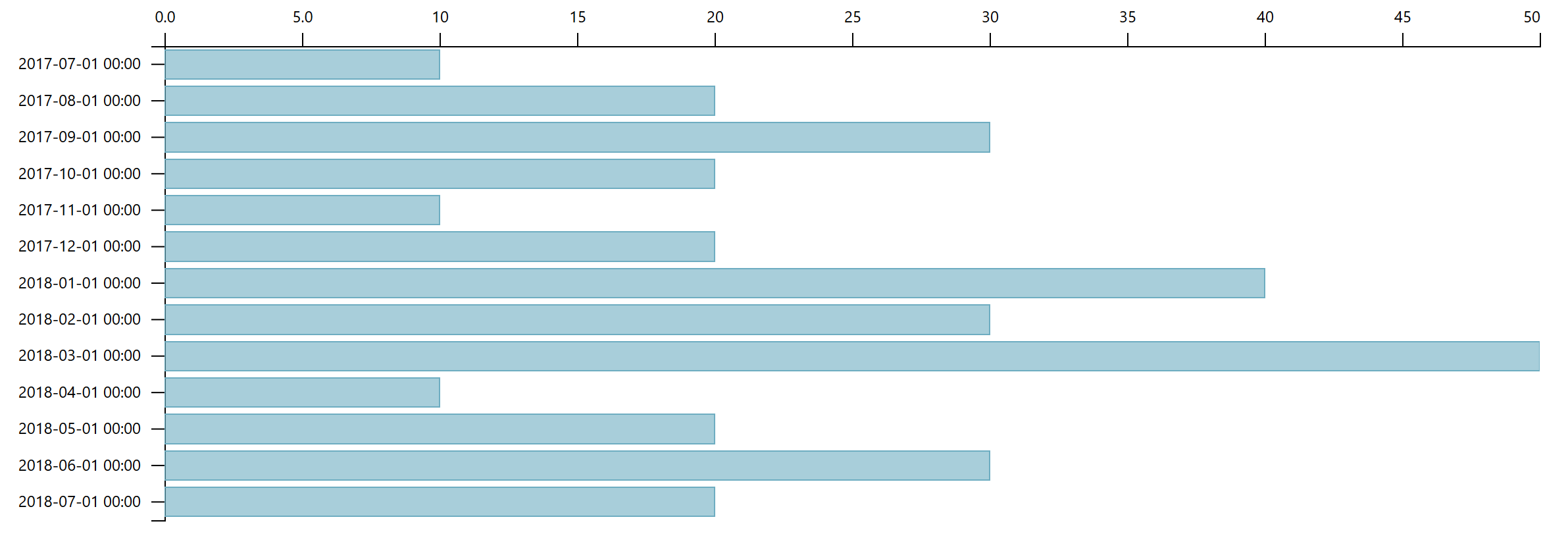
###d3HorizontalBar
This component is for showing scientific data in horizontal bar chart. It takes an array of elements like {key : 'String|Date|Number', value : 'Number'}, key will be
used in tooltip, value will be used to calculate the width needed. By default when every key is of type date, brush will be enabled. You can chose a new range
by using the brush or by clicking a bar if options.axisYTimeInterval has been settled.
template
<d3-horizontal-bar
    :data="data"
    :options="options"
    :margin="margin"
    @range-updated="(dateTimeStart, dateTimeEnd) => fetchDataWithCurrentInterval(dateTimeStart, dateTimeEnd)"
    width="100%"
    height="400px">
</d3-horizontal-bar>
options
| key | description | type | default |
|---|---|---|---|
fill |
bar internal color |
string (rgb, hex, hsl...) |
#6eadc1 |
stroke |
bar edge color |
string (rgb, hex, hsl...) |
#6eadc1 |
fillOpacity |
bar internal color opacity |
number |
0.6 |
strokeOpacity |
bar edge color opacity |
number |
1 |
barTitle |
tooltip |
function |
d => d.value |
tickSize |
tick height/width of axis |
number |
10 |
tickPadding |
tick padding |
number |
8 |
axisFontSize |
axis text font size |
number |
12 |
axisFontWeight |
axis text font weight |
number |
400 |
axisFontOpacity |
axis text font opacity |
number ([0, 1]) |
0.5 |
axisXLabel |
label of axis x |
string or null |
null |
axisYLabel |
label of axis y |
string or null |
null |
axisLabelFontSize |
label font size |
number |
12 |
axisLabelFontWeight |
label font weight |
number |
400 |
axisLabelFontOpacity |
label font opacity |
number |
0.5 |
axisXLaneHeight |
lane height of axis x |
number |
30 |
axisYLaneWidth |
lane width of axis y |
number |
120 |
axisYTimeInterval |
used when data is of type date_histogram, it will be used to decide the date format of axis y |
number OR null |
null |
isAxisPathShow |
if the axis path will be shown |
boolean |
true |
animationDuration |
duration of animation |
number |
1000 |
delay |
delay of animation (milliseconds) |
number |
50 |
axisXTickFormat |
d3-format support |
string |
.2s |
negative |
the axis y should start at 0 or not |
boolean |
false |
nice |
the tick number of axis should be rounded or not |
false |
events
| name | description | arguments |
|---|---|---|
range-updated |
new range has been chosen by using the brush or by clicking a bar |
(dateTimeStart, dateTimeEnd) |
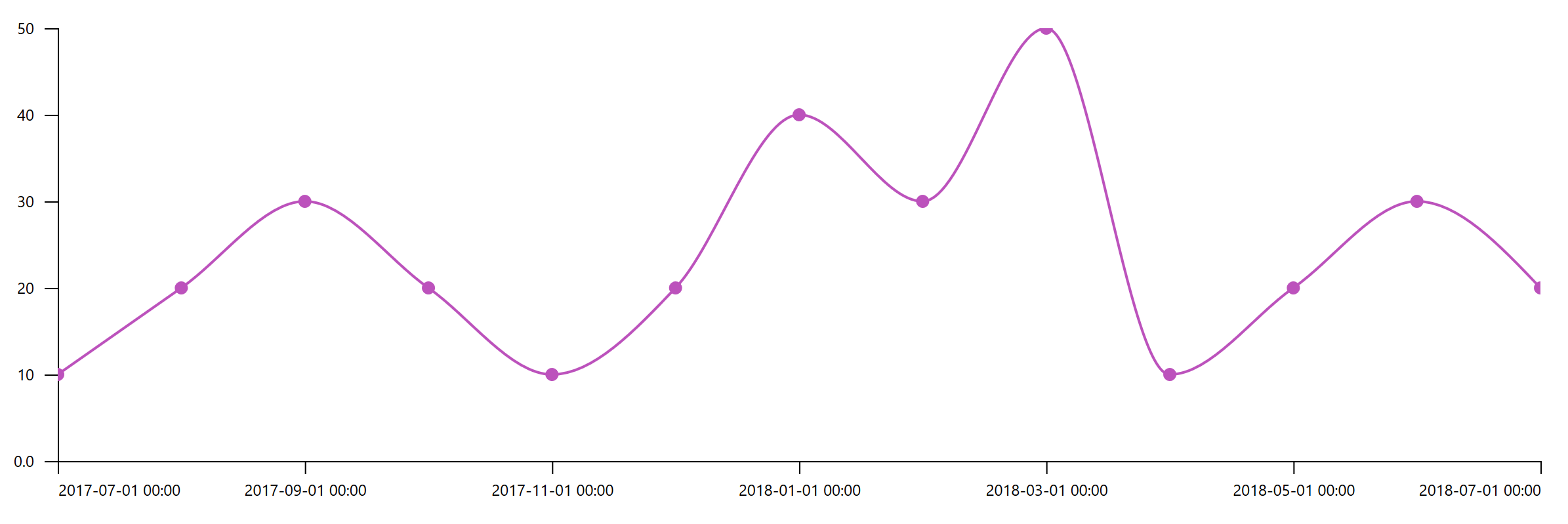
###d3Line
This component is for showing scientific data in line chart. It takes an array of elements like {key : 'String|Date|Number', value : 'Number'}, key will be
used in tooltip, value will be used to calculate the width needed. By default when every key is of type date, brush will be enabled. You can chose a new range
by using the brush.
template
<d3-line
    :data="data"
    :options="options"
    :margin="margin"
    @range-updated="(dateTimeStart, dateTimeEnd) => fetchDataWithCurrentInterval(dateTimeStart, dateTimeEnd)"
    width="100%"
    height="400px">
</d3-line>
options
| key | description | type | default |
|---|---|---|---|
stroke |
line edge color |
string (rgb, hex, rgba, hsl...) |
rgb(188, 82, 188) |
strokeWidth |
line edge width |
number |
2 |
axisXLaneHeight |
lane height of the axis x |
number |
60 |
axisYLaneWidth |
lane width of the axis y |
number |
35 |
axisFontSize |
axis text font size |
number |
12 |
axisFontWeight |
axis text font weight |
number |
400 |
axisFontOpacity |
axis text font opacity |
number |
1 |
tickSize |
tick height/width of axis |
number |
10 |
tickPadding |
tick padding |
number |
8 |
circleRadius |
emphasis circle radius |
number |
5 |
circleColor |
emphasis circle color |
number |
rgb(188, 82, 188) |
circleTitle |
emphasis circle tooltip |
function |
d => d.value |
curve |
curve algorithm |
string |
curveMonotoneX |
axisXLabel |
label of axis x |
string or null |
null |
axisYLabel |
label of axis y |
string or null |
null |
axisLabelFontSize |
label font size |
number |
12 |
axisLabelFontWeight |
label font weight |
number |
400 |
axisLabelFontOpacity |
label font opacity |
number |
0.5 |
axisXTimeInterval |
used when data is of type date_histogram, it will be used to decide the date format of axis x |
number OR null |
null |
axisXTickFormat |
d3-format support |
string |
.2s |
negative |
the axis y should start at 0 or not |
boolean |
false |
nice |
the tick number of axis should be rounded or not |
false |
events
| name | description | arguments |
|---|---|---|
range-updated |
new range has been chosen by using the brush|(dateTimeStart, dateTimeEnd)` |
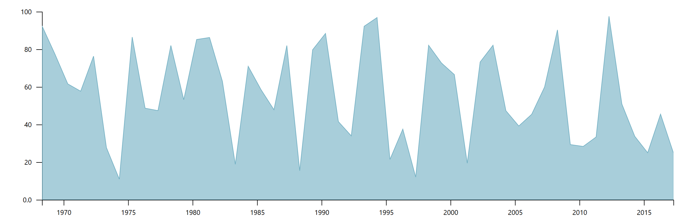
###d3Area
This components is for show big date_histogram data, It takes an array of elements like {key : 'Date', value : 'Number'}.
template
<d3-area
    :data="data"
    :options="options"
    :margin="margin"
    @range-updated="(dateTimeStart, dateTimeEnd) => fetchDataWithCurrentInterval(dateTimeStart, dateTimeEnd)"
    width="100%"
    height="400px">
</d3-area>
options
| key | description | type | default |
|---|---|---|---|
fill |
area path internal color |
string (rgb, hex, hsl...) |
#6eadc1 |
fillOpacity |
area path internal color opacity |
number |
0.6 |
stroke |
area path edge color |
string (rgb, hex, rgba, hsl...) |
rgb(188, 82, 188) |
strokeOpacity |
area path edge color opacity |
number |
1 |
areaTitle |
tooltip |
function |
d => d.value |
axisXLaneHeight |
lane height of the axis x |
number |
60 |
axisYLaneWidth |
lane width of the axis y |
number |
60 |
axisFontSize |
axis text font size |
number |
12 |
axisFontWeight |
axis text font weight |
number |
400 |
axisFontOpacity |
axis text font opacity |
number |
1 |
tickSize |
tick height/width of axis |
number |
10 |
tickPadding |
tick padding |
number |
8 |
curve |
curve algorithm |
string |
curveLinear |
axisXLabel |
label of axis x |
string or null |
null |
axisYLabel |
label of axis y |
string or null |
null |
axisLabelFontSize |
label font size |
number |
12 |
axisLabelFontWeight |
label font weight |
number |
400 |
axisLabelFontOpacity |
label font opacity |
number |
0.5 |
axisXTickFormat |
d3-format support |
string |
.2s |
negative |
the axis y should start at 0 or not |
boolean |
false |
nice |
the tick number of axis should be rounded or not |
false |
|
isAxisPathShow |
if the axis path will be shown |
boolean |
true |
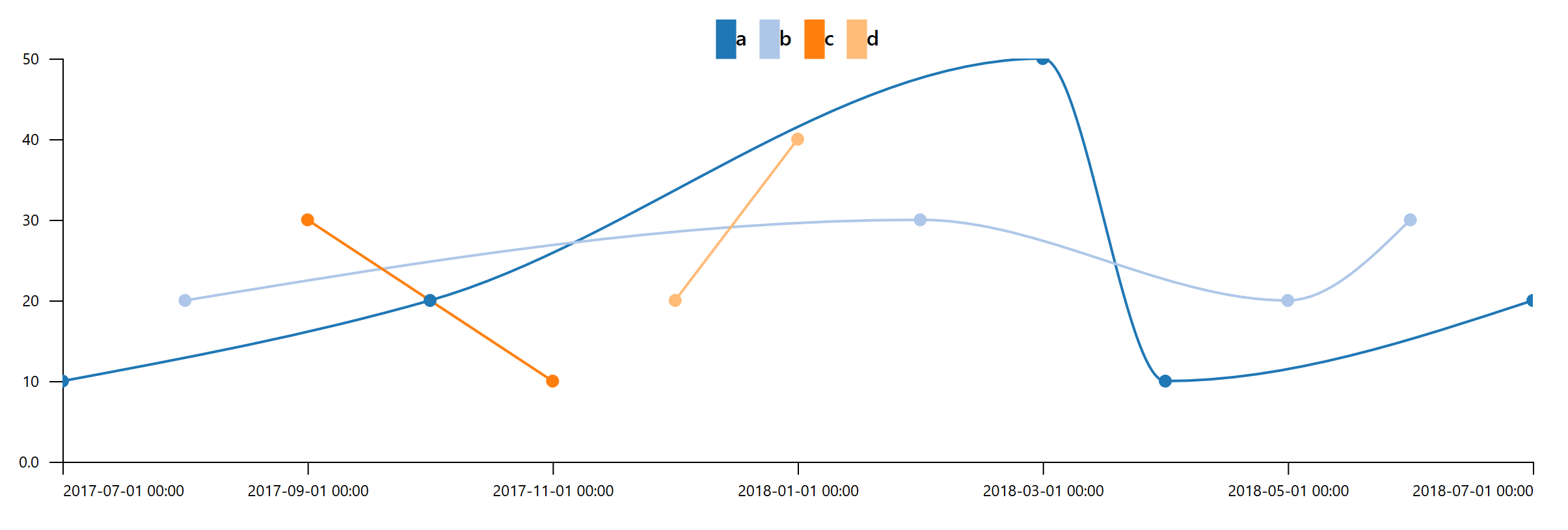
###d3MultiLine
This component is for showing multiple lines together. It takes an array of elements like {group: 'string', key : 'String|Date|Number', value: 'Number'}.
template
<d3-multi-line
    :data="data"
    :options="options"
    :margin="margin"
    @range-updated="(dateTimeStart, dateTimeEnd) => fetchDataWithCurrentInterval(dateTimeStart, dateTimeEnd)"
    width="100%"
    height="400px">
</d3-multi-line>
options
| key | description | type | default |
|---|---|---|---|
strokeWidth |
line edge width |
number |
2 |
axisXLaneHeight |
lane height of the axis x |
number |
60 |
axisYLaneWidth |
lane width of the axis y |
number |
35 |
axisFontSize |
axis text font size |
number |
12 |
axisFontWeight |
axis text font weight |
number |
400 |
axisFontOpacity |
axis text font opacity |
number |
1 |
tickSize |
tick height/width of axis |
number |
10 |
tickPadding |
tick padding |
number |
8 |
circleRadius |
emphasis circle radius |
number |
5 |
circleTitle |
emphasis circle tooltip |
function |
d => d.value |
crossWidth |
legend cross line edge width |
number |
2 |
crossColor |
legend cross line color |
string (rgb, hex, rgba, hsl...) |
white |
curve |
curve algorithm |
string |
curveMonotoneX |
axisXLabel |
label of axis x |
string or null |
null |
axisYLabel |
label of axis y |
string or null |
null |
axisLabelFontSize |
label font size |
number |
12 |
axisLabelFontWeight |
label font weight |
number |
400 |
axisLabelFontOpacity |
label font opacity |
number |
0.5 |
axisXTimeInterval |
used when data is of type date_histogram, it will be used to decide the date format of axis x |
number OR null |
null |
axisXTickFormat |
d3-format support |
string |
.2s |
negative |
the axis y should start at 0 or not |
boolean |
false |
nice |
the tick number of axis should be rounded or not |
false |
|
isAxisPathShow |
if the axis path will be shown |
boolean |
true |
axisXGroupLabelLaneHeight |
group lane height |
number |
35 |
axisXGroupLabelWidth |
group legend width |
number |
15 |
axisXGroupLabelFillColorOpacity |
group legend internal color opacity |
number |
1 |
axisXGroupLabelBorderColorOpacity |
group legend edge color opacity |
number |
0.6 |
axisXGroupLabelGap |
group legend gap |
number |
10 |
dashedGroups |
dash groups |
Array<string> |
[] |
strokeDashArray |
dash array |
number |
5 |
Flow Of Transitions
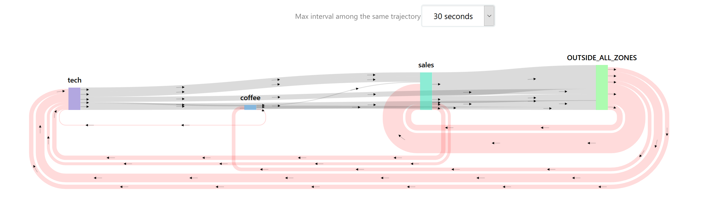
###d3SankeyCircular
This component is for showing the flow of transitions between zones. It takes an array nodes to represent all the zones, and it takes an array of elements
like:
{
    source: `String`,
    target: `String`,
    value: 'Number'
}
template
<d3-sankey-circular
    :nodes="nodes"
    :links="links"
    :options="options"
    :nodeTitle="nodeTitle"
    :linkTitle="linkTitle"
    @max-period-updated="(period) => yourMethod(period)"
    width="100%"
    height="400px">
</d3-sankey-circular>
nodeTitle
Tooltip of zone. Default to d => ${d.name}<br>${d.value}.
linkTitle
Tooltip of link. Default to d => ${d.source.name} → ${d.target.name}<br>${d.value}.
options
| key | description | type | default |
|---|---|---|---|
nodeWidth |
node width |
number |
20 |
nodeTextFontSize |
node text font size |
number |
12 |
nodeTextFontWeight |
node text font weight |
number |
600 |
nodeTextFontOpacity |
node text font opacity |
number |
1 |
circularLinkGap |
circular link gap |
number |
4 |
circularLinkColor |
circularLinkColor |
string (rgb, hex, rgba, hsl...) |
red |
linkColor |
link color |
string (rgb, hex, rgba, hsl...) |
black |
gapLength |
gap length |
number |
150 |
arrowLength |
arrow length |
number |
10 |
arrowHeadSize |
arrow head size |
number |
4 |
axisXSelectBoxLabel |
select box label |
string |
Max interval among the same trajectory |
axisXSelectBoxLabelFontSize |
select box label font size |
number |
12 |
axisXSelectBoxLabelFontWeight |
select box label font weight |
number |
400 |
axisXSelectBoxLabelFontOpacity |
select box label font opacity |
number |
0.5 |
axisXLabel |
label of axis x |
string OR null |
null |
axisXLabelFontSize |
label font size of axis x |
number |
12 |
axisXLabelFontWeight |
label font weight of axis x |
number |
400 |
axisXLabelFontOpacity |
label font opacity |
number |
1 |
Time Series
###d3Timelion
This component is similar to kibana timelion with a interval select box. It accepts an array of elements like { key : 'Date', value: 'Number'}.
template
<d3-timelion
    :data="data"
    :options="options"
    :margin="margin"
    width="100%"
    height="400px"
    @range-updated="(dateTimeStart, dateTimeEnd) => fetchDataWithCurrentInterval(dateTimeStart, dateTimeEnd)"
    @interval-updated="interval => fetchDataWithInterval(interval)">
</d3-timelion>
options
| key | description | type | default |
|---|---|---|---|
fill |
bar internal color |
string (rgb, hex, hsl...) |
#6eadc1 |
stroke |
bar edge color |
string (rgb, hex, hsl...) |
#6eadc1 |
fillOpacity |
bar internal color opacity |
number |
0.6 |
strokeOpacity |
bar edge color opacity |
number |
1 |
barTitle |
tooltip |
function |
d => d.value |
tickSize |
tick height/width of axis |
number |
10 |
tickPadding |
tick padding |
number |
8 |
axisFontSize |
axis text font size |
number |
12 |
axisFontWeight |
axis text font weight |
number |
400 |
axisFontOpacity |
axis text font opacity |
number ([0, 1]) |
0.5 |
axisXLabel |
label of axis x |
string or null |
null |
axisYLabel |
label of axis y |
string or null |
null |
axisLabelFontSize |
label font size |
number |
12 |
axisLabelFontWeight |
label font weight |
number |
400 |
axisLabelFontOpacity |
label font opacity |
number |
0.5 |
axisXLaneHeight |
lane height of axis x |
number |
60 |
axisYLaneWidth |
lane width of axis y |
number |
60 |
axisXTimeInterval |
used when data is of type date_histogram, it will be used to decide the date format of axis x |
number OR null |
null |
isAxisPathShow |
if the axis path will be shown |
boolean |
true |
animationDuration |
duration of animation |
number |
1000 |
delay |
delay of animation (milliseconds) |
number |
50 |
axisYTickFormat |
d3-format support |
string |
.2s |
negative |
the axis y should start at 0 or not |
boolean |
false |
nice |
the tick number of axis should be rounded or not |
false |
|
timeRangeLabelFontSize |
time range label font size |
number |
12 |
timeRangeLabelFontWeight |
time range label font weight |
number |
400 |
timeRangeLabelFontOpacity |
time range label font opacity |
number |
0.5 |
events
| event | description | arguments |
|---|---|---|
range-updated |
user has chosen a new time range by using the brush |
(dateTimeStart, dateTimeEnd) |
interval-updated |
user has changed the time interval by using the select box |
(interval) |
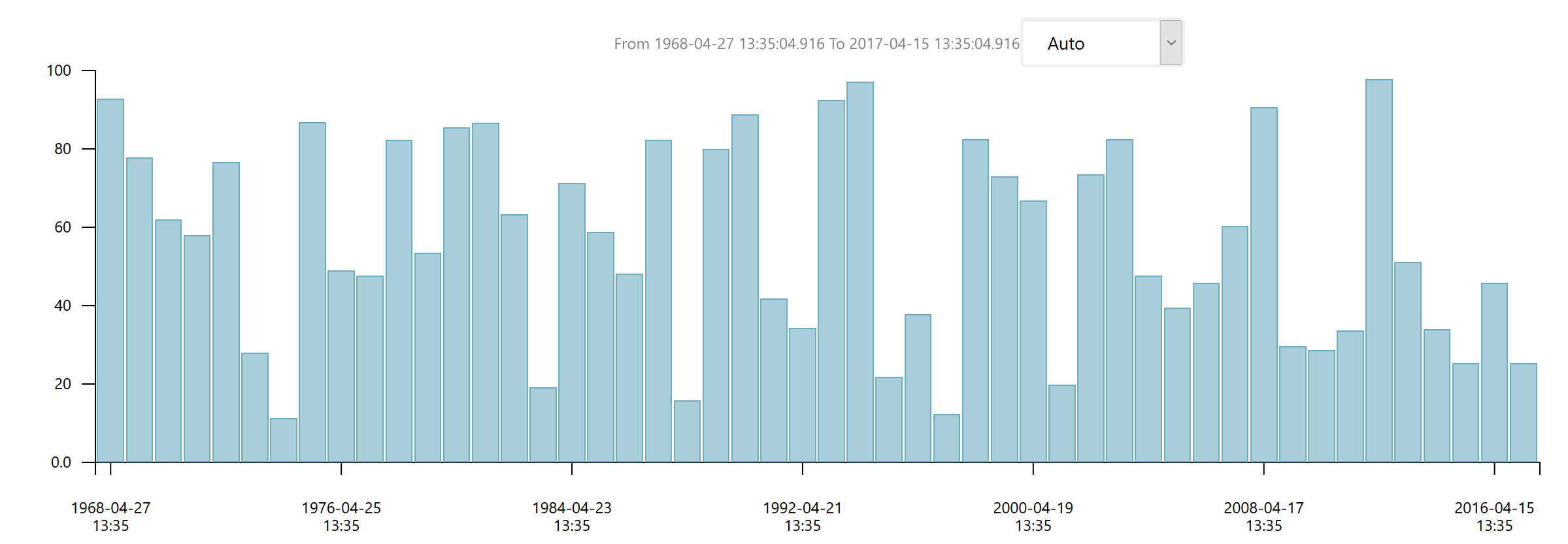
###d3Timeline
This component is for showing time entries. We have two type entries in d3Timeline, they are Point and Interval. It takes an array of entries as data.
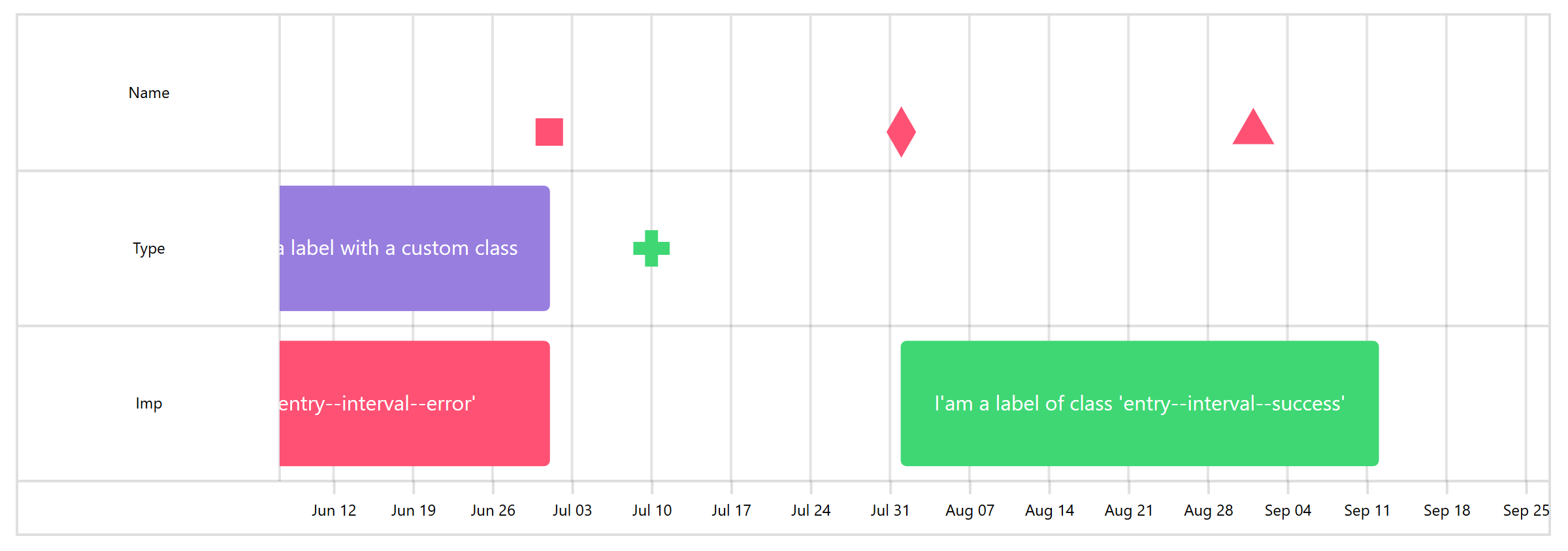
To specify an entry Point:
{
   at: 'Date',
   // tooltip
   title: 'String',
   group: 'String',
   // internally we have 4 className, they are 'entry--point--default', 'entry--point--success', 'entry--point--warn', 'entry--point--info'
   // you can also specify your own class and add it to SPA. The class shouldn't be in scoped style
   className: 'String',
   // it supports 7 symbols, they are 'symbolCircle', 'symbolCross', 'symbolDiamond', 'symbolSquare', 'symbolStar', 'symbolTriangle', 'symbolWye'
   symbol: 'String'
}
To specify an entry 'Interval':
{
    from : 'Date',
    to: 'Date',
    // tooltip
    title: 'String',
    label: 'String',
    group: 'String',
    // internally we have 4 className, they are 'entry--point--default', 'entry--point--success', 'entry--point--warn', 'entry--point--info'
    // you can also specify your own class and add it to SPA. The class shouldn't be in scoped style
    className: 'String'
}
template
<d3-timeline
    :data="data"
    :options="options"
    :margin="margin"
    width="100%"
    height="400px">
</d3-timeline>
options
| key | description | type | default |
|---|---|---|---|
intervalCornerRadius |
corner radius of Interval entry |
number |
4 |
symbolSize |
symbol size of Point entry |
number |
400 |
groupLabelFontSize |
group label font size |
number |
12 |
groupLabelFontWeight |
group label font weight |
number |
400 |
groupLabelFontOpacity |
group label font opacity |
number |
1 |
groupLaneWidth |
group lane width |
number |
200 |
tickSize |
tick size of axis |
number |
10 |
tickPadding |
tick size padding |
number |
8 |
axisXLaneHeight |
lane height of axis x |
number |
40 |
axisFontSize |
axis text font size |
number |
12 |
axisFontWeight |
axis text font weight |
number |
400 |
axisFontOpacity |
axis text font opacity |
number ([0, 1]) |
0.5 |
axisXLabel |
label of axis x |
string or null |
null |
axisLabelFontSize |
label font size |
number |
12 |
axisLabelFontWeight |
label font weight |
number |
600 |
axisLabelFontOpacity |
label font opacity |
number |
0.5 |
backgroundColor |
background color |
string (rgb, hex, rgba, hsl...) |
rgba(255, 255, 255, 0.125) |
borderRadius |
border radius |
number |
0 |
borderWidth |
border width |
number |
2 |
borderColor |
border color |
string (rgb, hex, rgba, hsl...) |
rgba(0, 0, 0, .125) |
boundingLineWidth |
bounding line width |
number |
2 |
boundingLineColor |
bounding line color |
string (rgb, hex, rgba, hesl...) |
rgba(0, 0, 0, .125) |
currentTimeLineWidth |
current time line width |
number |
2 |
currentTimeLineColor |
current time line color |
string (rgb, hex, rgba, hsl...) |
rgba(255, 56, 96, 1) |
Functional
###d3Tracker
This component is like d3Timeline. The difference is that d3Tracker has no support for group and we can hit the space key in keyboard to start
playing. It will also trigger an event to tell us the dateTime of the cursor and the entries it is now passing.
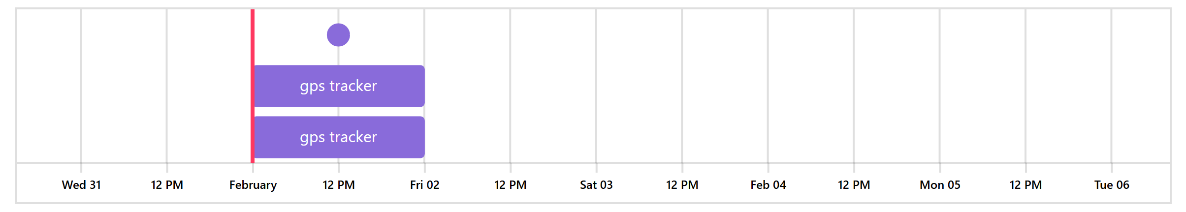
template
<d3-tracker
    :data="data"
    :options="options"
    :margin="margin"
    width="100%"
    height="400px"
    @reference-updated="(dateTimeRange, entries) => yourMethod(dateTimeRange, entries)">
</d3-tracker>
options
| key | description | type | default |
|---|---|---|---|
intervalCornerRadius |
corner radius of Interval entry |
number |
4 |
symbolSize |
symbol size of Point entry |
number |
400 |
tickSize |
tick size of axis |
number |
10 |
tickPadding |
tick size padding |
number |
8 |
axisXLaneHeight |
lane height of axis x |
number |
40 |
axisFontSize |
axis text font size |
number |
12 |
axisFontWeight |
axis text font weight |
number |
400 |
axisFontOpacity |
axis text font opacity |
number ([0, 1]) |
0.5 |
axisXLabel |
label of axis x |
string or null |
null |
axisLabelFontSize |
label font size |
number |
12 |
axisLabelFontWeight |
label font weight |
number |
600 |
axisLabelFontOpacity |
label font opacity |
number |
0.5 |
backgroundColor |
background color |
string (rgb, hex, rgba, hsl...) |
rgba(255, 255, 255, 0.125) |
borderRadius |
border radius |
number |
0 |
borderWidth |
border width |
number |
2 |
borderColor |
border color |
string (rgb, hex, rgba, hsl...) |
rgba(0, 0, 0, .125) |
boundingLineWidth |
bounding line width |
number |
2 |
boundingLineColor |
bounding line color |
string (rgb, hex, rgba, hesl...) |
rgba(0, 0, 0, .125) |
referenceLineWidth |
current time line width |
number |
4 |
referenceLineColor |
current time line color |
string (rgb, hex, rgba, hsl...) |
rgba(255, 56, 96, 1) |
overlayWidth |
cursor overlay rectangle width |
number |
30 |
playDuration |
play should be done in the duration |
10000 |
|
playJump |
play jump should be enabled or not |
boolean |
false |
events
| event | description | arguments |
|---|---|---|
reference-updated |
reference cursor move |
(dateTimeRange, entries) |
###d3Slider
This component is make it more simple to choose a value in a range. This range can be a range of color, date or number. It takes a min and max
as data.

template
<d3-slider
    v-model="data"
    :min="min"
    :max="max"
    :margin="margin"
    :options="options"
    width="100%"
    height="100%">
</d3-slider>
options
| key | description | type | default |
|---|---|---|---|
trackStroke |
track edge color |
string (rgb, hex, rgba, hsl...) |
#000 |
trackStrokeWidth |
track edge width |
number |
10 |
trackStrokeOpacity |
track edge opacity |
number |
0.3 |
trackRounded |
track round or not |
boolean |
true |
trackInsetStroke |
inset track edge color |
string (rgb, hex, rgba, hsl...) |
#ddd |
trackInsetStrokeOpacity |
inset track edge color opacity |
number |
1 |
trackInsetStrokeWidth |
inset track edge width |
number |
8 |
circleFill |
circle handler internal color |
string (rgb, hex, rgba, hsl...) |
#fff |
circleStroke |
circle handler edge color |
string (rgb, hex, rgba, hsl...) |
#000 |
circleStrokeOpacity |
circle handler edge color opacity |
number |
0.5 |
circleStrokeWidth |
circle handler edge width |
number |
1.25 |
isAxisShow |
if axis will be shown |
boolean |
false |
axisFontSize |
axis text font size |
number |
12 |
axisFontWeight |
axis text font weight |
number |
400 |
axisFontOpacity |
axis text font opacity |
number ([0, 1]) |
0.5 |
Layout
###d3Tree
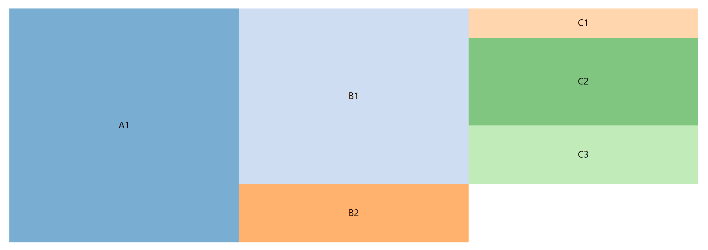
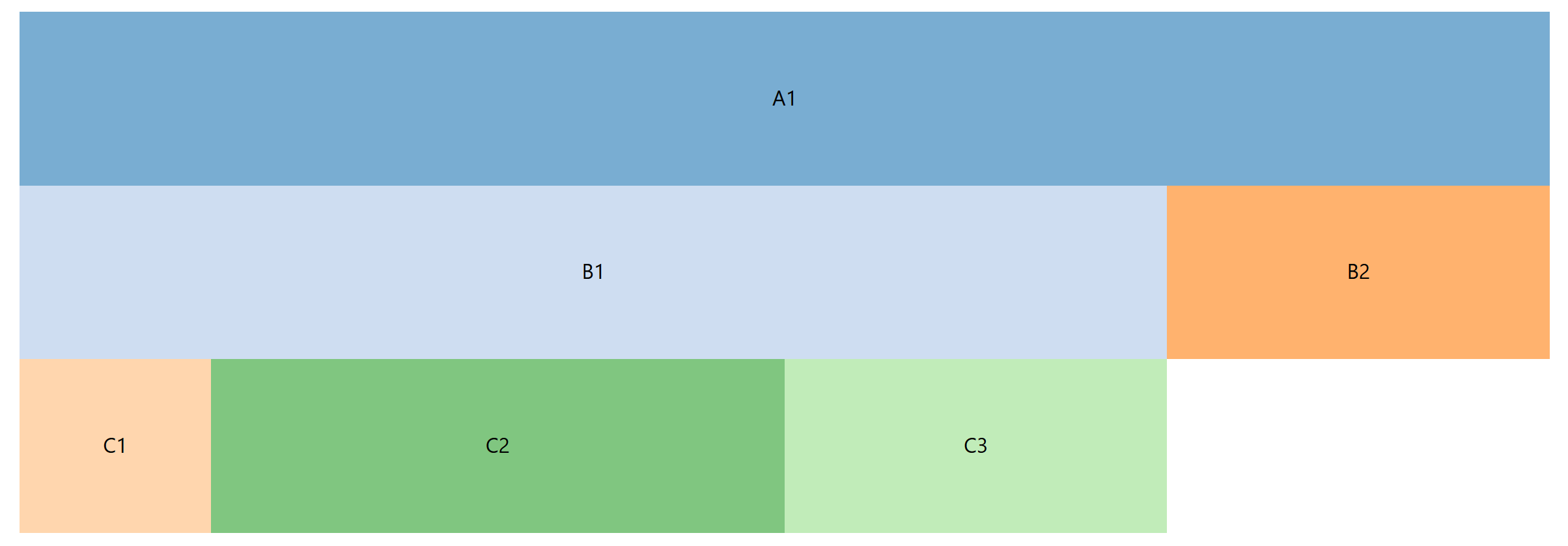
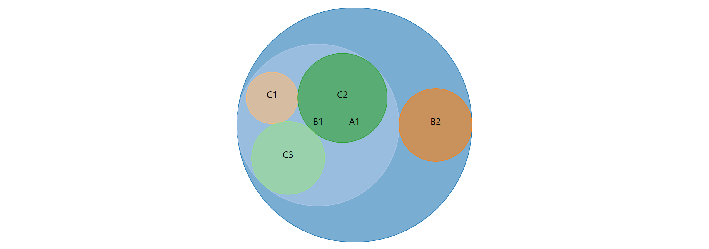
This component is for showing tree layout which is recursive. It takes an object of Hierarchical layouts as data.
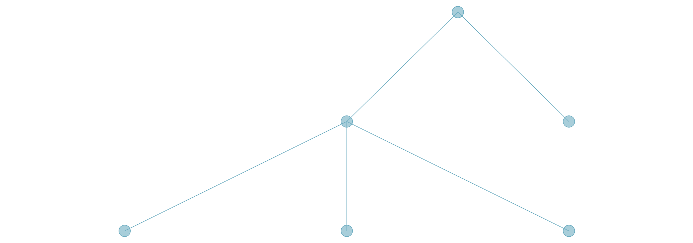
hierarchical layout object
{
  "name": "A1",
  "children": [
    {
      "name": "B1",
      "children": [
        {
          "name": "C1",
          "value": 100
        },
        {
          "name": "C2",
          "value": 300
        },
        {
          "name": "C3",
          "value": 200
        }
      ]
    },
    {
      "name": "B2",
      "value": 200
    }
  ]
}
template
<d3-tree
    :data="data"
    :options="options"
    :margin="margin"
    width="100%"
    height="400px">
</d3-tree>
options
| key | description | type | default |
|---|---|---|---|
nodeTitle |
tooltip |
function |
d => d.data.key + '<br>' + 'd.data.value' |
nodeFill |
tree node internal color |
string (rgb, hex, rgba, hsl...) |
#6eadc1 |
nodeStroke |
tree node edge color |
string (rgb, hex, rgba, hsl...) |
#6eadc1 |
nodeFillOpacity |
tree node internal color opacity |
number |
0.6 |
nodeStrokeOpacity |
tree node edge color opacity |
number |
1 |
linkStroke |
link edge color |
string (rgb, hex, rgba, hsl...) |
#6eadc1 |
linkStrokeWidth |
link edge width |
number |
1 |
linkStrokeOpacity |
link edge color opacity |
number |
1 |
nodeRadius |
tree node circle radius |
number |
10 |
axisXLabel |
label of axis x |
string or null |
null |
axisFontSize |
axis text font size |
number |
12 |
axisFontWeight |
axis text font weight |
number |
400 |
axisFontOpacity |
axis text font opacity |
number ([0, 1]) |
0.5 |
###d3Cluster
This component is like d3-tree but with all leaf nodes are at the same height. It takes an object of Hierarchical layouts as data.
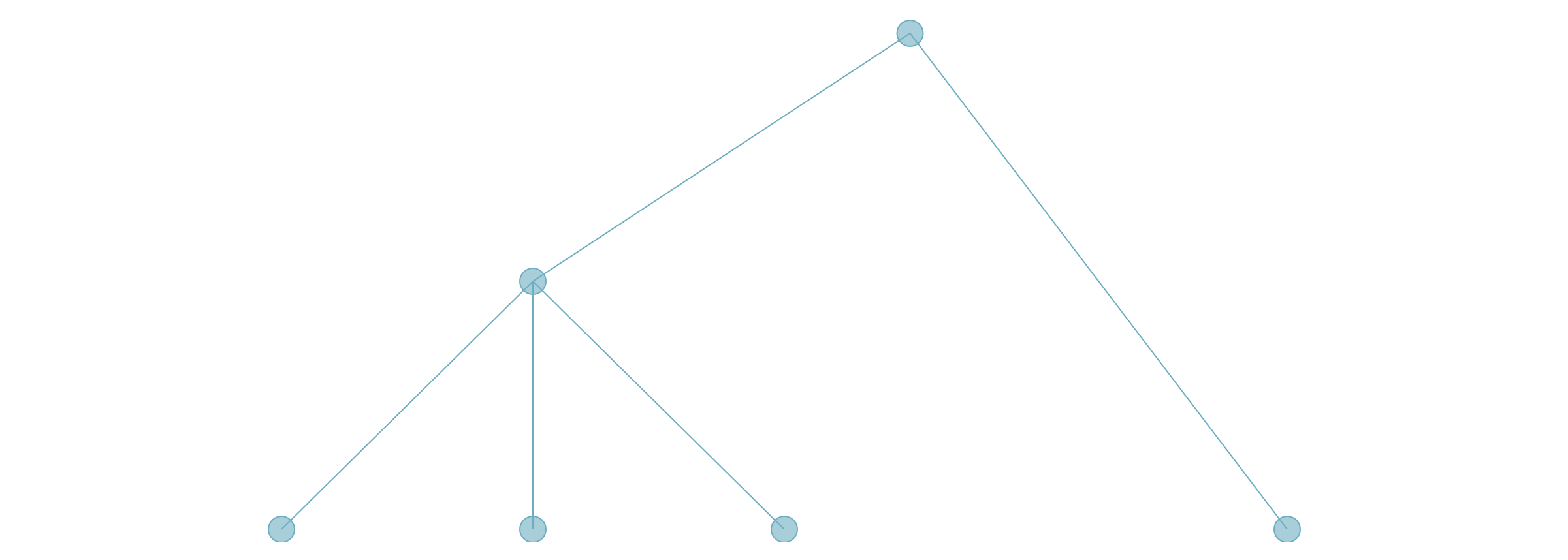
hierarchical layout object
{
  "name": "A1",
  "children": [
    {
      "name": "B1",
      "children": [
        {
          "name": "C1",
          "value": 100
        },
        {
          "name": "C2",
          "value": 300
        },
        {
          "name": "C3",
          "value": 200
        }
      ]
    },
    {
      "name": "B2",
      "value": 200
    }
  ]
}
template
<d3-cluster
    :data="data"
    :options="options"
    :margin="margin"
    width="100%"
    height="400px">
</d3-cluster>
options
| key | description | type | default |
|---|---|---|---|
nodeTitle |
tooltip |
function |
d => d.data.key + '<br>' + 'd.data.value' |
nodeFill |
tree node internal color |
string (rgb, hex, rgba, hsl...) |
#6eadc1 |
nodeStroke |
tree node edge color |
string (rgb, hex, rgba, hsl...) |
#6eadc1 |
nodeFillOpacity |
tree node internal color opacity |
number |
0.6 |
nodeStrokeOpacity |
tree node edge color opacity |
number |
1 |
linkStroke |
link edge color |
string (rgb, hex, rgba, hsl...) |
#6eadc1 |
linkStrokeWidth |
link edge width |
number |
1 |
linkStrokeOpacity |
link edge color opacity |
number |
1 |
nodeRadius |
tree node circle radius |
number |
10 |
axisXLabel |
label of axis x |
string or null |
null |
axisFontSize |
axis text font size |
number |
12 |
axisFontWeight |
axis text font weight |
number |
400 |
axisFontOpacity |
axis text font opacity |
number ([0, 1]) |
0.5 |
###d3ICicleHorizontal
This component is for show icicle horizontal layout which is recursive. It takes an object of Hierarchical layouts as data.
template
<d3-icicle-horizontal
    :data="data"
    :options="options"
    :margin="margin"
    width="100%"
    height="400px">
</d3-icicle-horizontal>
options
| key | description | type | default |
|---|---|---|---|
rectTitle |
tooltip |
function |
d => d.data.value |
padding |
partition padding |
number |
0 |
fillOpacity |
partition internal color opacity |
number |
0.6 |
strokeOpacity |
partition edge color opacity |
number |
1 |
axisXLabel |
label of axis x |
string or null |
null |
axisFontSize |
axis text font size |
number |
12 |
axisFontWeight |
axis text font weight |
number |
400 |
axisFontOpacity |
axis text font opacity |
number ([0, 1]) |
0.5 |
###d3ICicleVertical
This component is for show icicle vertical layout which is recursive. It takes an object of Hierarchical layouts as data.
template
<d3-icicle-vertical
    :data="data"
    :options="options"
    :margin="margin"
    width="100%"
    height="400px">
</d3-icicle-vertical>
options
| key | description | type | default |
|---|---|---|---|
rectTitle |
tooltip |
function |
d => d.data.value |
padding |
partition padding |
number |
0 |
fillOpacity |
partition internal color opacity |
number |
0.6 |
strokeOpacity |
partition edge color opacity |
number |
1 |
axisXLabel |
label of axis x |
string or null |
null |
axisFontSize |
axis text font size |
number |
12 |
axisFontWeight |
axis text font weight |
number |
400 |
axisFontOpacity |
axis text font opacity |
number ([0, 1]) |
0.5 |
###d3Sunburst
This component is for showing sunburst layout. It takes an object of Hierarchical layouts as data.

hierarchical layout object
{
  "name": "A1",
  "children": [
    {
      "name": "B1",
      "children": [
        {
          "name": "C1",
          "value": 100
        },
        {
          "name": "C2",
          "value": 300
        },
        {
          "name": "C3",
          "value": 200
        }
      ]
    },
    {
      "name": "B2",
      "value": 200
    }
  ]
}
template
<d3-sunburst
    :data="data"
    :options="options"
    :margin="margin"
    width="100%"
    height="400px">
</d3-sunburst>
options
| key | description | type | default |
|---|---|---|---|
arcTitle |
tooltip |
function |
d => d.data.value |
padding |
partition padding |
number |
0 |
fillOpacity |
partition internal color opacity |
number |
0.6 |
strokeOpacity |
partition edge color opacity |
number |
1 |
axisXLabel |
label of axis x |
string or null |
null |
axisFontSize |
axis text font size |
number |
12 |
axisFontWeight |
axis text font weight |
number |
400 |
axisFontOpacity |
axis text font opacity |
number ([0, 1]) |
0.5 |
###d3Pack
This component is for showing pack layout. It takes an object of Hierarchical layouts as data.
hierarchical layout object
{
  "name": "A1",
  "children": [
    {
      "name": "B1",
      "children": [
        {
          "name": "C1",
          "value": 100
        },
        {
          "name": "C2",
          "value": 300
        },
        {
          "name": "C3",
          "value": 200
        }
      ]
    },
    {
      "name": "B2",
      "value": 200
    }
  ]
}
template
<d3-pack
    :data="data"
    :options="options"
    :margin="margin"
    width="100%"
    height="400px">
</d3-pack>
options
| key | description | type | default |
|---|---|---|---|
circleTitle |
tooltip |
function |
d => d.data.key + '<br>' + d.data.value |
circleFillOpacity |
partition circle internal color opacity |
number |
0.6 |
circleStrokeOpacity |
partition circle edge color opacity |
number |
1 |
axisXLabel |
label of axis x |
string or null |
null |
axisFontSize |
axis text font size |
number |
12 |
axisFontWeight |
axis text font weight |
number |
400 |
axisFontOpacity |
axis text font opacity |
number ([0, 1]) |
0.5 |
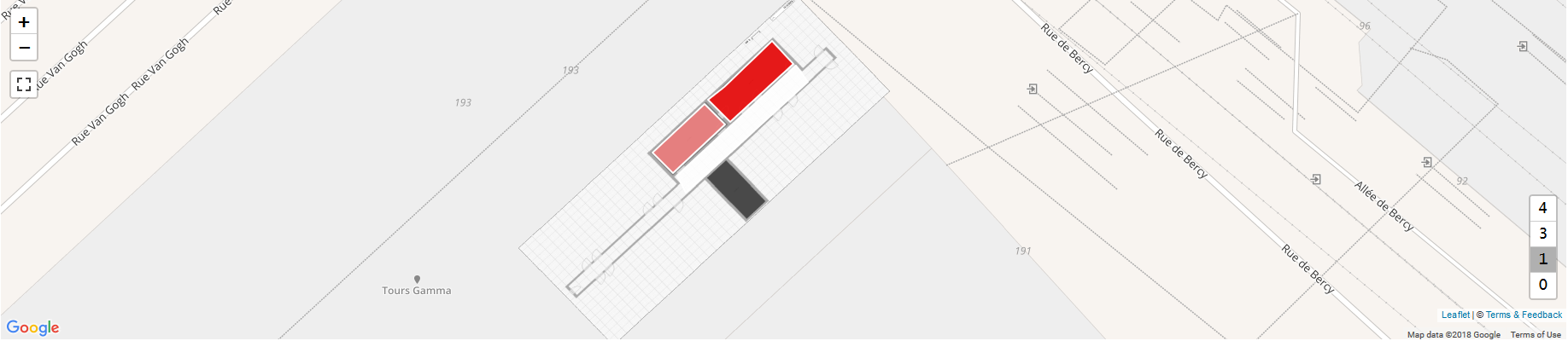
template
<d3-l-choropleth
:data="data"
:options="options"
:indoorMaps="indoorMaps"
width="100%"
height="400px">
</d3-l-choropleth>
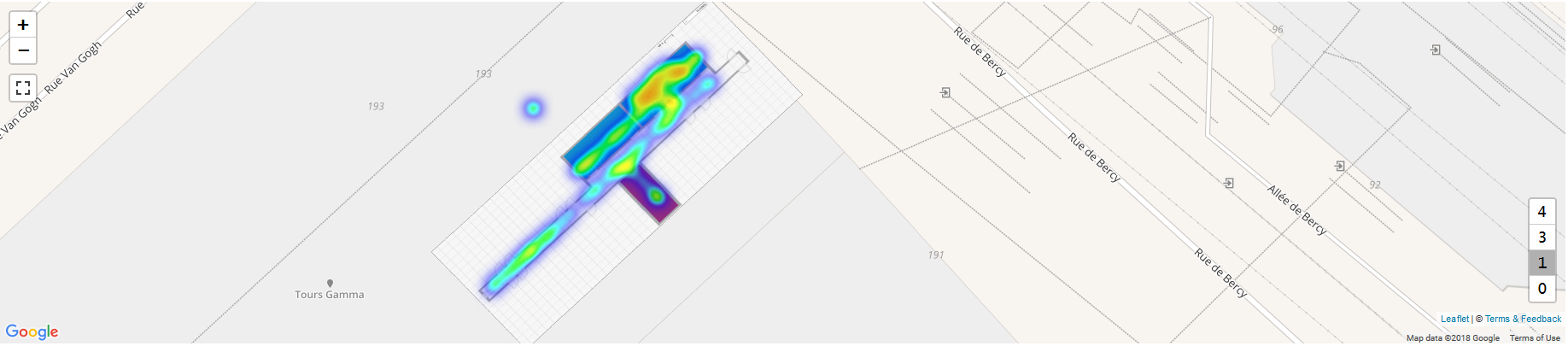
<d3-l-heat
:data="data"
:options="options"
:indoorMaps="indoorMaps"
width="100%"
height="400px">
</d3-l-heat>
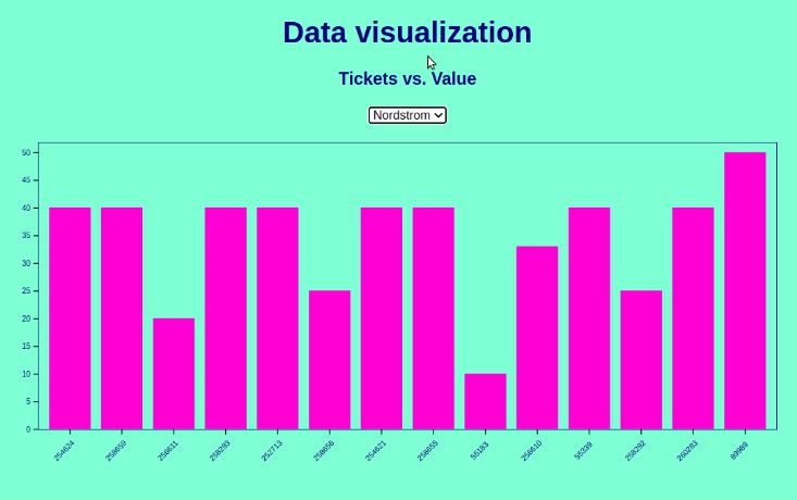
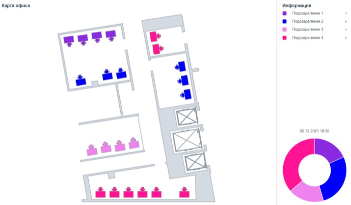
Screenshots
ToDo
d3ColorPickerd3Ganttd3Gauged3Goald3HeatMapd3RadialBard3RadialSectord3RadialLined3ScatterPlotd3Tabled3WordCloudd3Markdownd3JsonViewerd3LReplay