Vue Tinytabs
Vuejs wrapper for Tinytabs which is a super tiny javascript plugin for rendering tabs (< 2KB).
Find the npm package link
Install and basic usage
$ npm install vue-tiny-tabs
Example
<template>
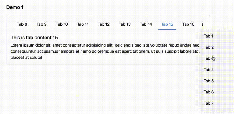
<vue-tiny-tabs id="mytabs" :anchor="false" :closable="true" :hideTitle="false" @on-close="onClose" @on-before="onBefore" @on-after="onAfter">
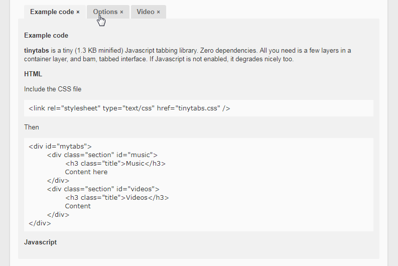
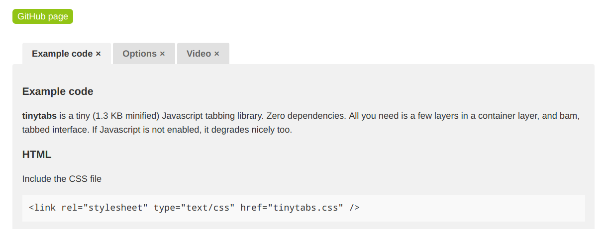
<div class="section" id="example">
<h3 class="title">Example code</h3>
<h3>Javascript</h3>
</div>
<div class="section" id="options">
<h3 class="title">Options table</h3>
<h3>Options</h3>
</div>
<div class="section" id="components">
<h3 class="title">Components</h3>
<h3>Options</h3>
</div>
</vue-tiny-tabs>
</template>
<script>
import VueTinyTabs from 'vue-tiny-tabs'
export default {
name: 'TinyTabs',
components: {
'vue-tiny-tabs': VueTinyTabs
},
methods: {
onClose (id) {
console.log('Callback function that gets evaluated while closing the tab', id)
},
onBefore (id, tab) {
console.log('Callback function that gets evaluated before a tab is activated', id, tab)
},
onAfter (id, tab) {
console.log('Callback function that gets evaluated after a tab is activated', id, tab)
}
},
}
</script>
Customized CSS for styling
.tinytabs .tabs {
	margin-left: 15px;
	display: flex;
	flex-flow: row wrap;
}
.tinytabs .tabs .tab .close {
	padding-left: 5px;
}
.tinytabs .tabs .tab {
	margin: 0 3px 0 0;
	background: #e1e1e1;
	display: block;
	padding: 6px 15px;
	text-decoration: none;
	color: #666;
	font-weight: bold;
	border-radius: 3px 3px 0 0;
}
.tinytabs .section {
	background: #f1f1f1;
	overflow: hidden;
	padding: 15px;
	clear: both;
	border-radius: 3px;
}
.tinytabs .tab.sel {
	background: #f1f1f1;
	color: #333;
	text-shadow: none;
}
Options
| Properties | Description |
|---|---|
| anchor | false (default) or true. If enabled, when a tab is clicked, it's id is set in url's fragment so that the tab is retained on page reloads. |
| hideTitle | false (default) or true. Hide the title element within section elements. |
| sectionClass | Section element's class. Default is section. |
| tabsClass | Tab (ul) container's class. Default is tabs. |
| tabClass | Individual tab's (li) class. Default is tab. |
| titleClass | Title element's tag. Default is title. |
| onBefore | function(id, tab). Callback function that gets evaluated before a tab is activated. The first arg is the id of the tab and the second is the DOM element of the tab. |
| onAfter | function(id, tab). Callback function that gets evaluated after a tab is activated. The first arg is the id of the tab and the second is the DOM element of the tab. |
| onClose | function(id). Callback function that gets evaluated while closing the tab. The argument is the id of the tab. |
MIT License.