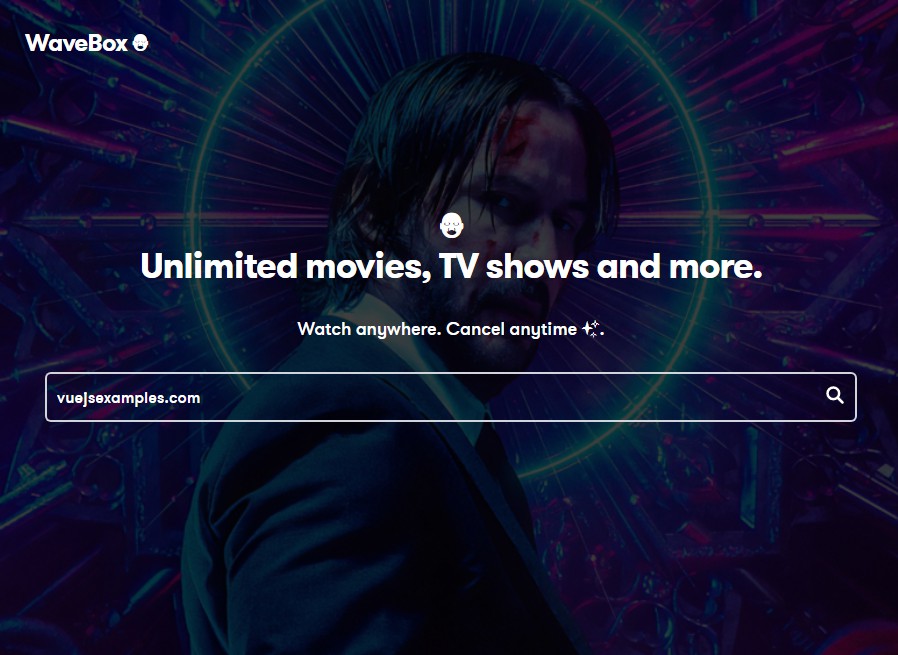
WaveBox ?
An Movie Search Application Built with the IMDB API
Requirements
- Build the web app using Vue
- The Web app will use the OMDB API
- Have a search bar at the top of the page from where a user can search for a movie.
- The search results should be displayed as a movie in a way that showcases the title, the cover image, and links to the details about the movie.
- Freedom to decide what your UI and UX should look like.
Prerequisites
- Ensure that you have Node.js and NPM installed locally
Project setup
Install Dependenceis ✨
yarn install
Compiles and hot-reloads for development ✨
yarn serve
Run test ✨
yarn test:unit
Compiles and minifies for production ✨
yarn build
View in browser ✨
http://localhost:8080
Project Technologies ?
- VueJS
- CSS / SCSS
UI components ??
- SearchBar: The SearchBar component is used to allow users input a search term.
import { SearchBar } from "@/components"
The SearchBar has the following props: modelView, handleSearch
- MovieCard: The MovieCard Component is designed to display the initial of the movie after search.
import { MovieCard } from "@/components"
The MovieCard has the following props: type, poster, title, genre, year, imdbRating, rottentomatoes
- MovieDetailModal: The MovieDetailModal is designed to display all the details of a movie.
import { MovieDetailModal } from "@/components"
The MovieDetailmodal has the following props: type, poster, title, genre, year, imdbRating, rottentomatoes, plot, writers, director, runtime, rated, awards, language, show
- Tag: The Tag components is for aesthetics, to help display unique set of data.
import { Tag } from "@/components"
The Tag has the following props: text
- NoResult: The NoResult components is for used to alert the user that there was no result after a search.
import { NoResult } from "@/components"
The NoResult has the following props: message
- Loader: The Loader component is used to improve UX, it shows the user that data is getting fetched.
import { Loader } from "@/components"
- Footer: The Footer components displays meta data.
import { Footer } from "@/components"
UI Design
The UI design for this app was inspired by
- Fink Movie – https://www.figma.com/community/file/879798185346840008
- MovieBox – https://www.figma.com/community/file/1030753090086308330
- Netflix – https://www.netflix.com
License
MIT License