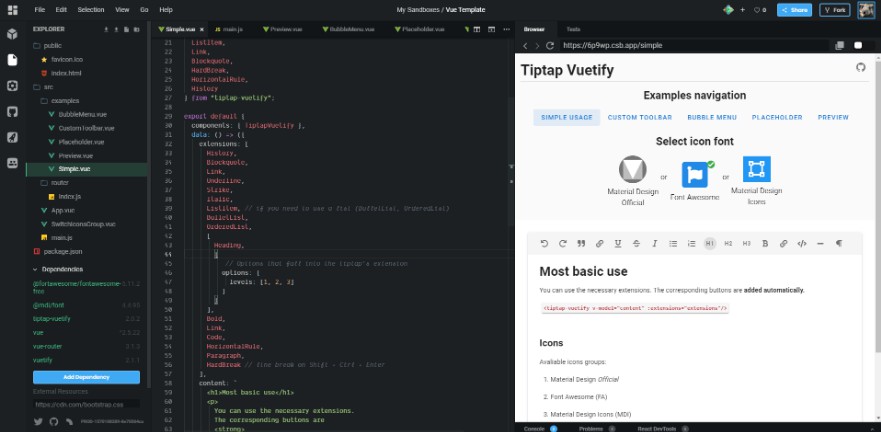
tiptap-vuetify
WYSIWYG editor for Vuetify. Component simplifies integration tiptap with vuetify.
Features
- used vuetify components
- support for different types of icons (fa, md, mdi)
- internationalization (en, fr, pl, es, ru, uk, ptbr), with automatic detection of the current language through the Vuetify
- easy to start using
- props and events are available
- TypeScript support
- the project is ready to actively develop if there is support (stars)!
- the ability to create and use your own extensions
- choose where the extension buttons should be displayed: in the toolbar or in the bubble menu
- Vuetify
2.xand1.xsupport
Installation
yarn add tiptap-vuetify
# Or
npm install --save tiptap-vuetify
Get started
NPM (ES modules)
- Installing the package and Vuetify 2 from scratch:
import Vue from 'vue'
import Vuetify from 'vuetify'
// import plugin
import { TiptapVuetifyPlugin } from 'tiptap-vuetify'
// don't forget to import CSS styles
import 'tiptap-vuetify/dist/main.css'
// Vuetify's CSS styles
import 'vuetify/dist/vuetify.min.css'


// Vuetify Object (as described in the Vuetify 2 documentation)
const vuetify = new Vuetify()

// use Vuetify's plugin
Vue.use(Vuetify)
// use this package's plugin
Vue.use(TiptapVuetifyPlugin, {
  // the next line is important! You need to provide the Vuetify Object to this place.
  vuetify, // same as "vuetify: vuetify"
  // optional, default to 'md' (default vuetify icons before v2.0.0)
  iconsGroup: 'md'
})
More about vuetify icons you can read here.
- Use in your component. Here is a complete example:
<template>
  <div>
    <!-- Use the component in the right place of the template -->
    <tiptap-vuetify
      v-model="content"
      :extensions="extensions"
    />
  </div>
</template>

<script>
// import the component and the necessary extensions
import { TiptapVuetify, Heading, Bold, Italic, Strike, Underline, Code, Paragraph, BulletList, OrderedList, ListItem, Link, Blockquote, HardBreak, HorizontalRule, History } from 'tiptap-vuetify'

export default {
  // specify TiptapVuetify component in "components"
  components: { TiptapVuetify },
  data: () => ({
    // declare extensions you want to use
    extensions: [
      History,
      Blockquote,
      Link,
      Underline,
      Strike,
      Italic,
      ListItem,
      BulletList,
      OrderedList,
      [Heading, {
        options: {
          levels: [1, 2, 3]
        }
      }],
      Bold,
      Link,
      Code,
      HorizontalRule,
      Paragraph,
      HardBreak
    ],
    // starting editor's content
    content: `
      <h1>Yay Headlines!</h1>
      <p>All these <strong>cool tags</strong> are working now.</p>
    `
  })
}
</script>
Nuxt
If you have Nuxt.js, here is a description of how to integrate with it.
CDN
There is another use case with the script tag (CDN version of package):
<script src="https://unpkg.com/tiptap-vuetify"></script>
Or
<script src="https://cdn.jsdelivr.net/npm/tiptap-vuetify"></script>
The plugin should be installed automatically after connecting the script.
The only thing is that the Vuetify object must be set in window.vuetify so that the plugin gets access to it.
Write if you have questions.
Props
placeholder
Placeholder is displayed when there is no content in the editor.
How to use:
  <tiptap-vuetify
    placeholder="Write something …"
  />
extensions
You can use the necessary extensions. The corresponding buttons are added automatically
(in the order in which you specify the extension).
How to import and use them can be seen in the example above.
Available extensions:
BoldItalicStrikeUnderlineCodeCodeBlockParagraphBulletListOrderedListListItemLinkBlockquoteHardBreakHorizontalRuleHistory
I can easily add more.
toolbar-attributes
You can specify your attributes for the toolbar (<v-toolbar> vuetify component).
For example, change the color:
:toolbar-attributes="{ color: 'yellow' }"
editor-properties
Tiptap Editor properties (passed to the constructor).
You can see the full list of properties here.
Only these properties are not available: content, onUpdate, they are used in this package.
If you want to add extensions to the extensions property, then use the native-extensions prop of this package.
native-extensions
How to use:
<tiptap-vuetify
  :native-extensions="nativeExtensions"
/>
// in script:
data () {
  return {
    nativeExtensions: [new TiptapExtension1(), new TiptapExtension2()]
  }
}
output-format
The format to output from the v-model. This defaults to html
For example, to get json instead:
<tiptap-vuetify
  output-format="json"
/>
Events
@init
first argument (object):
{
  // tiptap editor instance
  editor: Editor
}
How to use:
<tiptap-vuetify
  @init="onInit"
/>
Slots
toolbar
How to use:
- Since Vue
2.6.0(new syntax):
<tiptap-vuetify
  v-model="content"
  :extensions="extensions"
  :toolbar-attributes="{ color: 'yellow' }"
>
  <template #toolbar="{ buttons, commands, isActive }">
    <!--You can render the buttons as you wish (you can see in the source code how this is done).-->
    <pre>{{ buttons }}</pre>
  </template>
</tiptap-vuetify>
- Before
2.6.0:
<tiptap-vuetify>
  <div
    slot="toolbar"
    slot-scope="{ buttons, commands, isActive }"
  >
    <!--You can render the buttons as you wish (you can see in the source code how this is done).-->
    <pre>{{ buttons }}</pre>
  </div>
</tiptap-vuetify>
footer
Footer of the Editor.
toolbar-before
You can add content before the toolbar.
toolbar-after
You can add content after the toolbar.
TODO
- images uploading (free hosting by default) Relevant issue.
- site with full-docs and examples
- emoticons
- tests
- support for more extensions