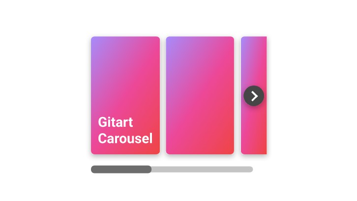
Vue Split Carousel
a carousel component for vue, meanwhile display several carousel item.
SSR supported, compatible IE 10+ and modern browsers.
Install
import by npm
install package
npm i vue-split-carousel -S
Local Usage
example code
<template>
  <div id="app">
    <split-carousel>
      <split-carousel-item v-for="item in 8" :key="item">
        {{ item }}
      </split-carousel-item>
    </split-carousel>
  </div>
</template>

<script>
  import { SplitCarousel, SplitCarouselItem } from "vue-split-carousel";
  export default {
    components: {
      SplitCarousel,
      SplitCarouselItem
    }
  };
</script>

<style>
  #app {
    width: 800px;
    margin: 60px auto;
  }
</style>
Global Usage
example code
import Vue from "vue";
import App from "./App.vue";

import SplitCarousel from "vue-split-carousel";
import "vue-split-carousel/dist/vue-split-carousel.css";
Vue.use(SplitCarousel);

new Vue({
  render: h => h(App)
}).$mount("#app");
import by <script>
- import component style from dist dir
- import vue.js
- import vue-split-carousel.umd.js
example code
<!DOCTYPE html>
<html lang="en">
  <head>
    <!-- import component-style -->
    <link rel="stylesheet" href="./vue-split-carousel.css" />
  </head>
  <body>
    <div id="app" style="width:800px;margin:0 auto;">
      <split-carousel>
        <split-carousel-item v-for="item in list" :key="item">
          {{ item }}
        </split-carousel-item>
      </split-carousel>
    </div>
    <!-- import vue -->
    <script src="https://cdn.jsdelivr.net/npm/vue"></script>
    <!-- import component script vue-split-carousel.umd.js from dist dir -->
    <script src="./vue-split-carousel.umd.js"></script>
    <script>
      new Vue({
        data() {
          return {
            list: 6
          };
        }
      }).$mount("#app");
    </script>
  </body>
</html>
Browser Compatibility
animation effect is implent by CSS property transition, thus only support for IE 10+ and other modern browsers.
Component Structure
Use <split-carousel-item> in <split-carousel>,put your custom content in split-carousel-item.
<split-carousel>
  <split-carousel-item>
    custom content
  </split-carousel-item>
  <split-carousel-item>
    custom content2
  </split-carousel-item>
  ...
</split-carousel>
You can customize carousel arrow by slots arrow-left and arrow-right
<split-carousel>
  <h3 slot="left-arrow">left</h3>
  <split-carousel-item>
    custom content
  </split-carousel-item>
  <h3 slot="right-arrow">right</h3>
</split-carousel>
Document
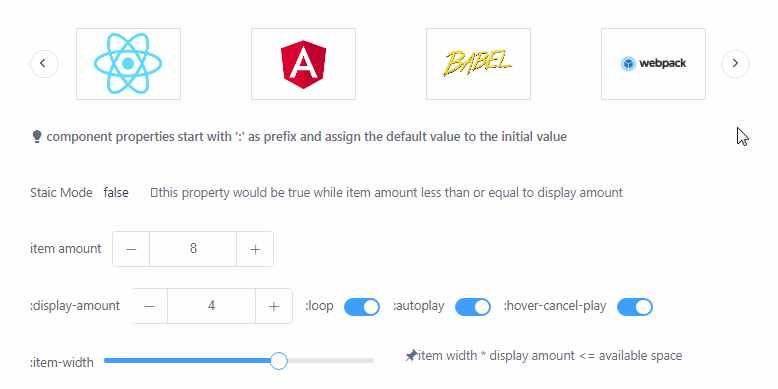
Split Carousel Attributes
| Attribute | Description | Type | Accpected Values | Default |
|---|---|---|---|---|
| speed | duration of carousel item animation,in milliseconds | Number | - | 500 |
| autoplay | whether automatically switch carousel items | Boolean | - | true |
| interval | interval of switch carousel items, in milliseconds | Number | - | 3000 |
| loop | whether display carousel items in loop | Boolean | - | true |
| initial-index | index of initally first carousel item | Number | - | 0 |
| display-amount | the amount of carousel items display in carousel container | Number | - | 4 |
| item-width | the width of carousel items | Number | - | 120 |
| item-align | carousel item alignment while carousel item amount less than display amount | - | center/left/right | center |
| height | height of carousel | Number | - | 80 |
| timing-function | the animation effect of carousel item,reference [transition-timing-function][1] | String | - | ease |
| arrow-area-width | the width of arrow area | Number | - | 50 |
| arrow-visible | when arrows are show | - | enable/always | enable |
| hover-cancle-play | whether stop auto play while mouse hover | Boolean | - | true |
| play-direction | the moving direction of carousel item | - | ltr/rtl | ltr |
Split Carousel Slots
| Name | Descrition |
|---|---|
| left-arrow | customize left arrow |
| right-arrow | customize right arrow |