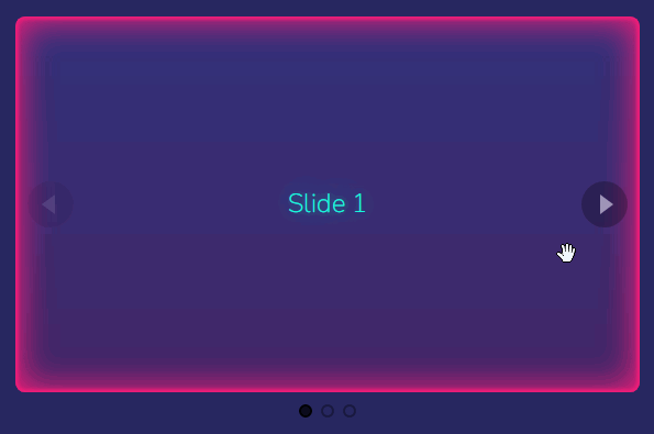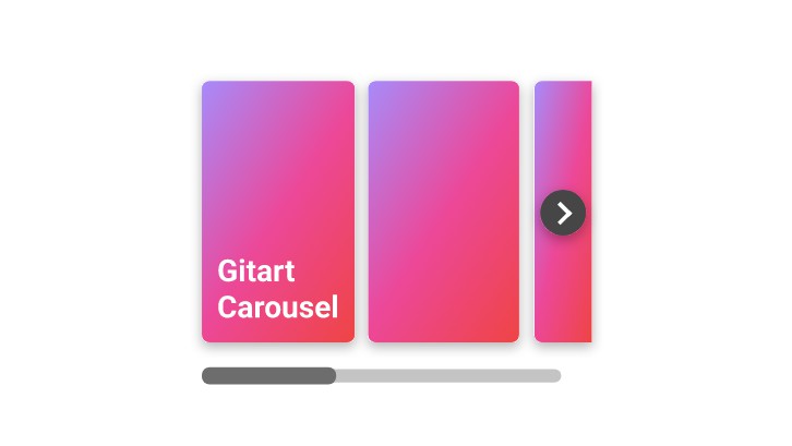
Vue Base Carousel
Basic Carousel component writtin in Vue 3 and TypeScript
Two CarBasicousel components:
- BaseCarousel for general use with Vue's slot support
- ImageCarousel specifically designed for image slideshow (has a prop to get all image sources)

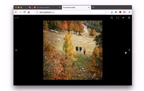
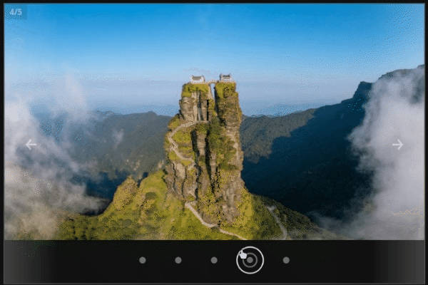
Carousel Features
Both Carousels have these features:
- Continuous item navigation
- Cycle through items
- Change cycle period (ex: '1000' in ms)
- Autofocus on page load
- Go to specific item using dots (pagination)
- Write custom html for prev/next buttons (default is arrow shape)
- Hide prev/next navigation buttons (arrows)
- Beautiful transitions
- Change transition time (ex: '0.3s')
- Adjust padding on each carousel item and whole carousel when in fullscreen mode (to prevent interference with carousel arrows)
- Excellent touch and focus support for navigation:
- Change items based on touch swipe direction (left and right swipe), implemented using custom Vue directive (v-swipe)
- Touch swipes can be adjusted to your needs with options like swipe duration and distance
- Keyboard support:
- Left arrow goes to previous item
- Right arrow goes to next item
- Escape cancel focus (on carousel element)
- f key view carousel in fullscreen mode
- Fullscreen mode (with Safari support) by:
- Pressing f key (no interfere with ctrl + f which is binded to find action)
- Double clicking on carousel (except it's arrow buttons, and pagination dots)
- Enough accessibility support
- Can load async content (images from APIs)
Usage
Basically you need to import styles on a top level scope then use components where ever you want. For example:
<script setup lang="ts">
  import { BaseCarousel, BaseCarouselItem } from "vue-base-carousel";
  import "vue-base-carousel/style.css";
</script>

<template>
  <BaseCarousel v-slot="{ current }">
    <BaseCarouselItem
      v-for="(value, index) in ['ONE', 'TWO', 'THREE']"
      v-show="current === index"
      :key="index"
    >
      <h1>SLIDE {{ value }}</h1>
    </BaseCarouselItem>
  </BaseCarousel>
</template>
ImageCarousel
<script setup lang="ts">
  import { reactive } from "vue";
  import ImageCarousel from "@/components/ImageCarousel.vue";

  // your images should be an array of objects like below (alt is optional)
  const state = reactive({
    carouselImages: [
      { src: "/images/1.jpg", alt: "aerial view island" },
      { src: "/images/2.jpg", alt: "annular eclipse sunset" },
      // and so forth...
    ],
  });
</script>

<template>
  <main>
    <!-- use image carousel in your html -->
    <!-- don't need "section" tag, it's already wrapped inside one -->
    <image-carousel :images="state.carouselImages" />
  </main>
</template>
BaseCarousel
BaseCarousel is desigend using slots for general usage. Simply put your html elements inside BaseCarousel and it's BaseCarouselItem like so:
<script setup lang="ts">
  import { reactive } from "vue";
  import BaseCarousel from "./components/BaseCarousel.vue";
  import BaseCarouselItem from "./components/BaseCarouselItem.vue";

  const state = reactive({
    carouselContent: [
      {
        heading: "Heading",
        paragraph:
          "Lorem ipsum dolor sit amet consectetur adipisicing elit. Numquam, perferendis?",
        button: "Button",
      },
      {
        heading: "Heading",
        paragraph:
          "Lorem ipsum dolor, sit amet consectetur adipisicing elit. Nesciunt pariatur magnam molestiae?",
        button: "Button",
      },
      // and so forth...
    ],
  });
</script>

<template>
  <main>
    <!-- total-items prop is required, everything else is optional -->
    <!-- you have to extract "current" index from base carousel -->
    <base-carousel
      v-slot="{ current }"
      :total-items="state.carouselContent.length"
    >
      <!-- v-show is required and works with "current" and some index to compare (in this case "i" from v-for) -->
      <!-- you can remove accessibility (aria) labels if you don't need them -->
      <base-carousel-item
        v-for="(item, i) in state.carouselContent"
        :key="`base-carousel-item-${i}`"
        v-show="current === i"
        :aria-hidden="current !== i"
        :aria-label="`slide ${i + 1} of ${state.carouselContent.length}`"
      >
        <!-- everything inside here will work fine, this is just an example -->
        <h2>{{ item.heading }} {{ i + 1 }}</h2>
        <p>{{ item.paragraph }}</p>
        <button>{{ item.button }} {{ i + 1 }}</button>
      </base-carousel-item>
    </base-carousel>
  </main>
</template>
All Props
These are for BaseCarousel and should work fine for ImageCarousel as well:
// totalItems is required everything else is optional
type Props = {
  totalItems: number;
  cycle?: boolean | number;
  continuous?: boolean;
  autofocus?: boolean;
  hideArrows?: boolean;
  fullscreenPadding?: boolean;
  transitionDuration?: string;
  maxWidth?: string;
  prevButton?: string;
  nextButton?: string;
  dotButton?: string;
  hideDots?: boolean;
  overlayDots?: boolean;
};
Props Defaults
const props = withDefaults(defineProps<Props>(), {
cycle: false,
continuous: true,
transitionDuration: "0.2s",
maxWidth: "40rem",
prevButton: "←",
nextButton: "→",
dotButton: "•",
overlayDots: false,
});Please note that if a prop is passed to component without value like this:
`<base-carousel autofocus />`It means :autofocus="true".
Also to auto cycle you can either pass 'cycle' prop to BaseCarousel (or ImageCarousel) to enable default behaviour like this:
<!-- this will enable slideshow with default 1000ms period -->
`<base-carousel cycle />`
or set the time (in ms) like example below:
<!-- this will enable slideshow with 2500ms period -->
`<base-carousel :cycle="2500" />`
Note that
cycleis disbaled by default (because some people find it annoying)
v-swipe Directive
Touch swiping on Carousel items, is another way to navigate them. This project has implemented this feature using Vue's directives (here named v-swipe).
Simply add v-swipe directive to your element and determine direction with modifiers like left, right, up and down and pass an handler (function) and do the logic needed in you app (here we change carousel items based on swipe direction available on event.detail).
v-swipe Example
First import v-swipe initializer:
import { initSwipeDirective } from "@/composables/vSwipe";If using TypeScript you can import types too:
import type { SwipeEventDetail } from "@/composables/vSwipe";In your TypeScript define a function to run when swipe triggers:
// if not satisfied with defaults then
// pass your own options as an object to initSwipeDirective
const vSwipe = initSwipeDirective();

// in JavaScript just write: function handleSwipe(event) {...}
function handleSwipe(event: CustomEvent<SwipeEventDetail>) {
  // log swipe details here:
  // console.log(event.detail.direction)
  // console.log(event.detail.distance)
  // console.log(event.detail.duration)
  if (event.detail.direction === "left") changeItem("next");
  if (event.detail.direction === "right") changeItem("prev");
}
Default swipe options are 50(ms) for minimal swipe duration and 10(px) minimal swipe distance (direction is found automatically to calculate distance).
please note that options don't have a unit just pass the number.
Use v-swipe like any other Vue directives on your HTML element:
<!-- you have to use modifiers to limit swipe direction like so: -->

<section v-swipe.left.right="handleSwipe">
  <!-- now this element is swipe-active and listens to touch events -->

  <!-- note: for all directions: v-swipe.left.right.top.down="..." -->
</section>
Notes
CSS Notes
- Responsive design, from 320px screen (smart watch, phone, tablet) up-to 4K screens (laptop, desktop, TV)
- Images are not absolute-positioned, so CSS content flow is not broken (this means that if you nest the carousel inside another element there should be no CSS break happening)
- Supports dark/light color-schemes and carousel colors react to user's system theme
- Has almost no CSS resets, so it should work fine inside any project
Logic sorting method
All Vue projects logic code can be sorted in two ways:
- a) Sort base on normal vue sections:
For example all actions for onMounted are always in the same place and when a new feature is added, it is placed inside the same (previous) onMounted hook.
This makes features coupled together because you have to know what relates to what!
- b) Sort base on features:
For example I already have used onMounted for one feature, but my new feature also needs to run an action when component mounts (needs to run inside, onMounted); in this case we don't touch previous codes and simply write everything needed for this feature to work at the end of the last feature code.
This makes adding and debugging very easy, because all features code are possibly in the same place.
This project's logic is sorted based on feature concerns not specifically Vue's concern
This means that you can easily find and remove features you don't want or add new features with no hassle to touch current code
Continuous Development
Next features will be:
- Navigation via touch swipes
- Navigation with pagination (dots)
- Show multiple items on each page
- Add pause button helper when carousel cycles
- Add fullscreen button helper for better accessibility
- Support double touch for fullscreen mode