Gitart Vue Carousel
Vue 3 Carousel Component
~9 KiB - index.cjs gitart-scroll-carousel
~3.5 KiB - style.css gitart-scroll-carousel/dist/style.css
Getting started
Installation
npm install gitart-scroll-carousel
Basic Using
<script>
import 'gitart-vue-dialog/dist/style.css'
import { GCarousel } from 'gitart-scroll-carousel';

export default {
  components: {
    GCarousel,
  },
  data: () => ({
    items: [0,1,2,3,4]
  })
};
</script>

<template>
  <GSCarousel
    :items="items"
    item-gap="16"
    :items-to-show="2"
  >
    <template #item="{ data }">
      <div class="slide">
        {{ data }}
      </div>
    </template>
  </GSCarousel>
</template>

<style scoped>
.slide {
  box-shadow: 0 6px 15px -3px rgb(0 0 0/0.3);
  padding: 25px;
  border-radius: 5px;
}
</style>
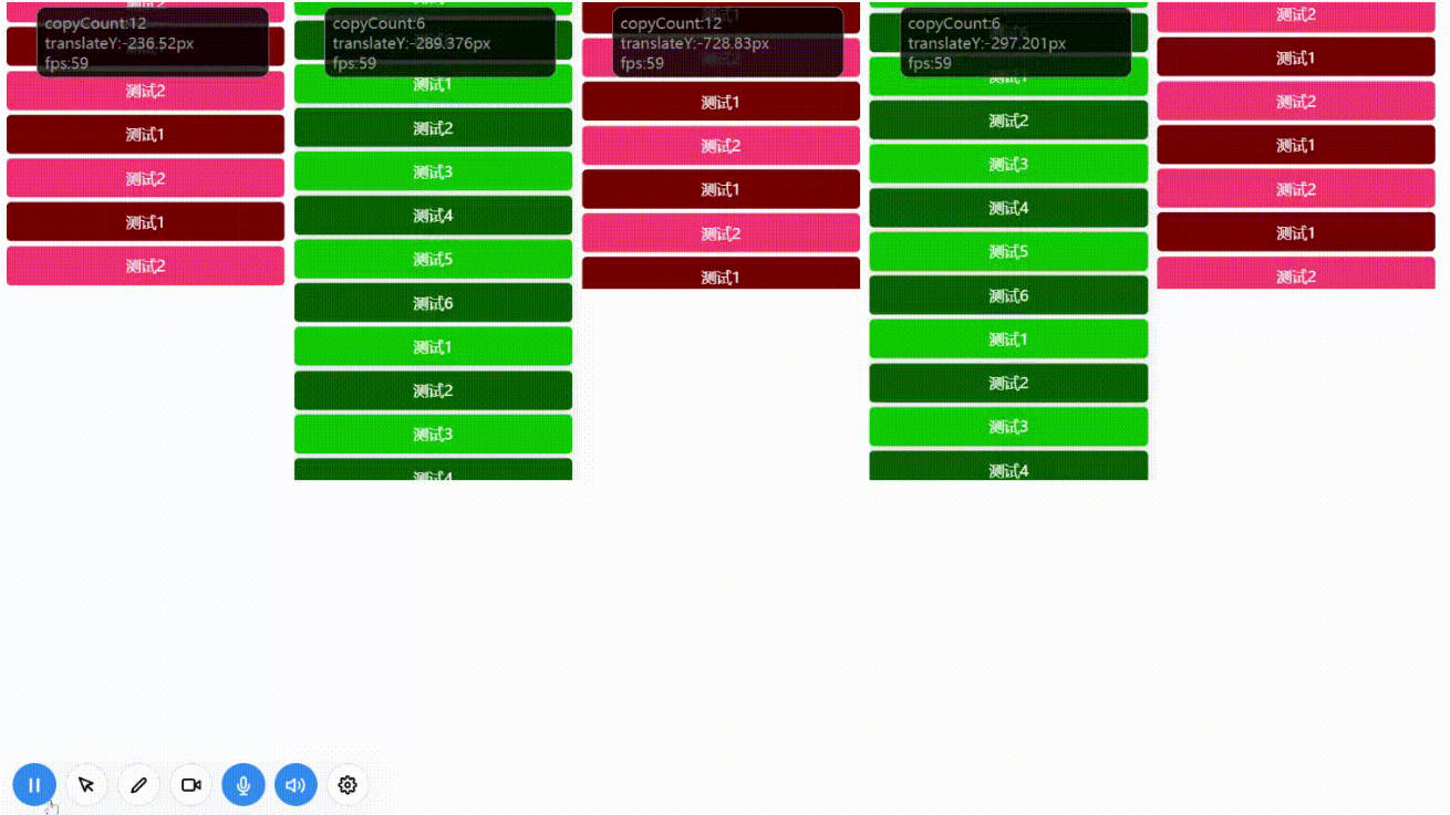
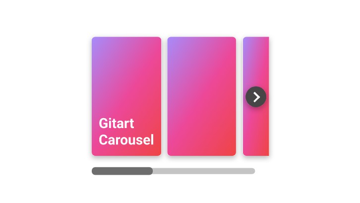
Result:

Docs
Theming
CSS variables
You can partially change appearance of the carousel by using css variables.
Here is a list:
--gsc-custom-arrow-bg - background color of the arrow
--gsc-custom-arrow-bg-hover - background color of the arrow when hovered
--gsc-custom-arrow-color - color of the arrow
--gsc-custom-indicator-bar-color - color of the bar below the carousel
--gsc-custom-indicator-track-color - color of the track for bar
Classes
Overwrite styling by yourself. Just use some classes below.
The package uses BEM. There is almost no inheritance.
Arrow:
.gsc-arrow, .gsc-arrow--side-right, .gsc-arrow--side-left
Indicator:
.gsc-indicator, .gsc-indicator--scrolling
.gsc-indicator__track
.gsc-indicator__bar
Props
items-
Type:
Array -
Required
-
Details:
An array of slider items. Each array element will be
passed to the#itemslot.
-
itemsToShow-
Type:
Number -
Required
-
Details:
The number of items to show.
-
-
keyField -
Type:
String -
Default:
null -
Details:
The field name of the item to use as a key. Using index if field is
not specified.
itemGap-
Type:
Number | String -
Default:
0 -
Details:
The gap between each item.Value '12' means 'padding: 6px;' for each item.
Value '12 20' means 'padding: 6px 10px;' for each item.
-
previewSize-
Type:
Number -
Default:
120 -
Details:
The visible part of the next item in the carousel.
-
showArrows-
Type:
Boolean -
Default:
true -
Details:
Determines whether arrows should be visible
-
showArrows-
Type:
Boolean -
Default:
true -
Details:
Determines whether arrows should be visible
-
arrowsTransition-
Type:
String -
Default:
'gsc-arrow-transition' -
Details:
Transition name for disappearing arrows
-
ssrSlideMinWidth-
Type:
Number, String -
Default:
null -
Details:
Slide min-width on app startup when HTML is displayed,
but js is not loaded yet.
It corrects the slide width in SSR mode.
-
ssrSlideMaxWidth-
Type:
Number, String -
Default:
null -
Details:
Slide max-width on app startup when HTML is displayed,
but js is not loaded yet.
It corrects the slide width in SSR mode.
-
Slots
| Name | Description |
|---|---|
| item | slot for each carousel item |
| arrow | slot specify custom arrows |
item-
Scoped Data:
{ data: Object index: Number } -
Details:
The slot is for each item of your carousel.
data- current carousel item fromitemspropsindex- index of the current carousel item.<GSCarousel :items="[1, 2, 3]" items-to-show="2"> <template #item="{ data, index }"> {{ data }} | {{ index }} </template> </GSCarousel>
-
arrow-
Scoped Data:
{ side: String ('left' | 'right') active: Boolean move: Function ((move: number) => void) } -
Details:
Don't like default arrow? You can use this slot to specify custom arrow.
side- 'left' or 'right'. specifies the arrow side.
set a specific style for each side using this scope data.active- true if the arrow is clickable.move- function to move the carousel.<GSCarousel :items="[1, 2, 3]" items-to-show="2"> <!-- ... --> <template #arrow="{ side, move, active }"> <!-- optional transition if you want hide inactive arrow --> <Transition name="some-transition"> <div v-if="active" :class="`arrow arrow-${side}`" @click="move" > <span> {{ side === 'left' ? '<' : '>' }} </span> </div> </transition> </template> </GDialog>
-