V-Calendar
V-Calendar is a clean and lightweight plugin for displaying simple, attributed calendars in Vue.js. It uses attributes to decorate the calendar with various visual indicators including highlighted date regions, dots, bars, content styles and popovers for simple tooltips and even custom slot content.
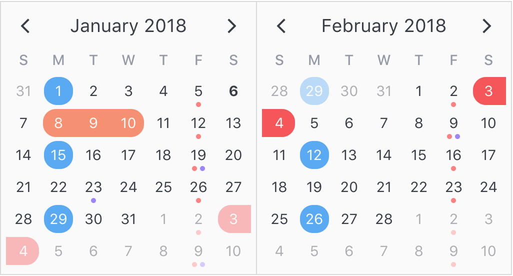
Animated calendar/datepicker that displays regions, indicators and day popovers for simple & recurring dates.
Any single attribute may contain one of each object and can be displayed for single dates, date ranges and even complex date patterns like every other Friday, the 15th of every month or the last Friday of every other month.
It has date picker support out of the box with single date, multiple date and date range selection modes. Because v-date-picker is simply a wrapper for v-calendar, both can be extensively customized using props, slots and theme styling, just like v-calendar. And of course, V-Calendar is responsive and mobile friendly. For example, it supports touch swipes for month navigation.
Calendar
v-calendar is the core component. By default, it has a neutral design that should blend nicely within any web application, with various options for configuring the basic layout:
- Single or double paned
- Can be expanded to fill the width of its container
- Header can be left, right or center-aligned
- Slot support for custom headers and arrows
- Navigation transitions (horizontal slide, vertical slide, fade)
Along with the calendar panes, v-calendar employs a semantic-inspired navigation pane when the header title is hovered or focused by the user.


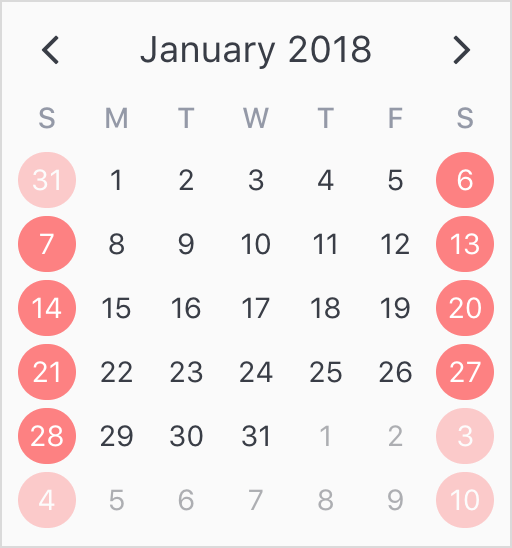
Attributes
Attributes are the most important concept to understand. They provide a powerful way to communicate visual information to your users quickly and effectively. Fortunately, they are also easy to specify.
What to display
The first thing to understand about attributes is what they are capable of displaying.
- Highlights
- Dot Indicators
- Bar Indicators
- Popovers
- Content Styles
- Content Hover Styles (applied on hover state)
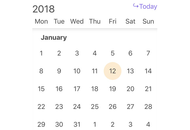
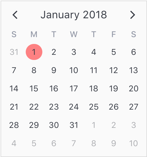
For now, let's just start by displaying a simple highlight on today's date.
<template>
  <v-calendar :attributes='attrs'>
  </v-calendar>
</template>
export default {
  data() {
    return {
      attrs: [
        {
          key: 'today',
          highlight: {
            backgroundColor: '#ff8080',
            // Other properties are available too, like `height` & `borderRadius`
          },
          dates: new Date(2018, 0, 1)
        }
      ],
    };
  },
};
To add some contrast to the highlighted date, we can use a content style, which is simply a style object that gets applied to the day content text.
export default {
  data() {
    return {
      attrs: [
        {
          key: 'today',
          highlight: {
            backgroundColor: '#ff8080',
          },
          // Just use a normal style
          contentStyle: {
            color: '#fafafa',
          },
          dates: new Date(2018, 0, 1)
        },
      ],
    };
  },
};

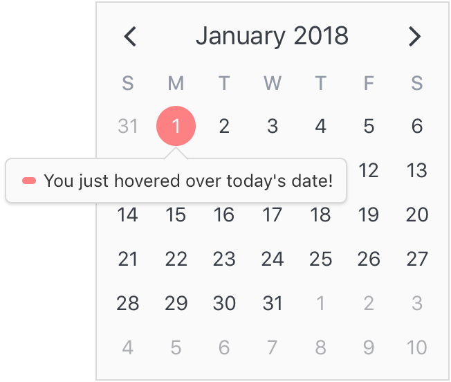
Finally, let's see how simple it is to add a popover label (or tooltip) to the calendar when this highlight is hovered over. To do that, we just need to add a popover section to our attribute.
export default {
  data() {
    return {
      attrs: [
        {
          key: 'today',
          dates: new Date(2018, 0, 1),
          highlight: {
            backgroundColor: '#ff8080',
          },
          // Just use a normal style
          contentStyle: {
            color: '#fafafa',
          },
          // Our new popover here
          popover: {
            label: 'You just hovered over today\'s date!',
          }
        },
      ],
    };
  },
};
Where to display
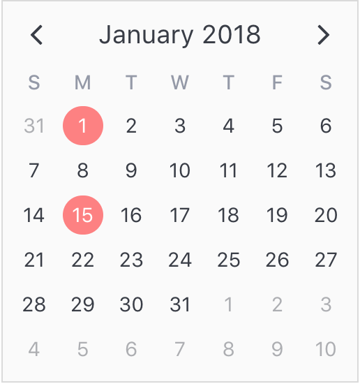
The second aspect of attributes is specifying where to display them. In the previous example, we saw that all we had to do was use a simple date object assigned to the dates property. Note that we aren't limited to using single date or date range objects. We can also use an array of dates.
  ...
  dates: [ new Date(2018, 0, 1), new Date(2018, 0, 15) ]
  ...
Or date ranges...
  ...
  dates: [
    { start: new Date(2018, 0, 1), end: new Date(2018, 0, 5) },
    { start: new Date(2018, 0, 15), span: 5 } // Span is number of days
  ]
  ...
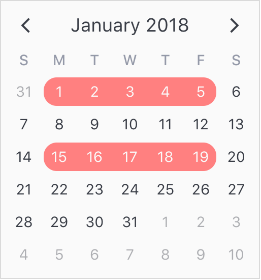
Or date patterns.
  ...
  dates: { weekdays: [1, 7] } // On the weekends
  ...
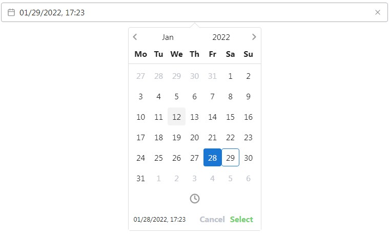
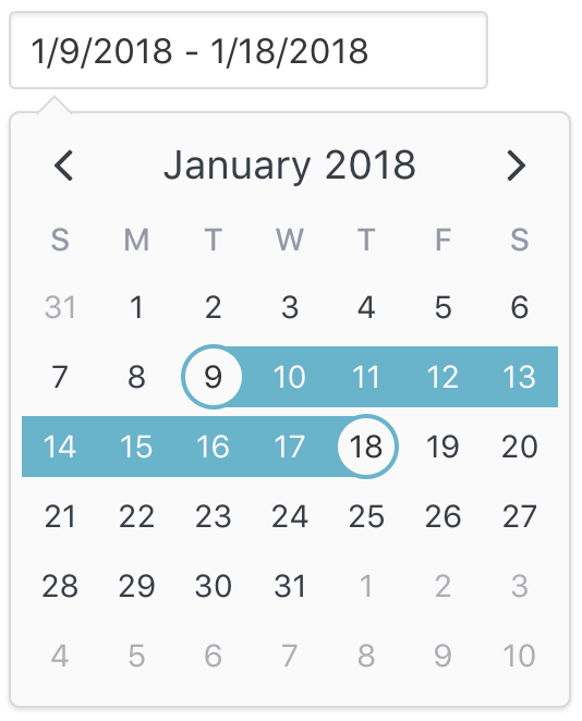
Date Picker
The v-date-picker component is a flexible date picker component wrapper around v-calendar, which means it supports all props and events that v-calendar does. Using the mode prop, it is capable of 3 selection modes:
- Single dates
- Multiple dates
- Date ranges
Date pickers can be displayed inline or as a popover for an input element which can be classed or styled.
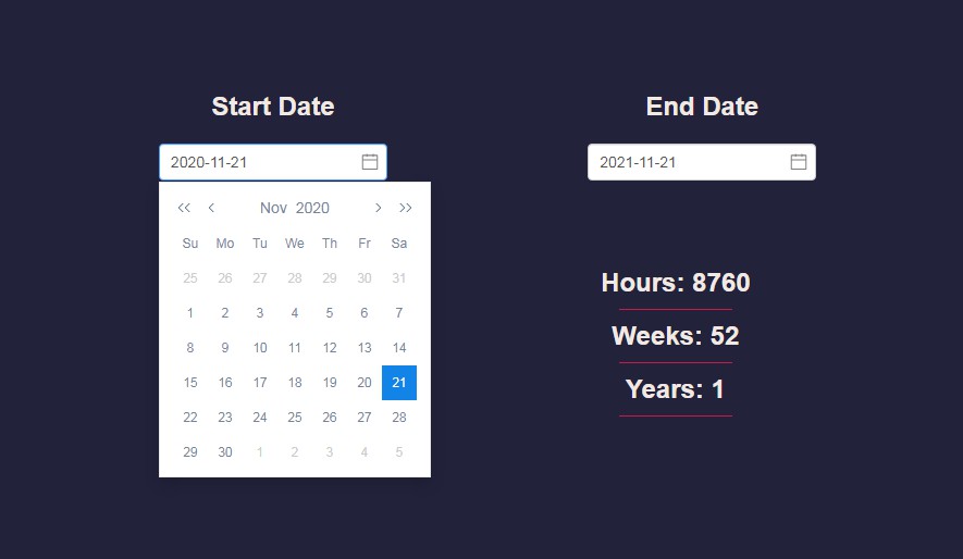
<v-date-picker
  mode='range'
  v-model='selectedDate'
  show-caps>
</v-date-picker>
export default {
  data() {
    return {
      selectedDate: {
        start: new Date(2018, 0, 9),
        end: new Date(2018, 0, 18)
      }
    };
  },
};
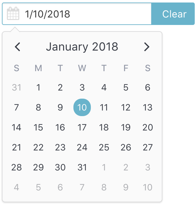
Also, a custom slot element can be used to display your own input element. This example uses Buefy for a custom styled input component.
<v-date-picker
  mode='single'
  v-model='selectedDate'>
  <b-field :type='inputState.type' slot-scope='props'>
    <b-input
      type='text'
      icon='calendar'
      :value='props.inputValue'
      :placeholder='inputState.message'
      @change.native='props.updateValue($event.target.value)'
      expanded>
    </b-input>
    <p
      class='control'
      v-if='selectedValue'>
      <a
        :class='["button", inputState.type]'
        @click='selectedValue = null'>
        Clear
      </a>
    </p>
  </b-field>
</v-date-picker>
export default {
  data() {
    return {
      selectedDate: new Date(2018, 0, 10)
    };
  },
  computed: {
    inputState() {
      if (!this.selectedValue) {
        return {
          type: 'is-danger',
          message: 'Date required.',
        };
      }
      return {
        type: 'is-primary',
        message: '',
      };
    },
  },
};
You can disable dates, date ranges and date patterns using the following props:
- Explicitly via
disabled-dates.<!--Disable weekend selection--> <v-date-picker :mode='single' :disabled-dates='{ weekdays: [1, 7] }' v-model='selectedDate'> </v-date-picker> - Implicitly via
available-dates. Any dates not included inavailable-datesare disabled.<!--Today is the minimum date (null denotes infinite date)--> <v-date-picker :mode='single' :available-dates='{ start: new Date(), end: null }' v-model='selectedDate'> </v-date-picker>
Installation
Vue.js version 2.5+ is required.
1 Install via npm
npm install v-calendar
2 Import and use VCalendar
import Vue from 'vue';
import VCalendar from 'v-calendar';
import 'v-calendar/lib/v-calendar.min.css';

// Use v-calendar, v-date-picker & v-popover components
Vue.use(VCalendar);
3 Reference in your component templates
<template>
  <v-calendar
    is-double-paned>
  </v-calendar>
  <v-date-picker
    mode='single'
    v-model='selectedValue'>
  </v-date-picker>
</template>
<script>
export default {
  data() {
    return {
      selectedValue: new Date(),
    };
  },
};
</script>
Or use a CDN
<html>
  <head>
    <meta charset='utf-8'>
    <meta name='viewport' content='width=device-width, initial-scale=1, shrink-to-fit=no'>
    <meta http-equiv='x-ua-compatible' content='ie=edge'>
    <!--1. Link VCalendar CSS-->
    <link rel='stylesheet' href='https://unpkg.com/v-calendar/lib/v-calendar.min.css'>
  </head>
  <body>
    <div id='app'>
      <v-calendar></v-calendar>
      <v-date-picker :mode='mode' v-model='selectedDate'></v-date-picker>
    </div>
    <!--2. Link Vue Javascript-->
    <script src='https://unpkg.com/vue/dist/vue.js'></script>
    <!--3. Link VCalendar Javascript (Plugin automatically installed)-->
    <script src='https://unpkg.com/v-calendar'></script>
    <!--4. Create the Vue instance-->
    <script>
      new Vue({
        el: '#app',
        data: {
          // Data used by the date picker
          mode: 'single',
          selectedDate: null,
        }
      })
    </script>
  </body>
</html>