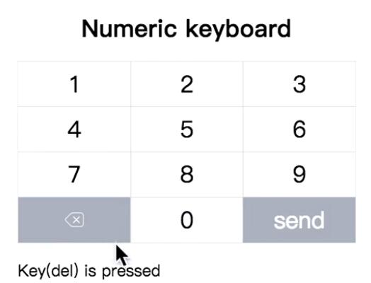
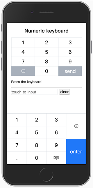
Numeric Keyboard
A custom virtual numeric keyboard works in mobile browsers. It contains a virtual input box which would invoke the numeric keyboard instead of system keyboard, the virtual input box supports many html5 standard properties and also has a nice cursor to make it behaves like native input element as much as possible. Besides, the numeric keyboard is a pluggable component can be used together with other input interfaces.
The numeric keyboard has several versions: Vanilla JavaScript class, React component and Vue component.
Install
You can install it via Yarn
yarn add numeric-keyboard
Config Webpack to use the right version
resolve: {
  alias: {
    // use Vue component for example
    'numeric-keyboard$': 'numeric-keyboard/dist/numeric_keyboard.vue.js'
  }
},
Usage
Vanilla JavaScript
import { NumericInput } from 'numeric-keyboard'
new NumericInput('.input', {
  type: 'number',
  placeholder: 'touch to input',
  onInput(value) {
    ...
  }
})
React
import { NumericInput } from 'numeric-keyboard'
class App extends React.Component {
  input(val) {
    ...
  },
  render() {
    return <div className="input">
      <label>Amount: </label>
      <NumericInput type="number" placeholder="touch to input" onInput={this.input.bind(this)} />
    </div>
  }
}
Vue
<template>
  <div class="input">
    <label>Amount: </label>
    <NumericInput placeholder="touch to input" v-model="amount" />
  </div>
</template>

<script>
  import { NumericInput } from 'numeric-keyboard'
  export default {
    components: {
      NumericInput
    },
    data() {
      return {
       amount: null
      }
    }
  }
</script>
Options/Props
As a substitute for native input element, the input box supports most of the standard attributes, you can refer the HTML spec for details.
// There are only two types: number and tel
// The layout property for keyboard is inherited from it
type: {
  type:String,
  default: 'number'
},
autofocus: {
  type: Boolean,
  default: false
},
disabled: {
  type: Boolean,
  default: false
},
maxlength: {
  type: Number
},
name: {
  type: String
},
placeholder: {
  type: String
},
readonly: {
  type: Boolean,
  default: false
},
value: {
  type: [String, Number]
},
// Passs a regexp string or function to limit the input.
format: {
  type: [String, Function]
},
// Config the numeric keyboard which will be called when focus. The config detail is described below.
keyboard: {
  type: Object
}
Callback/Events
input
The input event is emitted when the value of input changes. The first argument for the callback is the value of the input box rather than an event object from a native input element. A onInput() callback is used in vanilla javascript version.
Keyboard
The keyboard is a pluggable component which supports custom layout and theme. In order to be able to work properly in a real scene, it usually needs to match an output interface.
Usage
Vanilla JavaScript
import { NumericKeyboard } from 'numeric-keyboard'
new NumericKeyboard('.keyboard', {
  layout: 'tel',
  onPress(key) {
    ...
  }
})
React
import { NumericKeyboard } from 'numeric-keyboard'
class App extends React.Component {
  press(key) {
    ...
  }
  render() {
    return <div className="keyboard">
      <NumericKeyboard layout="tel" onPress={this.press.bind(this)} />
    </div>
  }
}
Vue
<template>
   <div class="keyboard">
     <NumericKeyboard layout="tel" @press="press" />
   </div>
</template>

<script>
  import { NumericKeyboard } from 'numeric-keyboard'
  export default {
    components: {
      NumericKeyboard
    },
    methods: {
      press(key) {
        ...
      }
    }
  }
</script>
Options/Props
// change the layout of keyboard
 layout: {
   type: [String, Array],
   default: 'number'
 },
 // change the style of keyboard
 theme: {
   type: [String, Object],
   default: 'default'
 },
 // change the label of submit button, this is used for specific context and language
 entertext: {
   type: String,
   default: 'enter'
 }
layout
There are two built-in layouts called number and tel which can be used as a replacement of system keyboard. You can still rearrange all the keys to create your own layout. The layout object is a two-dimension array which constructs a table layout, you can make table-specific operations like merging cells.
number layout

tel layout

custom layout
// code sample for the build-in number layout
import { keys } from 'numeric-keyboard'
[
  [
    {
      key: keys.ONE
    },
    {
      key: keys.TWO
    },
    {
      key: keys.THREE
    },
    {
      key: keys.DEL,
      rowspan: 2,
    },
  ],
  [
    {
      key: keys.FOUR
    },
    {
      key: keys.FIVE
    },
    {
      key: keys.SIX
    },
  ],
  [
    {
      key: keys.SEVEN
    },
    {
      key: keys.EIGHT
    },
    {
      key: keys.NINE
    },
    {
      key: keys.ENTER,
      rowspan: 2,
    },
  ],
  [
    {
      key: keys.DOT
    },
    {
      key: keys.ZERO
    },
    {
      key: keys.ESC
    },
  ],
]
theme
The style of the keyboard can be modified global or per key, currently, it only supports several limit style like font color and background color, however, you can override CSS directly for the complicated style.
// the default style declaration
import { keys } from 'numeric-keyboard'
{
  global: {
    color: '#000000',
    backgroundColor: ['#ffffff', '#929ca8'], // specify a pair of colors for active pseudo class
  },
  key: {
    [keys.ENTER]: {
      color: '#ffffff',
      backgroundColor: ['#007aff', '#0051a8'],
    },
  }
}
Callbacks/Events
press
the press event is emitted with a key code when the key is pressed. The argument for the callback is the key just pressed. A onPress() callback is used in vanilla javascript version.