vue3-dropdown-navbar
The package implements dropdown navbar, it based on Tailwind CSS.
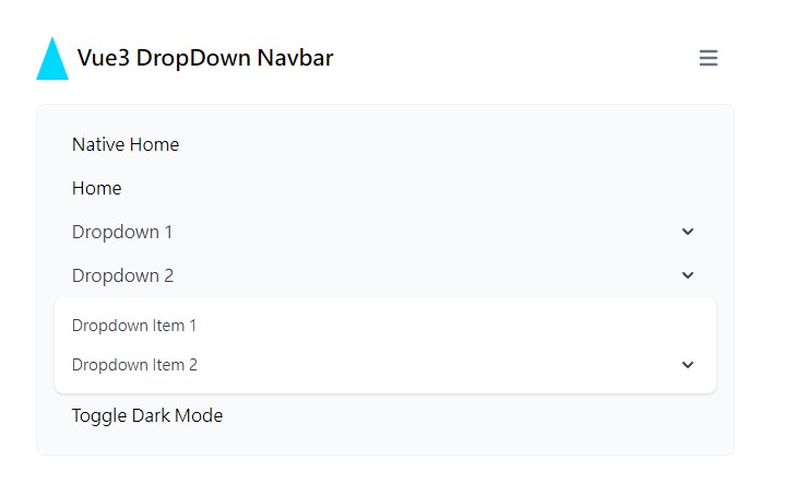
Demo


Install
$ npm install vue3-dropdown-navbar
Usage
<script setup lang="ts">
import {
  TheDropDownNavbar,
  TheDropDownMenu,
  TheDropDownItem,
  TheDropDownDivideBlock,
} from "vue3-dropdown-navbar";
import { ref } from "vue";

const dropdownMenu = ref<InstanceType<typeof TheDropDownMenu>>();
const toggleDarkMode = () => {
  document.documentElement.classList.toggle("dd-nav-dark");
};
</script>

<template>
  <TheDropDownNavbar>
    <template #logo>
      <TheDropDownNavbarLogo>Vue3 DropDown Navbar</TheDropDownNavbarLogo>
    </template>
    <TheDropDownItem link="/home">Home</TheDropDownItem>
    <TheDropDownMenu text="Dropdown 1" ref="dropdownMenu">
      <TheDropDownItem>Dropdown Item 1</TheDropDownItem>
      <TheDropDownItem>Dropdown Item 2</TheDropDownItem>
      <TheDropDownMenu text="Dropdown Item 3">
        <TheDropDownItem>Dropdown Item 3-1</TheDropDownItem>
        <TheDropDownItem>Dropdown Item 3-2</TheDropDownItem>
      </TheDropDownMenu>
      <TheDropDownDivideBlock>
        <TheDropDownItem>Sign out</TheDropDownItem>
      </TheDropDownDivideBlock>
    </TheDropDownMenu>
    <TheDropDownItem @click="toggleDarkMode">Toggle Dark Mode</TheDropDownItem>
  </TheDropDownNavbar>

  <button
    class="border bg-blue-500 text-white px-4 py-2 rounded-lg"
    @click="dropdownMenu?.openDropdownMenu"
  >
    Open Dropdown Menu
  </button>
</template>
Assume you have not installed TailwindCSS, you may reset the style, can import preflight in main.(js|ts), it provides by Tailwind CSS.
import { createApp } from "vue";
import App from "./App.vue";
// ...

import "vue3-dropdown-navbar/preflight.css"; // <-- Add this

const app = createApp(App);

app.use(router);

app.mount("#app");
Property Description
if the suffix is (?), which is an optional property.
TheDropDownNavbarLogo component available properties:
| Type | Name | Description |
|---|---|---|
| String | link? | set link. |
| String | imageUrl? | set image url. |
| String | alt? | set image alt property. |
| Boolean | native? | set whether use native (<a>) link. |
TheDropDownMenu component available properties:
| Type | Name | Description |
|---|---|---|
| String | text | set text for dropdown menu. |
| Boolean | closeOthers? | set whether close other menus when open this menu. |
TheDropDownItem component available properties:
| Type | Name | Description |
|---|---|---|
| String | link? | set link. |
| Boolean | native? | set whether use native (<a>) link. |
Function Description
TheDropDownNavbar component available function:
| Name | Description |
|---|---|
| closeAllDropdownMenu | close all dropdown menus. |
TheDropDownMenu component available function:
| Name | Description |
|---|---|
| openDropdownMenu | open this dropdown menu. |
| closeDropdownMenu | close this dropdown menu. |
Extra Slot Description
TheDropDownNavbar component available slot:
| Name | Description |
|---|---|
| logo | set navbar left side content, recommand using TheDropDownNavbarLogo component. |
Common Attribute Description
| Name | Description |
|---|---|
| no-close-others | by default, dropdown menu closes when clicking another element, if you want to click a specific element without closing dropdown menu, this can help you. |
Example
<button no-close-others>Click Me Without Close Dropdown Menu</button>
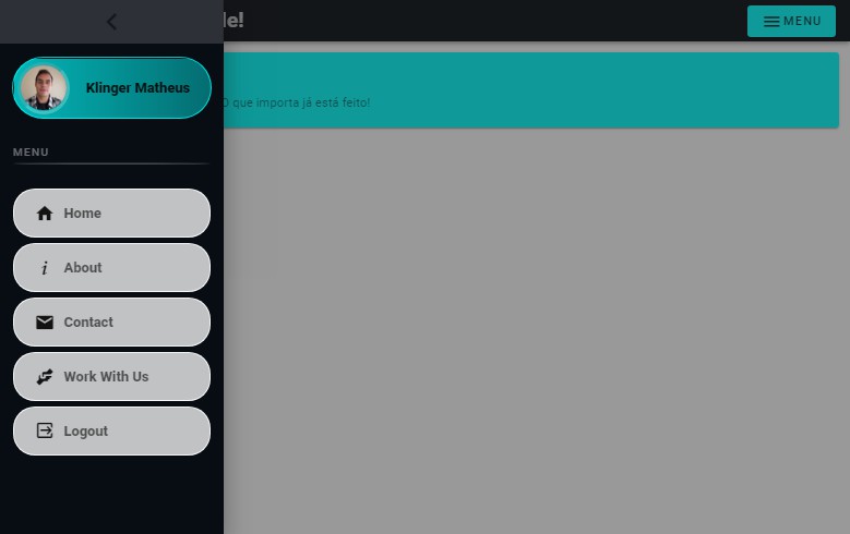
Dark Mode
Add dd-nav-dark class to <html> tag.