vue-datepicker-mobile
A calendar friendly for mobile, which can select the date by the range, friendly for mobile.It is typically used for hotel.
TODO:* is bugs.it can't use async data.It's repairing.
Attr
| param | description | type | defalut |
|---|---|---|---|
| autoComplete | After choosing the date whether to auto-complete, if false, it will show confirm button. | boolean | false |
| mondayFirst | Whether Monday is the first-day as a week, default for Sunday. | boolean | false |
| reverseSelect | Whether allow reverse choose date. | boolean | false |
Prop
| param | description | type | defalut |
|---|---|---|---|
| display | display state, show or hide datepicker window. | boolean | false |
| displayRange | unit is month | number | 13 |
| displayRangeStart | display start month.default is this month. e.g. '2018-9-1' |
string | - |
| selectRangeStart | can choose start date.default is today. | string | - |
| selectRangeEnd | can choose the end date. default show the end. | string | - |
| restday* | custom restday.default highlight display and show chinese "休".e.g. ['2019.5.1', '2019.5.2', '2019.5.3'] |
array | - |
| workday* | custom restday.default highlight display and show chinese "班".e.g. ['2019.5.4', '2019.5.5'] |
array | - |
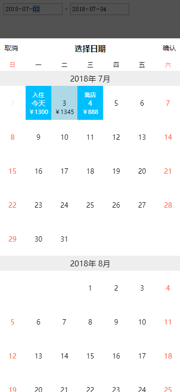
| customData* | custom data.display custom text on date,and optional highlight. | array | - |
customData*
Data will use today as index to 0, one by one add to after the date.
If value's type is string, it will show as text.['¥100']
If you need to show highlight, you need a object.[{ highlight: true, text: '¥100' }]
Events
select({ start, end, range })
Called after select date range.start: object, end: object, range:[object].
range is a selected array does't include start and end.If don't have space between start and end,range is a array of null.
object
Selected date object has following keys:
| param | description | type |
|---|---|---|
| year | year | number |
| month | month | number |
| day | date | number |
| date | full date YYYY-M-D | string |
| odate | full date YYYY-MM-DD | string |
| rest | Whether restday,include is not workday's weekend and custom restday. | boolean |
| restday | Whether custom restday | boolean |
| workday | Whether custom workday | boolean |
| disabled | Whether disabled | boolean |
| customData | custom data{ highlight: boolean, text: string } |
object |
| begin | Whether selected date start | boolean |
| active | Whether selected date between start and end | boolean |
| end | Whether selected date end | boolean |
cancle()
After cancle, it used to hide datepicker window.
used demo
<input type="date" @touchstart="show = true" v-model="startDate" readonly>
-
<input type="date" @touchstart="show = true" v-model="endDate" readonly>
<DatePicker
  :displayRangeStart="start"
  :restday="restday"
  :workday="workday"
  :display="show"
  :customData="data"
  @select="select"
  @cancle="cancle"
  autoComplete/>
import DatePicker from './DatePicker'

export default {
  components: {
    DatePicker
  },
  data() {
    return {
      startDate: '',
      endDate: '',
      start: '2018-6-1',
      restday: [],
      workday: ['2018-9-29', '2018-9-30'],
      data: ['¥1300', '¥1345', { highlight: true, text: '¥888' }],
      show: true
    }
  },
  methods: {
    select({ start, end, range }) {
      this.startDate = start.odate
      this.endDate = end.odate
      console.log('range', range)
      this.show = false
    },
    cancle() {
      this.show = false
    }
  },
  created() {
    // async data does't work on current version.
    setTimeout(() => {
      this.restday = ['2018-9-22', '2018-9-23', '2018-9-24']
    }, 2000)
  }
}