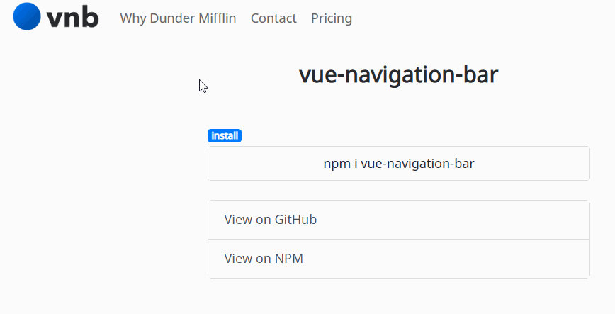
vue-navigation-bar
A simple, pretty navbar for your Vue projects. (A work in progress for a few more days maybe) .

Install
# npm
npm i vue-navigation-bar

#yarn
yarn add vue-navigation-bar
Or you can include it through the browser at the bottom of your page along with the css:
<!-- Please note if you're using the browser method you're going to want to adjust the version number as needed. The number given there is just the initial version. -->

<script src="https://unpkg.com/[email protected]/dist/vue-navigation-bar.min.js"></script>

<link rel="stylesheet" type="text/css" href="https://unpkg.com/[email protected]/dist/vue-navigation-bar.css">
About
Often when starting a new project I like to get together the main foundation pieces first. A main part of that process is working on the main navbar.
This component is meant to help with that process - it gives you a standard looking navigation bar for for your app that can be easily defined using JSON or a just an array of objects.
vue-navigation-bar is meant to be used for the 80% of cases that exist when you need a standard navbar for your app/website. The layout has the brand-image anchored on the left side, and two slots for menu-options that push and pull based on designation.
I know there are lots of other styles that navbar's can be, for instance the brand-image could be in the middle - but this component won't be allowing you to do that - so if that's your thing then I would probably look to roll out something on your own, or fork this to apply to your needs if possible. That being said, the actual css here is very easy to override - I'm using BEM with SASS (.scss) and have the style skeleton posted below - so you should be able to style it quite nicely without issue. I've put a lot of time in placing sensible defaults that should work well against any style.
The trade-off is that the initialization and usage of this component is very easy and won't force you to do anything except declare the structure initially and declare a few css styles as necessary.
vue-navigation-bar is compatible with both vue-router projects and non-vue-router projects - just make sure to pass in true for the isUsingVueRouter option.
Usage Example
Below is a basic usage example. You'll see that a lot of the work is actually just declaring your options object.
In the style section you'll see that I provide a button class to color a button in the navbar. This is done like this to give you the most control over the button color and other pseudo properties. In this case, I want one of my buttons to be red, so I provide a class in my options object and then style the class appropriately like this:
Note - the first example uses basic css, the second example is the same thing just using sass nesting - same result.
.vnb .button-red {
    background: #FF3B30;
}
.vnb .button-red:hover {
    background: #FC0D00;
}
.vnb {
    .button-red {
        background: #FF3B30;

        &:hover {
            background: darken(#FF3B30, 10%);
        }
    }
}
You can make a bunch of button-color classes and set them up just like above.
<!-- css import for when you want to import the component css into your css file/files  -->
@import '/path/to/node_modules/vue-navigation-bar.css';

<!-- javascript import for when you're importing the css directly in your javascript  -->
import 'vue-navigation-bar/dist/vue-navigation-bar.css'

import VueNavigationBar from 'vue-navigation-bar'
Vue.component('vue-navigation-bar', VueNavigationBar)
<template>
    <vue-navigation-bar :options="options" />
</template>

<script>
    export default {
        ...
        data () {
            return {
                navbarData: {
                    elementId: 'main-navbar',
                    isUsingVueRouter: true,
                    mobileBreakpoint: 992,
                    brandImagePath: '/',
                    brandImage: require('../src/assets/images/lockup-color.png'),
                    brandImageAltText: 'vue-navigation-bar',
                    collapseButtonStyle: 'dark',
                    ariaLabelMainNav: 'Main Navigation',
                    menuOptionsLeft: [
                        {
                            type: 'link',
                            text: 'Why Dunder Mifflin',
                            path: '/why',
                            subMenuOptions: [
                                {
                                    type: 'link',
                                    text: 'About',
                                    path: '#',
                                },
                                {
                                    type: 'hr',
                                },
                                {
                                    type: 'link',
                                    text: 'Locations',
                                    path: '/locations',
                                },
                                {
                                    type: 'link',
                                    text: 'Blog',
                                    path: '/blog',
                                },
                            ]
                        },
                        {
                            type: 'link',
                            text: 'Contact',
                            path: '/contact',
                            subMenuOptions: [
                                {
                                    type: 'link',
                                    text: 'Customer Service',
                                    path: '/customer-service',
                                },
                                {
                                    type: 'link',
                                    text: 'Accounting',
                                    path: '/accounting',
                                },
                                {
                                    type: 'link',
                                    text: 'Reception',
                                    path: '/reception',
                                },
                            ]
                        },
                        {
                            type: 'link',
                            text: 'Pricing',
                            path: '/pricing',
                        },
                    ],
                    menuOptionsRight: [
                        {
                            type: 'button',
                            text: 'Signup',
                            path: '/signup',
                            class: 'button-red'
                        },
                        {
                            type: 'button',
                            text: 'Login',
                            path: '/login',
                        }
                    ]
                }
            }
        }
        ...
    }
</script>

<style lang="scss">
    .vnb {
        .button-red {
            background: #FF3B30;

            &:hover {
                background: darken(#FF3B30, 10%);
            }
        }
    }
</style>
Take a look at the ./example folder in this project - it has the complete working example that you see in the demo. (FYI - the vue-router setup there is really rudimentary so all the different pages aren't real - doesn't affect the demo.)
Props
| prop | type | required | default | possible values | description |
|---|---|---|---|---|---|
| elementId | String | no | A generated uuid | This value will be set as the id of the instance |
|
| isUsingVueRouter | Boolean | no | false | If you want to use vue-router, set this to true and all links will automatically be <router-link></router-link> |
|
| mobileBreakpoint | Number | no | 992 | Width at which the navbar turns into the mobile version | |
| brandImagePath | String | no | '/' | The path for your brand-image's link |
|
| brandImage | Image | no | brandImageAltText |
require() your image here to use your brand image |
|
| brandImageAltText | String | no | 'brand-image' | The alt tag text for your brand image |
|
| collapseButtonStyle | String | no | 'dark' | 'dark', 'light' | The type of collapse button to show |
| ariaLabelMainNav | String | no | 'Main Navigation' | The aria-label value for the main navbar element |
|
| menuOptionsLeft | Object | no | {} | Menu options that will be pulled to the left towards the brand-image |
|
| menuOptionsLeft.type | String | yes | 'link', 'button', 'spacer' | What type of link will this menu-option be? link will be a link, button will be a button, spacer will be a spacer with a width of 30px |
|
| menuOptionsLeft.text | String | yes | Text of menu-option | ||
| menuOptionsLeft.path | String | yes | Link path of menu-option | ||
| menuOptionsLeft.class | String | no | Only for menuOptionsLeft.type === 'button' - provide a class name so you can style your buttons |
||
| menuOptionsLeft.subMenuOptions | Object | no | Sub-menu-options that will be shown | ||
| menuOptionsLeft.subMenuOptions.type | String | yes | 'link', 'hr' | What type of link will this sub-menu-option be? link will be a link, hr will be a hr spacer |
|
| menuOptionsLeft.subMenuOptions.text | String | yes | Text of sub-menu-option | ||
| menuOptionsLeft.subMenuOptions.path | String | yes | Link path of sub-menu-option | ||
| menuOptionsRight | Object | no | {} | See above - all menuOptionsLeft apply |
SASS Structure
.vnb {

    &__brand-image-wrapper {
        &__link {
            &__image {
            }
        }
    }

    &__menu-options {
        &--left {
        }

        &--right {
        }

        &__option {
            &__link {
                &:hover {
                }
            }

            &__button {
            }

            &__spacer {
            }
        }
    }

    &__sub-menu-options {
        &__option {
            &__link {
                &:hover {
                }
            }

            &__hr {
            }
        }
    }

    &__collapse-button {
        &:hover {
        }

        &__image {
        }
    }

    &__popup {
        &__top {
            &__close-button {
                &:hover {
                }

                &__image {
                }
            }
        }

        &__bottom {
            &__menu-options {
                &__option {
                    &:not(:last-child) {
                    }

                    &__link {
                        &:hover {
                        }

                        &--no-highlight {
                            &:hover {
                            }
                        }
                    }
                }
            }

            &__sub-menu-options {
                &__option {

                    &__link {
                        &:hover {
                        }
                    }
                }
            }
        }
    }
}

.vnb-button {
    &:hover {
    }
}
Accessability
Throughout the development of this component I've been making sure to allow for proper a11y options to be set when possible. This means things like aria-haspopup and aria-expanded are set on the popup-menus, aria-label's are set on the elements, and any user can come through and use the navbar nicely using the tab button. Of course there can probably be improvements on this front, so I'll keep an eye on it myself and look for any pull-requests that improve it.
Development
# install dependencies
npm install

# serve with hot reload
npm run watch

# run the tests
npm run test

# build demo page
npm run build:example

# build
npm run build
TODO
-
I'd like to be able to have icons with each option. I usually use font-awesome, but we'd want them to be totally free for use in an open-source program.
-
Add an optional search input bar.
-
It may be cool to
$emitsome events out when different actions happen, like when the collapse button is clicked. May be something that can added and useful to someone. -
Add more thorough tests.
Other
Go ahead and fork the project! Submit an issue if needed. Have fun!
If you use this in a project let me know and I'll make a list here linking to it.