Nuxt Battery module
A simple Nuxt 3 module to show info about your battery device.


Features
- Nuxt 3 with composables
- Nuxt 3 component battery-status imported automatically
- TypeScript support
Install
Add nuxt-battery dev dependency to your project:
yarn add nuxt-battery
Then, add nuxt-battery to the modules section of your Nuxt configuration:
export default {
  modules: ['nuxt-battery'],
}
Usage
Learn how to use the nuxt-battery module in your Nuxt 3 application.
This module exposes composables that are auto-imported by Nuxt 3.
useBattery
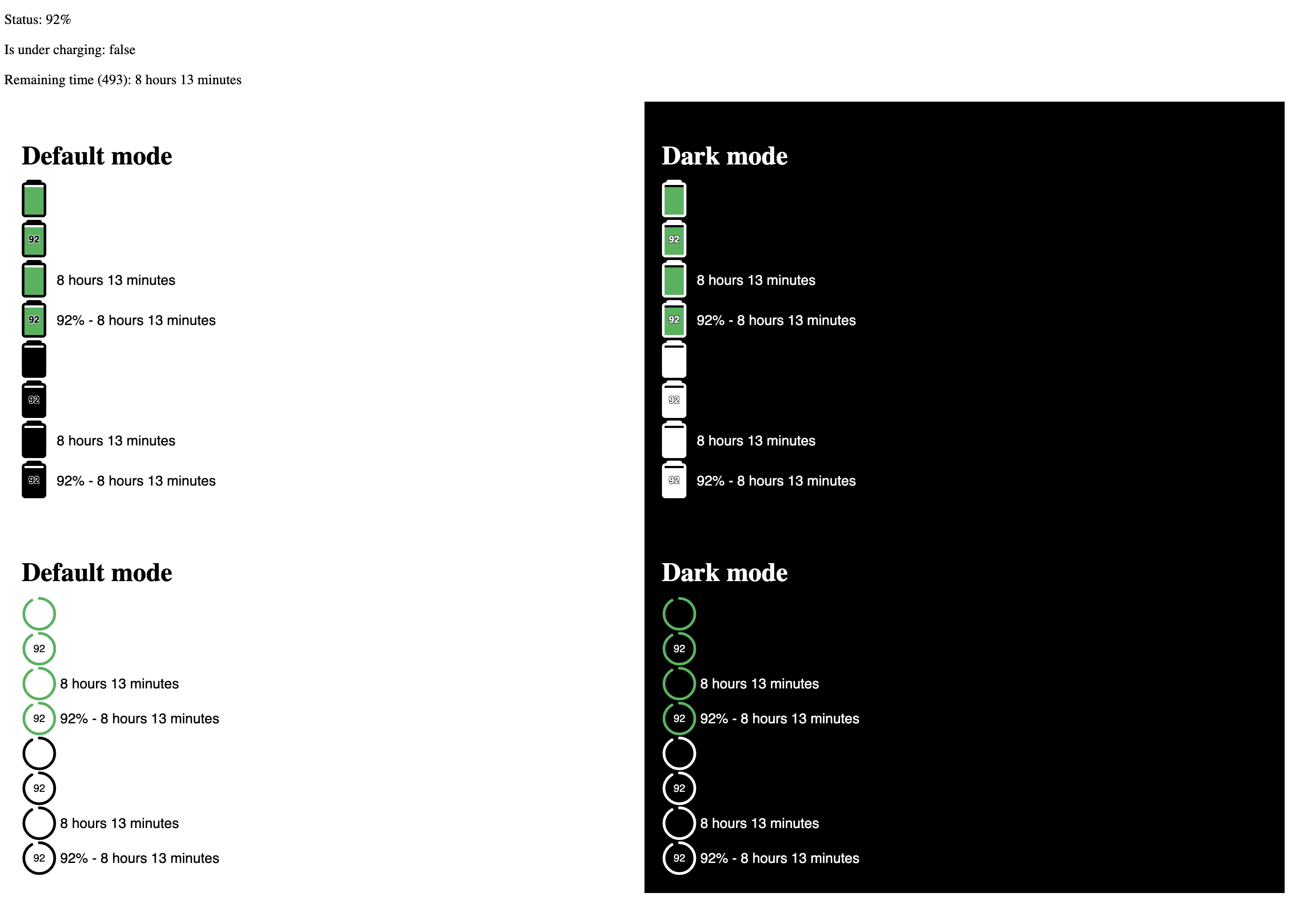
This composable return info about your battery status.
<script setup lang="ts">
const {
  status, // number - between 0 and 100 (-1 means the plugin still loading)
  charging, // boolean - true/false if it is charging or not
  time, // number - battery time remaining in minutes
  label // string - battery time remaining label
} = useBattery()
</script>
<nuxt-battery />
If you don’t need to develop your own custom component, you can simply use this one to have a status battery.
::code-group
<template>
  <div>
    <nuxt-battery />
  </div>
</template>
<template>
  <div>
    <nuxt-battery
      :show-label
      :show-percentage
      :dark
      :colored
    />
  </div>
</template>
| Key | Type | Default | Description |
|---|---|---|---|
showLabel |
boolean |
false | If you need the remaining time label close to the battery icon |
showPercentage |
boolean |
false | If you need to show percentage in battery icon (and label) |
dark |
boolean |
false | Default battery icn border is white, choose dark if you need black |
colored |
boolean |
true | If you need to show green, yellow and red color in battery icon |
Development
- Clone this repository
- Install dependencies using
yarn installornpm install - Build module using
yarn buildornpm run buildto build once
- Use
yarn build --stubornpm run build --stubduring active development
- Start development server using
yarn devornpm run dev