Steppy
A simple Stepper component for Vue 3
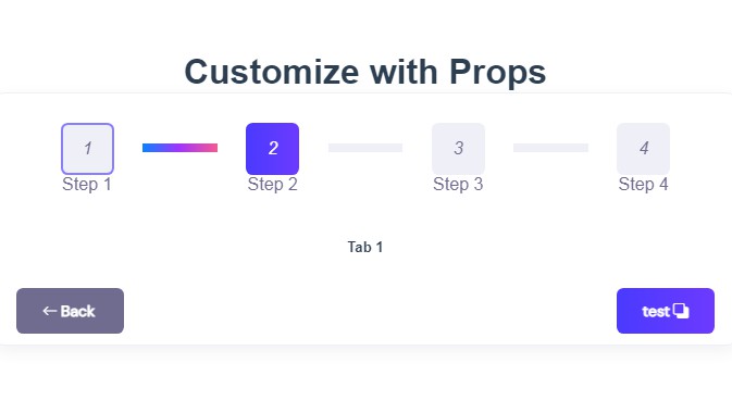
Demo
You can try a live demo here
Key Features
- Keep track of current step
- Change step content
- Configure finalization
- Customizable
- Colors
- Titles
- Icons
- Button text
How To Use
Install
$ npm install vue3-steppy
Import
import {Steppy} from 'vue3-steppy'
Template
<Steppo v-model:step="step">
  <template #1><!-- Step 1 Content --></template>
  <template #2><!-- Step 2 Content --></template>
  <template #3><!-- Step 3 Content --></template>
</Steppo>
API Props
/**
 * Contains the current step. Very similar to a
 * `value` attribute on an input. In most cases, you'll want
 * to set this as a two-way binding, using the `v-model` directive.
 * @type {Number}
 */
step: {
  type: Number,
  default: 1
},

/**
 * Contains the steps with custom titles and icons.
 * @type {Array}
 *
 * @param {Image} iconSuccess - You can point to an imported icon from you assets like:
 * import CheckMark from '../assets/check-mark.png'
 * If you set it to null, a default SVG will be used with primary color 1.
 *
 * @param {boolean} isValid - Used to determine if the user can move to the next step.
 */
tabs: {
  type: Array,
  default: reactive([
    {
      title: 'Step 1',
      iconSuccess: null,
      isValid: true
    },
    {
      title: 'Step 2',
      iconSuccess: null,
      isValid: true
    },
    {
      title: 'Step 3',
      iconSuccess: null,
      isValid: true
    }
  ])
},

/**
 * Function that will run after all steps are completed (done button is clicked).
 * @type {Object}
 */
finalize: {
  type: Function,
default: function () {
    return {}
  }
},

/**
 * Text for back button.
 * @type {String}
 */
backText: {
  type: String,
default: 'Back'
},

/**
 * Text for next button.
 * @type {String}
 */
nextText: {
  type: String,
default: 'Next'
},

/**
 * Text for done button.
 * @type {String}
 */
doneText: {
  type: String,
default: 'Done'
},

/**
 * Primary Color 1
 * @type {String}
 */
,
primaryColor1: {
  type: String,
  default: 'orange'
},

/**
 * Primary Color 2
 * @type {String}
 */
,
primaryColor2: {
  type: String,
  default: '#C5C5C5'
}
Dependencies
This software uses the following open source packages:
Dev Dependencies
Support

License
· LinkedIn Mike Konstantakos