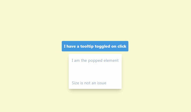
vue3-popper
A Vue.js popover component based on PopperJS.
Install
NPM
npm install vue3-popper
Yarn
yarn add vue3-popper
Usage
Vue environment
<!-- If your content is only a simple string, you can use the content prop: -->
<template>
  <Popper content="This is the Popper content">
    <button>Trigger element</button>
  </Popper>
</template>

<!-- If your content is more complex, you can use the content slot: -->
<template>
  <Popper>
    <button>Trigger element</button>
    <template #content>
      <div>This is the Popper content</div>
    </template>
  </Popper>
</template>

<script>
  import { defineComponent } from "vue";
  import Popper from "vue3-popper";

  export default defineComponent({
    components: {
      Popper,
    },
  });
</script>
Props
| Name | Default | Description |
|---|---|---|
placement |
bottom |
Preferred placement of the Popper |
disableClickAway |
false |
Disables automatically closing the Popper when the user clicks away from it |
offsetSkid |
0 |
Offset in pixels along the trigger element |
offsetDistance |
12 |
Offset in pixels away from the trigger element |
hover |
false |
Trigger the Popper on hover |
arrow |
false |
Display an arrow on the Popper |
arrowPadding |
0 |
Stop arrow from reaching the edge of the Popper (in pixels) |
disabled |
false |
Disables the Popper. If it was already open, it will be closed. |
openDelay |
0 |
Open the Popper after a delay (ms) |
closeDelay |
0 |
Close the Popper after a delay (ms) |
interactive |
true |
If the Popper should be interactive, it will close when clicked/hovered if false |
content |
null |
If your content is just a simple string, you can pass it as a prop |
Events
| Name | Description |
|---|---|
open:popper |
When the Popper is open |
close:popper |
When the Popper is hidden |
Slots
| Name | Description |
|---|---|
content |
For the Popper content |
Slot props
The content slot gives you access to useful variables and functions.
| Name | Type | Description |
|---|---|---|
close |
function | A function to close the Popper |
isOpen |
boolean | The open state of the Popper |
CSS variables
Popper only comes with some barebones styling by default, but it also uses a list of predefined CSS variables. You can overwrite these variables to suit your needs.
| CSS variable | Example value |
|---|---|
--popper-theme-background-color |
#ffffff |
--popper-theme-background-color-hover |
#ffffff |
--popper-theme-text-color |
inherit |
--popper-theme-border-width |
1px |
--popper-theme-border-style |
solid |
--popper-theme-border-color |
#eeeeee |
--popper-theme-border-radius |
6px |
--popper-theme-padding |
16px |
--popper-theme-box-shadow |
0 6px 30px -6px rgba(0, 0, 0, 0.25) |