Quick-v Form Validation Vue Components
QuickvInput Component
The QuickvInput component is a Vue input field with quick validation capabilities.
Usage
To use the QuickvInput component, simply import it into your Vue application and include it in your page:
<script setup >
	import QuickvInput from "@/components/QuickvInput"
</script>
<template>
    <form>
      <QuickvInput
          inputId="age"
          inputName="myInputAge"
          type="number"
          fieldPlaceholder="Age"
          label="Age"
          qvRules='required|number|between:18,35'
          qvMessages='age is required | invalid number| number between 18 and 35'
          qvInvalidClass='border border-red-500'
          qvValidClass='border border-green-500'
          v-model="formData.age"
        />
    </form>
</template>
Props
The QuickvInput component accepts the following props:
| Name | Type | Required | Description |
|---|---|---|---|
| label | string | true | The label content for the input field. |
| qvRules | string | true | The quick validation rules separated by| |
| qvMessages | string | true | The quick validation rules separated by| |
| inputName | string | true | The name of the input field and associated label. |
| qvInvalidClass | string | false | The CSS class to apply when the input field is invalid. |
| qvValidClass | string | false | The CSS class to apply when the input field is valid. |
| feedbackClass | string | false | The CSS class to apply to the div for displaying quick validation feedback. |
| fieldPlaceholder | string | false | The placeholder text for the input field. |
Others Rules
Validation Rules The following validation rules are supported by the QuickvInput component:
required: this rule ensures that the input field is not emptymin:value1,value2: this rule ensures that the input value is greater than or equal to the minimum value(s) specified. Multiple minimum values can be specified by separating them with commas.max:value1,value2: this rule ensures that the input value is less than or equal to the maximum value(s) specified. Multiple maximum values can be specified by separating them with commas.contains:value: this rule ensures that the input value contains the specified substring.minlength:minvalue: this rule ensures that the length of the input value is greater than or equal to the specified minimum value.maxlength:maxvalue: this rule ensures that the length of the input value is less than or equal to the specified maximum value.url: this rule ensures that the input value is a valid URL.in:value1,value2,value3,value4…: this rule ensures that the input value is included in the specified list of values.
QuickvForm Component
The
QuickvFormcomponent is a form wrapper component that can containQuickvInputcomponents as children. It provides an easy way to validate and submit form data.
Usage
<script setup>
  import QuickvSubmitButton from '@/components/QuickvSubmitButton.vue'
  import { onMounted } from 'vue'
  import  *  as  quickv  from  "quickv"

  onMounted(() => {
    const qv = new quickv.Quickv()
    qv.init()
  })

  const props = defineProps({
    formId:{
      type:Number,
      required:true
    },
    formName:{
      type:String,
      required:true
    },
    submitButtonText: {
      type:String,
      required:false,
      default:'submit form'
    }
  })


  const handleSubmit = function() {
    console.log("handleSubmit")
  }
</script>
<template>
  <form :id="props.formId" :name="props.formName" @submit.prevent="handleSubmit">
    <slot></slot>
    <div class="text-center">
      <quickv-submit-button :submitButtonText='submitButtonText' >
        {{ props.submitButtonText }}
       </quickv-submit-button >
    </div>
   </form>
</template>

<style  scoped>

</style>
Props
The QuickvForm component accepts the following props:
| Name | Type | Required | Description |
|---|---|---|---|
| formName | string | false | The name of the form. Must be unique within the page. |
| formId | string | false | The id of the form. Must be unique within the page. |
| submitButtonText | string | false | The text to display on the submit button. |
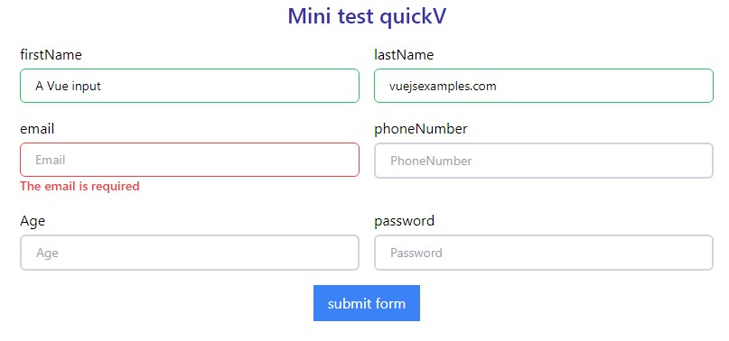
Example
<script setup>
  import {reactive} from 'vue'
  import QuickvForm from '@/components/QuickvForm.vue'
  import QuickvInput from '@/components/QuickvInput.vue'

  const formData = reactive({
    firstName:'',
    lastName:'',
    email:'',
    phoneNumber:'',
    age:'',
    password:''
  })


</script>
<template>
  <div>
    <quickv-form formId="authForm" name="myAuthForm">
      <div class="grid grid-cols-2 gap-4 container mx-auto my-4">
        <QuickvInput
          inputId="firstName"
          inputName="myInputFirstName"
          fieldPlaceholder="firstName"
          label="firstName"
          qvRules='required|minlength:3|maxlength:20'
          qvMessages='The firstname is required | The name should be at least 3 characters | The field size should not exceed 20 characters'
          qvInvalidClass='border border-red-500'
          qvValidClass='border border-green-500'
          v-model="formData.firstName"
        />
        <QuickvInput
          inputId="lastName"
          inputName="myInputLastName"
          fieldPlaceholder="lastName"
          label="lastName"
          qvRules='required|minlength:3|maxlength:20'
          qvMessages='The lastname is required | The name should be at least 3 characters | The field size should not exceed 20 characters'
          qvInvalidClass='border border-red-500'
          qvValidClass='border border-green-500'
          v-model="formData.lastName"
        />
        <QuickvInput
          inputId="email"
          inputName="myInputEmail"
          type="email"
          fieldPlaceholder="Email"
          label="email"
          qvRules='required|email'
          qvMessages='The email is required | invalid email'
          qvInvalidClass='border border-red-500'
          qvValidClass='border border-green-500'
          v-model="formData.email"
        />
        <QuickvInput
          inputId="phoneNumber"
          inputName="myInputPhone"
          type="number"
          fieldPlaceholder="PhoneNumber"
          label="phoneNumber"
          qvRules='required|number'
          qvMessages='The phoneNumber is required | invalid number'
          qvInvalidClass='border border-red-500'
          qvValidClass='border border-green-500'
          v-model="formData.phoneNumber"
        />
        <QuickvInput
          inputId="age"
          inputName="myInputAge"
          type="number"
          fieldPlaceholder="Age"
          label="Age"
          qvRules='required|number|between:18,35'
          qvMessages='age is required | invalid number| number between 18 and 35'
          qvInvalidClass='border border-red-500'
          qvValidClass='border border-green-500'
          v-model="formData.age"
        />
        <QuickvInput
          inputId="password"
          inputName="myInputPassword"
          type="password"
          fieldPlaceholder="Password"
          label="password"
          qvRules='required|password'
          qvMessages='password is required |invalide password'
          qvInvalidClass='border border-red-500'
          qvValidClass='border border-green-500'
          v-model="formData.password"
        />
      </div>


    </quickv-form>

  </div>
</template>

<style  scoped>

</style>
License
This project is licensed under the MIT License. See the LICENSE file for details.
Credits
These components were developed by Gomez jacob in collaboration with Claude Fassinou for Quick-v.
Demo : Quick-v Demo