json-schema
Library for converting JsonSchema to Form in field validation
For Vue 3
? Installation
npm i v3-json-schema-form
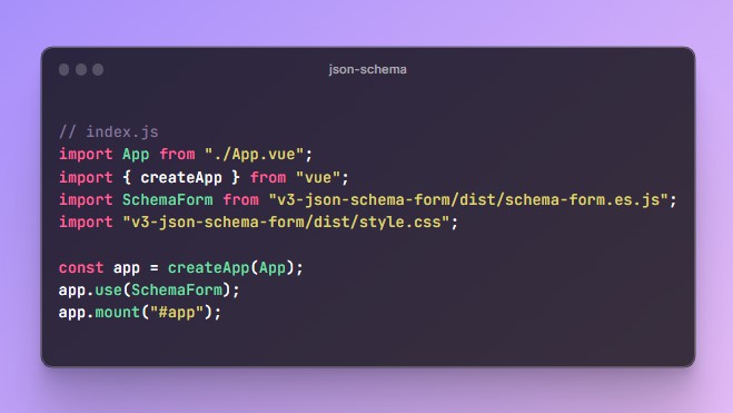
? Usage
// index.js
import App from "./App.vue";
import { createApp } from "vue";
import SchemaForm from "v3-json-schema-form/dist/schema-form.es.js";
import "v3-json-schema-form/dist/style.css";

const app = createApp(App);
app.use(SchemaForm);
app.mount("#app");
<!-- component.vue -->
<template>
  <schema-form
    :schema="schema"
    :form-data="form"
    @on-change-form="onChangeForm"
    @onSubmit="onSubmit"
  />
</template>
<script>
  import json from "./json-schema";

  export default {
    name: "component",
    data() {
      return {
        schema: json,
        form: {},
      };
    },
    methods: {
      onChangeForm(newForm) {
        this.form = newForm;
      },
      onSubmit() {
        console.table(this.form);
      },
    },
  };
</script>
schema JSON parameters:
properties – An Object with entity fields of the form
-
type– field value type (“object” or “array” or “string” or “boolean” or “number”) -
title– the output title of the field/node -
description– the output description of the field/node -
default– default value -
properties– only for type=”object”. This is an object with the same fields as the parent: type, title, properties, items, etc. -
items– only for type=”array”, This is an object describing an element of the form array, which has the same fields as the parent: type, title, properties, items, etc. -
validation– validation field/node:required– Boolean. Is it necessary to fill in field/nodeminimum/maximum– limiting the value for numbersminlength/maxlength– limitation of the allowed number of charactershardValue– fixed mandatory value
-
ui:inputType:- all built-in input types (view here)
- “select”
- “textarea”
draggable– Boolean. Only for inputType=”file” – Drag and Dropautofocus– Booleanplaceholder– Stringdescription– String. Description of the input under the headingmask– input mask ({ mask: “+7(000)000-00-00”, lazy: true }) (use vue-imask library)
-
customErrors– Object, in which the keys are the type of error from the validation field, and the value of the field is the text of the custom error -
enum– Array with a list of possible values (for types “radio”, “checkbox”, “select”)["val-1"]– a one-dimensional array with values. Then the value and the label of the element will be the same[{ caption: "one", value: 1, disabled: true }]– multidimensional array, where caption, value are specified specifically
-
grid– Object – custom item position in the gridcolumn(optional parameter) – Number – occupied column (on all screen resolutions)row(optional parameter) – Number – occupied row (on all screen resolutions)media(optional parameter) – Object of type{ "768": { column: 1, row: 2 } }(the key is the width of the screen above which it will be applied value (768+)). media permissions can be as many as you want. Has a higher priority than grid.column or grid.row
Notes
- What you need to get radio, checkbox, select:
- for the radio list, it is necessary that the node has the field
enum: [], and thetypeisstring || number || boolean(if there is the default field, then, of the corresponding type"default": "foo") - for the list of checkboxes it is necessary that the node has the field
enum: [], and thetypeisarray(if there is the default field, then, of the corresponding type"default": ["foo", "bar"]) - for the list of options select-a it is necessary that the node has the field
enum: []and the field"ui":{"inputType":"select"}. If itstypeisarray, then it is a multiple-choice selector, iftypewith the valuestring||number|| boolean, then it is a regular select - if you forget to specify the
enumfield, it will be a completely different type of node
- Toggle
- for a standard toggler, you only need to specify
"type": "boolean"("default": true/false)