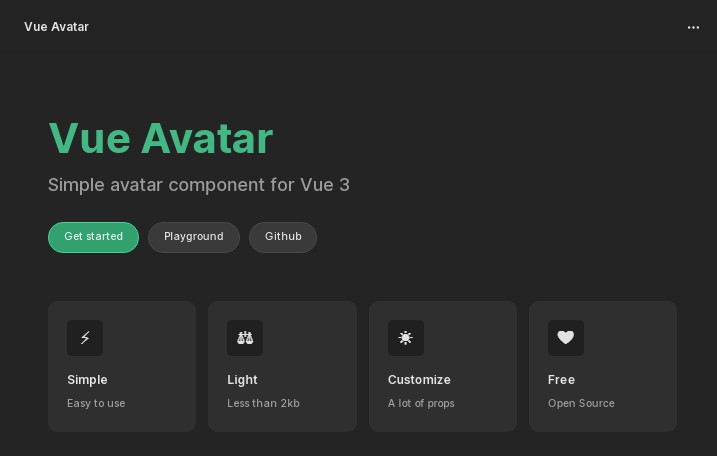
vue-avatar-component
This vue.js component provide a simple way to generate rounded and colored avatar stickers to use in your applications.
If you just provide a name to the component, i will show a colored patch showing the provided name's initials. Its color is depending and is unique for each given name.
If you provide an image url, this image will be shown, sized and truncated to fit into the component's placeholder.
Installation
npm install --save-dev vue-avatar-component
Example Usage from within a .vue component
<template>
  <div>
    <avatar fullname="My Sticker" size="96"></avatar>
  </div>
</template>

<script>
  import Avatar from 'vue-avatar-component'
  export default {
    components: { Avatar }
  }
</script>
This will show this avatar as result :

Parameters
fullname : the full name from which the initials and the color will be computed. Initials are extracted taking the first letter of each word, separated by a space or an hyphen. If there is more, only the 3 first initials are kept. For example, Foo Bar gives FB, My Foo-Bar gives MFB, FOO gives F and My Fantastic Vue Component gives MFV. If not provided, fullname defaults to '##'.
size : the size of the sticker to generate, in pixels. If not provided, the size defaults to 48 pixels. The font size inside the avatar is computed from its overall size (half if 1 or 2 letters, third for 3 letters).
image : the url of the image to fit in the avatar sticker. If provided not empty, initials will not show and the image wil be shown. Be careful that if the provided image url is wrong, the component has its size but shows nothing.
radius : percentage of the overall size to show the rounded corners of the avatar. Provide a number beetween 0 and 50 : at 0%, the avatar will be a square, at 50% it will be exactly circular. This percentage defaults to 50 if not provided.
color : If provided, overides the computed color for the initials based avatar. Just provide a CSS color (named, hex or rgba fits).
examples
If images don't show, go to this component's github repository to see the full README.
<avatar fullname="My Fabulous Component"></avatar> will show : |
 |
<avatar fullname="Foo Bar" size="60"></avatar> will show : |
 |
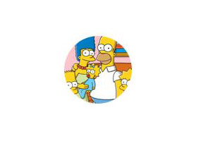
<avatar image="http://lorempicsum.com/simpsons/255/200/9" size="96"></avatar> will show : |
 |
<avatar image="http://lorempicsum.com/simpsons/255/200/5" size="96" radius="0"></avatar> will show : |
 |
<avatar fullname="Foo Bar" radius="25" color="red"></avatar> will show : |
 |