vue-dock-menu
Dockable Menu bar for Vue.
Features
- ⚓ Dock your menu with ease.
- ? Dock the Menubar by dragging and dropping to the edges of the screen.
- ? Support for nested menus up to any levels.
- ? The Menus adjust to any docked position and enables an intuitive menu navigation.
- ⚡ Zero dependencies.
- ? Built with Typescript.
- ? Intuitive API with data driven behavior.
- ? Built with the all new Vue 3.
⚡ Installation
yarn install vue-dock-menu
? Getting Started
vue-dock-menu has some great defaults. Please check the prop section for all available options.
The following snippet creates a simple Menubar and docks it to the top of the page.
<template>
<vue-dock-menu :items="items">
</vue-dock-menu>
</template>
<script>
import { DockMenu } from "vue-dock-menu";
import "vue-dock-menu/dist/vue-dock-menu.css";
export default {
name: "example",
components: {
DockMenu
},
data() {
return {
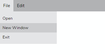
items = [
{
name: "File",
menu: [{ name: "Open"}, {name: "New Window"}, {name: "Exit"}]
},
{
name: "Edit",
menu: [{ name: "Cut"}, {name: "Copy"}, {name: "Paste"}]
}
]
}
}
}
</script>
Props
| Name | Description | Default |
|---|---|---|
| dock | default docking position. Can be any one of TOP, LEFT, RIGHT, BOTTOM |
TOP |
| on-selected | Callback that will be called on a menu item selection | |
| items | Data for the Menu bar | [] |
| theme | prop to customize the color theme | |
| draggable | enables/disbales dragging on the menubar. | True |
⚓ Dock
use the dock prop to dock the menubar to your preferred position. The prop can accept the following values TOP, BOTTOM, LEFT, RIGHT.
Here we dock the Menu bar to the right side of the screen.
<vue-dock-menu>
  :items="items"
  dock="RIGHT"
</vue-dock-menu>
? on-selected
The on-selected prop is used to retrieve the selected menu item. The callback receives an object with name and a path property.
- name - Name of the selected menu item.
- path - Full path of the selected menu item.
if you select the Copy menu item under the Edit menu, below would be the payload received on the on-selected callback.
{
  name: "Copy",
  path: "edit>copy"
}
⚡ Populating Menu
Use the items prop to create Simple or Nested menus of your liking.
Here we create a simple Menu structure with 3 Menu items with Edit and Open Recent having sub menus.
const items = [
  { name: "New" },
  {
    name: "Edit",
    menu: {
      name: "edit-items",
    },
  },
  {
    name: "Open Recent",
    menu: {
      name: "recent-items",
    },
  },
]
  <vue-dock-menu>
    :items="items"
    dock="BOTTOM"
  </vue-dock-menu>
? Custom color scheme
use the theme prop to customize the colors of the menu bar.
  <menu-bar
    :items="items"
    :on-selected="selected"
    :theme="{
      primary: '#001B48',
      secondary: '#02457a',
      tertiary: '#018abe',
      textColor: '#fff'
    }"
  />
What's coming next
- keyboard accessibility.
- support for react.
- support for icons in the menu.
- accordion style rendering on sidebar mode.
? Build Setup
# install dependencies
yarn install

# start dev
yarn run dev

# package lib
npm run rollup

# run css linting
yarn run lint:css