vue-simple-uploader
A Vue.js upload component powered by simple-uploader.js.
Features
- Treat Folder and File as
File - Pause/Resume upload
- Recover upload
- Error handling
- Drag and Drop with folder reader
- Custom upload buttons
- Folder Upload
- Queue management
- File validation
- Upload progress
- Time remaining
- Chunk uploads
Install
npm install vue-simple-uploader --save
Usage
init
import Vue from 'vue'
import uploader from 'vue-simple-uploader'
import App from './App.vue'

Vue.use(uploader)

/* eslint-disable no-new */
new Vue({
  render(createElement) {
    return createElement(App)
  }
}).$mount('#app')
App.vue
<template>
<uploader :options="options" class="uploader-example">
<uploader-unsupport></uploader-unsupport>
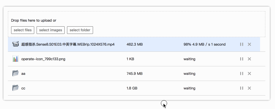
<uploader-drop>
<p>Drop files here to upload or</p>
<uploader-btn>select files</uploader-btn>
<uploader-btn :attrs="attrs">select images</uploader-btn>
<uploader-btn :directory="true">select folder</uploader-btn>
</uploader-drop>
<uploader-list></uploader-list>
</uploader>
</template>
<script>
export default {
data () {
return {
options: {
// https://github.com/simple-uploader/Uploader/tree/develop/samples/Node.js
target: '//localhost:3000/upload',
testChunks: false
},
attrs: {
accept: 'image/*'
}
}
}
}
</script>
<style>
.uploader-example {
width: 880px;
padding: 15px;
margin: 40px auto 0;
font-size: 12px;
box-shadow: 0 0 10px rgba(0, 0, 0, .4);
}
.uploader-example .uploader-btn {
margin-right: 4px;
}
.uploader-example .uploader-list {
max-height: 440px;
overflow: auto;
overflow-x: hidden;
overflow-y: auto;
}
</style>
Components
Uploader
Root component.
Props
-
options {Object} -
autoStart {Boolean}Default
true, Whether the file will be start uploading after it is added.
Events
See simple-uploader.js uploader/events
Note:
-
All events name will be transformed by lodash.kebabCase, eg:
fileSuccesswill be transformed tofile-success -
catchAllevent will not be emited. -
file-added(file), file added event, this event is used for file validation. To reject this file you should setfile.ignored = true.
Scoped Slots
-
files {Array}An array of files (no folders).
-
fileList {Array}An array of files and folders.
-
startedStarted uploading or not.
Get Uploader instance
You can get it like this:
const uploaderInstance = this.$refs.uploader.uploader
// now you can call all uploader methods
// https://github.com/simple-uploader/Uploader#methods
uploaderInstance.cancel()
UploaderBtn
Select files button.
Props
-
directory {Boolean}Default
false, Support selecting Folder -
single {Boolean}Default
false, To prevent multiple file uploads if it istrue. -
attrs {Object}Default
{}, Pass object to set custom attributes on input element.
UploaderDrop
Droped files area.
UploaderList
An array of Uploader.File file(folder) objects added by the user, but it treated Folder as Uploader.File Object.
Scoped Slots
-
fileList {Array}An array of files and folders.
UploaderFiles
An array of Uploader.File file objects added by the user.
Scoped Slots
-
files {Array}An array of files (no folders).
UploaderUnsupport
It will be shown if the current browser do not support HTML5 File API.
UploaderFile
File item component.
Props
-
file {Uploader.File}Uploader.Fileinstance. -
list {Boolean}It should be
trueif it is puted inUploaderList
Scoped Slots
-
file {Uploader.File}Uploader.Fileinstance. -
list {Boolean}In
UploaderListcomponent or not. -
status {String}Current status, the values is one of
success,error,uploading,paused,waiting -
name {String}File name.
-
paused {Boolean}Indicated if the file is paused.
-
error {Boolean}Indicated if the file has encountered an error.
-
averageSpeed {Number}Average upload speed, bytes per second.
-
formatedAverageSpeed {String}Formated average upload speed, eg:
3 KB / S -
currentSpeed {Number}Current upload speed, bytes per second.
-
isComplete {Boolean}Indicated whether the file has completed uploading and received a server response.
-
isUploading {Boolean}Indicated whether file chunks is uploading.
-
size {Number}Size in bytes of the file.
-
formatedSize {Number}Formated file size, eg:
10 KB. -
uploadedSize {Number}Size uploaded in bytes.
-
progress {Number}A number between 0 and 1 indicating the current upload progress of the file.
-
progressStyle {String}The file progress element's transform style, eg:
{transform: '-50%'}. -
progressingClass {String}The value will be
uploader-file-progressingif the file is uploading. -
timeRemaining {Number}Remaining time to finish upload file in seconds.
-
formatedTimeRemaining {String}Formated remaining time, eg:
3 miniutes. -
type {String}File type.
-
extension {String}File extension in lowercase.
-
fileCategory {String}File category, one of
folder,document,video,audio,image,unknown.
Development
# install dependencies
npm install

# serve with hot reload at localhost:8080
npm run dev

# build for production with minification
npm run build

# build for production and view the bundle analyzer report
npm run build --report