Vue A11Y Calendar
Localized, accessible calendar and datepicker for Vue with no external dependencies.
Installation
$ npm install vue-a11y-calendar
Peer Dependencies
Vue A11Y Calendar depends on Vue 2.4+ and if using webpack, Sass Loader 6.0+. Make sure they (and their peer dependencies) are installed and correctly configured in order to effectively use Vue A11Y Calendar. While this has been tested with webpack, it should work with any module bundler.
Recommended Webpack Configuration Additions
In addition to the required configuration for Sass Loader, the following configuration is recommended to be included:
const path = require('path');

function resolve (dir) {
  return path.join(__dirname, dir) // Change this to resolve to the root of your project
}

const config = {
  resolve: {
    extensions: ['.js', '.vue', '.json'],
    mainFiles: ['index', 'index.vue'],
    alias: {
      'vue$': 'vue/dist/vue.esm.js',
      '@': resolve('src'), // Replace `src` with the path to your source files from the root of your project
      '~': resolve('node_modules'),
    },
  },
};
The above configuration will allow .js, .vue, and .json files to be imported/required without including their extensions, allow index.js and index.vue files to be found as files to be imported when importing/requiring a folder (so calendar/index.vue can just be included/requires as calendar), and will resolve Vue to the correct version, and allow shortcut imports @ for source files and ~ for Node modules (useful for things distributed through Node modules that can't be directly imported). This will allow for code like import foo from '@/foo'; and import calendar from 'vue-a11y-calendar/calendar';.
Components
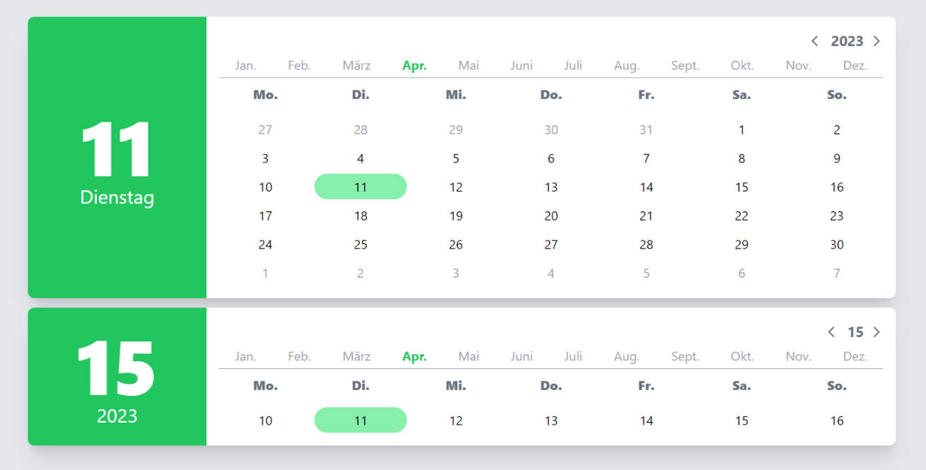
Calendar
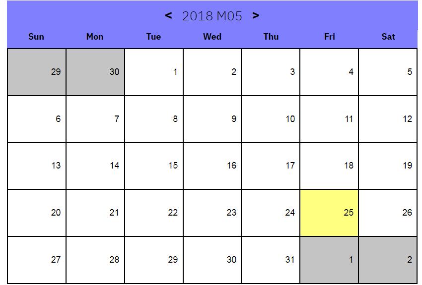
The Calendar component provides a responsive, dynamic, accessible, localized (using Date.prototype.toLocaleString()) month-based calendar.
Props
{string} locale- Any valid single locale forDate.prototype.toLocaleString(){object} microcopy- Translatable strings for the microcopy for the calendar. All properties must be present to be valid.{string} microcopy.today- String representation ofToday: {date}. Must include{date}, which will be replaced with the localized date.{string} microcopy.next- String representation ofNext Month.{string} microcopy.previous- String representation ofPrevious Month.
Events
dateSelected(target)- When a click event is fired on a date, this event will fire and pass the relevant target of the event.
Datepicker
The Datepicker component provides a dynamic, accessible, localized (using Date.prototype.toLocaleString()) month-based datepicker.
Props
{string} locale- Any valid single locale forDate.prototype.toLocaleString(){string} label- A string for the label of the input field. Defaults toChoose a date.{object} microcopy- Translatable strings for the microcopy for the calendar. All properties must be present to be valid.{string} microcopy.today- String representation ofToday: {date}. Must include{date}, which will be replaced with the localized date.{string} microcopy.next- String representation ofNext Month.{string} microcopy.previous- String representation ofPrevious Month.{string} microcopy.open- String representation ofOpen Calendar.{string} microcopy.cancel- String representation ofCancel.
{object} inputs- Input names (so multiple datepickers can be used in the same form).{string} inputs.local- Input name and ID for the visible, read-only input field. Defaults todate-local.{string} inputs.month- Input name for the hidden numeric day input. Defaults todate-day.{string} inputs.month- Input name for the hidden numeric month input. Defaults todate-month.{string} inputs.year- Input name for the hidden numeric year input. Defaults todate-year.
Customization
Neither the Calendar component nor the Datepicker component use scoped styles or CSS modules. While this isn't ideal from a performance perspective, it is the only reasonable way to allow users to write custom CSS to style these components from within their own components. A downside to this is that implementing components can't have their styles scoped or use CSS modules either, or styling won't cascade properly. To change styling of one of these components, it is recommended to wrap it in a single component and mirror the props down.
Classes are styled using BEM to, as best as possible, target the exact elements to be styled.
Alternatively, the HTML, JS, and Sass for each component has been split out in to separate files that can be imported individually. The HTML and JS can used to rebuild the components piecemeal with custom styling (even allowing for scoped styling if desired).