Supabase Auth UI Vue ?
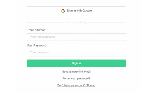
Supabase Auth UI is a pre-built Vue component for authenticating users. It supports custom themes and extensible styles to match your brand and aesthetic.
This was built as my first step towards contributing to open source and is heavily inspired by Supabase Auth UI React

Set up Auth UI ??♂️
Import the latest version of supabase-js and the Auth UI package
Using npm:
$ npm install @supabase/supabase-js auth-ui-vue
Using yarn:
$ yarn add @supabase/supabase-js auth-ui-vue
Import the Auth component
Pass supabaseClient from @supabase/supabase-js as a prop to the component.
<script setup lang="ts">
import { createClient } from "@supabase/supabase-js";
import { Auth } from "auth-ui-vue";
import "auth-ui-vue/dist/style.css"

const supabase = createClient(
  '<INSERT PROJECT URL>',
  '<INSERT PROJECT ANON API KEY>'
)
</script>

<template>
    <Auth :supabase-client="supabase" />
</template>
This renders the Auth component without any styling. We recommend using one of the predefined themes to style the UI. Import the theme you want to use and pass it to the appearence.theme prop.
<script setup lang="ts">
import { createClient } from "@supabase/supabase-js";
import { Auth,
        // Import predefined theme
        ThemeSupa
} from "auth-ui-vue";
import "auth-ui-vue/dist/style.css"

const supabase = createClient(
  '<INSERT PROJECT URL>',
  '<INSERT PROJECT ANON API KEY>'
)
</script>

<template>
    <Auth
        :supabase-client="supabase"
        /* Apply predefined theme */
        :appearance="{ theme: ThemeSupa }"
    />
</template>
Social Providers ?
The Auth component also supports login with offical social providers.
<script setup lang="ts">
import { createClient } from "@supabase/supabase-js";
import { Auth, ThemeSupa } from "auth-ui-vue";
import "auth-ui-vue/dist/style.css"

const supabase = createClient(
  '<INSERT PROJECT URL>',
  '<INSERT PROJECT ANON API KEY>'
)
</script>

<template>
    <Auth
        :supabase-client="supabase"
        :appearance="{ theme: ThemeSupa }"
        :providers="['google', 'facebook', 'twitter']"
    />
</template>
Customization ✨
There are several ways to customize Auth UI:
- Use one of the predefined themes that comes with Auth UI
- Extend a theme by overriding the variable tokens in a theme
- Create your own theme
- Use your own CSS classes
- Use inline styles
- Use your own labels
Predefined themes
Auth UI comes with several themes to customize the appearance. Each predefined theme comes with at least two variations, a default variation, and a dark variation. You can switch between these themes using the theme prop. Import the theme you want to use and pass it to the appearence.theme prop.
<script setup lang="ts">
import { createClient } from "@supabase/supabase-js";
import { Auth,
        // Import predefined theme
        ThemeSupa
} from "auth-ui-vue";
import "auth-ui-vue/dist/style.css"

const supabase = createClient(
  '<INSERT PROJECT URL>',
  '<INSERT PROJECT ANON API KEY>'
)
</script>

<template>
    <Auth
        :supabase-client="supabase"
        /* Apply predefined theme */
        :appearance="{ theme: ThemeSupa }"
    />
</template>
Currently there is only one predefined theme available, but I plan to add more as soon as Supabase does.
Switch theme variations
Auth UI comes with two theme variations: default and dark. You can switch between these themes with the theme prop.
<script setup lang="ts">
import { createClient } from "@supabase/supabase-js";
import { Auth, ThemeSupa } from "auth-ui-vue";
import "auth-ui-vue/dist/style.css"

const supabase = createClient(
  '<INSERT PROJECT URL>',
  '<INSERT PROJECT ANON API KEY>'
)
</script>

<template>
    <Auth
        :supabase-client="supabase"
        :appearance="{ theme: ThemeSupa }"
        /* Set theme to dark */
        theme="dark"
    />
</template>
If you don’t pass a value to theme it uses the "default" theme. You can pass "dark" to the theme prop to switch to the dark theme. If your theme has other variations, use the name of the variation in this prop.
Override themes
Auth UI themes can be overridden using variable tokens. See the list of variable tokens.
<script setup lang="ts">
import { createClient } from "@supabase/supabase-js";
import { Auth, ThemeSupa } from "auth-ui-vue";
import "auth-ui-vue/dist/style.css"

const supabase = createClient(
  '<INSERT PROJECT URL>',
  '<INSERT PROJECT ANON API KEY>'
)
</script>

<template>
    <Auth
        :supabase-client="supabase"
        :appearance="{
            theme: ThemeSupa,
            variables: {
                default: {
                    colors: {
                        brand: 'orange',
                        brandAccent: 'yellow'
                    }
                }
            }
        }"
    />
</template>
If you created your own theme, you may not need to override any of the them.
Create your own theme
You can create your own theme by following the same structure within a appearance.theme property. See the list of tokens within a theme.
<script setup lang="ts">
import { createClient } from "@supabase/supabase-js";
import { Auth } from "auth-ui-vue";
import "auth-ui-vue/dist/style.css"

const supabase = createClient(
  '<INSERT PROJECT URL>',
  '<INSERT PROJECT ANON API KEY>'
)

const customTheme = {
  default: {
    colors: {
      brand: 'hsl(153 60.0% 53.0%)'
      brandAccent: 'hsl(154 54.8% 45.1%)'
      brandButtonText: 'white',
      // ..
    }
  },
  dark: {
    colors: {
      brandButtonText: 'white'
      defaultButtonBackground: '#2e2e2e'
      defaultButtonBackgroundHover: '#3e3e3e'
      //..
    },
  },
  // You can also add more theme variations with different names.
  evenDarker: {
    colors: {
      brandButtonText: 'white',
      defaultButtonBackground: '#1e1e1e',
      defaultButtonBackgroundHover: '#2e2e2e',
      //..
    },
  },
}

</script>

<template>
    <Auth
        :supabase-client="supabase"
        theme="default" /* can also be "dark" or "evenDarker" */
        :appearance="{ theme: customTheme }"
    />
</template>
You can switch between different variations of your theme with the “theme” prop.
Custom CSS Classes
You can use custom CSS classes for the following elements: "button", "container", "anchor", "divider", "label", "input", "loader", "message".
<script setup lang="ts">
import { createClient } from "@supabase/supabase-js";
import { Auth } from "auth-ui-vue";
import "auth-ui-vue/dist/style.css"

const supabase = createClient(
  '<INSERT PROJECT URL>',
  '<INSERT PROJECT ANON API KEY>'
)
</script>

<template>
    <Auth
        :supabase-client="supabase"
        :appearance="{
            className: {
                anchor: 'my-awesome-anchor',
                button: 'my-awesome-button',
                //..
            }
        }"
    />
</template>
Custom inline CSS
You can use custom CSS inline styles for the following elements: "button", "container", "anchor", "divider", "label", "input", "loader", "message".
<script setup lang="ts">
import { createClient } from "@supabase/supabase-js";
import { Auth } from "auth-ui-vue";
import "auth-ui-vue/dist/style.css"

const supabase = createClient(
  '<INSERT PROJECT URL>',
  '<INSERT PROJECT ANON API KEY>'
)
</script>

<template>
    <Auth
        :supabase-client="supabase"
        :appearance="{
            style: {
                anchor: { color: 'blue' },
                button: { background: 'red', color: 'white' },
                //..
            }
        }"
    />
</template>
Custom labels
You can use custom labels with localization.variables. See the list of labels that can be overwritten.
<script setup lang="ts">
import { createClient } from "@supabase/supabase-js";
import { Auth } from "auth-ui-vue";
import "auth-ui-vue/dist/style.css"

const supabase = createClient(
  '<INSERT PROJECT URL>',
  '<INSERT PROJECT ANON API KEY>'
)
</script>

<template>
    <Auth
        :supabase-client="supabase"
        /* highlight starts */
        :localization="{
            variables: {
                sign_in: {
                    email_label: 'Your email address',
                    password_label: 'Your strong password',
                },
            }
        }"
        /* Highlight ends */
    />
</template>