Vue Stateful Form
Create a form that escalates all events to the top level and supports v-model.
Features
- [x] unstyled but includes lots of classes to target
- [x] 2 way binding with proper
v-modelsupport - [x] built-in debounce function
- [x] still allows
submithandler - [x] encodes "multiple" inputs (select[multiple], radio, checkbox)
- [x] no hacky "mounted" calls
- [x] supports most input elements (no
file/imagesupport) - [x] sets
reffor each input automatically - [x] supports custom components and passing props
Installation
npm install vue-stateful-form
Global Usage
import Vue from 'vue';
import StatefulForm from 'vue-stateful-form';

Vue.component('stateful-form', StatefulForm);
In Single File Components
import StatefulForm from 'vue-stateful-form';

export default {
  // ...
  components: {
    StatefulForm,
  },
  // ...
};
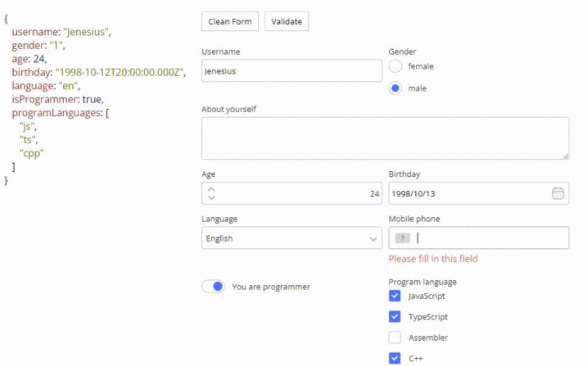
Usage
<template>
<div id="app">
<StatefulForm v-model="data" :schema="schema" @submit="handleSubmit" />
<pre v-html="JSON.stringify(data, null, 2)"></pre>
</div>
</template>
<script>
import Vue from 'vue';
import StatefulForm from 'vue-stateful-form';
export default Vue.extend({
name: 'StatefulFormExample',
components: {
StatefulForm
},
data() {
return {
// here is the model for the fields
// the name of the key should match the name of the field
// missing fields will be set to `null`
data: {
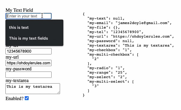
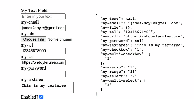
'my-text': 'This is my text field',
'my-email': '[email protected]',
'my-tel': '12345678900',
'my-url': 'https://ohdoylerules.com',
'my-textarea': 'This is my textarea',
'my-select': '2',
'my-multi-select': ['3'], // multiple values require arrays
'my-range': '25',
'my-checkbox': '1',
'my-multi-checkbox': ['2'], // multiple values require arrays
'my-radio': '1',
},
schema: [
{
// name will be used as the field `id` and also the v-model key
name: 'my-text',
label: 'My Text Field',
type: 'text',
required: true,
},
{
name: 'my-email',
label: null, // null label will remove the label
type: 'email',
required: true,
},
{
name: 'my-tel',
type: 'tel',
},
{
name: 'my-url',
type: 'url',
},
{
name: 'my-password',
type: 'password',
},
{
name: 'my-textarea',
type: 'textarea',
},
{
name: 'my-checkbox',
type: 'checkbox',
options: [
// single checkbox is just a single option
{ value: '1', label: 'Enabled?' },
],
},
{
name: 'my-multi-checkbox',
type: 'checkbox',
options: [
// multiple checkbox is more than 1 option
{ value: '1', label: 'Checkbox One' },
{ value: '2', label: 'Checkbox Two' },
{ value: '3', label: 'Checkbox Three' },
],
},
{
name: 'my-range',
type: 'range',
min: '1',
max: '100',
},
{
name: 'my-select',
type: 'select',
options: [
{ value: '1', label: 'One' },
{ value: '2', label: 'Two' },
{ value: '3', label: 'Three' },
],
},
{
name: 'my-radio',
type: 'radio',
options: [
// radio is the same as a select
{ value: '1', label: 'Radio One' },
{ value: '2', label: 'Radio Two' },
{ value: '3', label: 'Radio Three' },
],
},
{
name: 'my-multi-select',
type: 'selectMultiple',
options: [
// same as a checkbox with multiple
{ value: '1', label: 'One' },
{ value: '2', label: 'Two' },
{ value: '3', label: 'Three' },
],
},
{
name: 'my-submit',
type: 'submit',
},
],
}
},
methods: {
handleSubmit(event) {
event.preventDefault();
console.log('submission captured and stopped');
console.log('data', this.data);
return false;
},
},
});
</script>
Available Props
- schema:
Array<StatefulFormDetails>- the schema for the form (required) - debounce:
number- only emits theinputevent after a set amount of time has passed (default:10)
export interface StatefulFormDetails {
  id?: string
  name: string
  label?: string
  type: string
  required?: boolean
  class?: string
  placeholder?: string
  min?: number
  max?: number
  step?: number
  maxlength?: number
  rows?: number
  cols?: number
  pattern?: string
  data?: Vue.VNodeData
  options?: Array<{
    label: string
    value: any
  }>
}
Available Classes
/* the main wrapper class */
.stateful-form {}
/* wrapper for top level input */
.form-input-wrapper {}
/* wrapper for the label */
.form-label-wrapper {}
/* wrapper for radio and checkboxes when there are multiples */
.form-group-label {}
/* the actual text inside the label wrapper */
.form-label-text {}
/* a class applied based on the input tag */
.form-input-input {}
/* a class applied based on the input type */
.form-input-range {}
Development
npm run serve: run a development server with a theserve.vuepagenpm run build: generate the build output