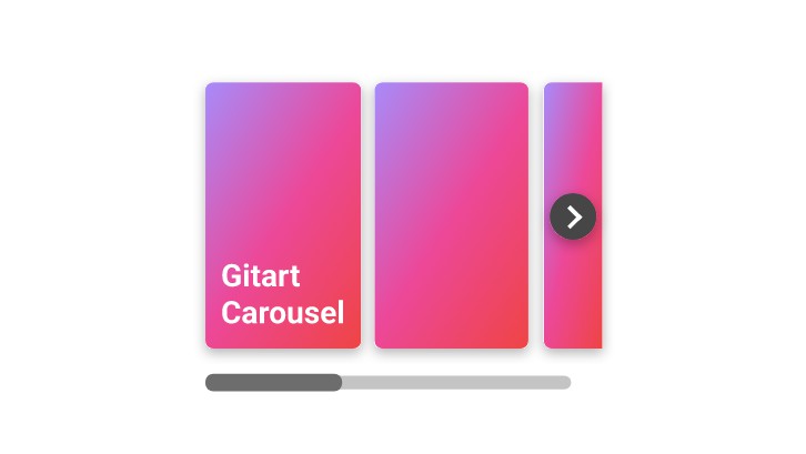
Vue Renderless Carousel
There are some really nice carousel libraries out there, but the best ones are mostly all jQuery plugins using byzantine initialisation objects to cover as many use cases as possible. They often don’t play nicely with the data-driven way of doing things that makes Vue so much fun to use, and it’s common to find yourself fighting with options and overriding CSS to get exactly what you want.
The initial work to implement these components is greater than using such an option, but in return you get components with a high degree of reusability and the ability to build to your own requirements.
Features
- Horizontal or vertical carousels
- Arbitrary slide width/height (slides can be any size)
- Variable slide width/height (slides within the same carousel can be different sizes)
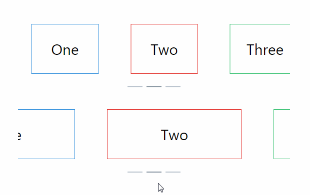
- Align active slide to either the left, centre, or right of the carousel
- Handles changes in bounding element size
- Handles dynamic slide insertion and removal (via
v-for, for example) - Full touch support
- Control over active slide via
v-modelbinding - Automatic wrapping when navigating past the last slide
- Comprehensive event emission to help link your carousels to other parts of your application (including other carousels!)
- The core layout system supports the latest versions of all major browsers [Safari, Chrome, Firefox, Edge, and IE (11)]
Installation
npm install --save vue-renderless-carousel
This library provides two components: rl-carousel and rl-carousel-slide. The former is used to implement your carousel, while the latter is a dumb wrapper for your slide content.
Once imported, they may be registered with Vue as with any other component.
ES6
import { RlCarousel, RlCarouselSlide } from 'vue-renderless-carousel'
UMD
const { RlCarousel, RlCarouselSlide } = require('vue-renderless-carousel')
Directly In-Browser
<script src="https://cdn.jsdelivr.net/npm/vue"></script>
<script src="https://unpkg.com/[email protected]/dist/index.min.js"></script>
<script>
  Vue.component('RlCarousel', VueRenderlessCarousel.RlCarousel)
  Vue.component('RlCarouselSlide', VueRenderlessCarousel.RlCarouselSlide)
  ...
</script>
If you use a bundler that supports the browser field in package.json, you may access the .vue SFCs directly by importing from vue-renderless-carousel/sfc.
Usage and API
Implementing your carousel
The best place to start is to check the demo page linked above, which contains full code examples for several different carousel implementations. You can then check back here for API specifics.
rl-carousel exposes data to the consuming component via scoped slots. It provides two objects:
wrapperStylescontains CSS controlling the bulk of the actual carousel functionality, responsible for laying out and transforming the slides. In most cases you should blindly bind it to the<div>that is the direct parent of your slide content, but it’s common to add some additional styles or classes.slidescontains two fields:count: the number of slides in the carouselactive: the zero-based index of the currently active slide
Outside of this, you have full responsibility for how your carousels render and behave.
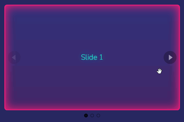
Example
YourCarouselComponent.vue
<template>
  <rl-carousel v-model="slide">
    <div slot-scope="{ wrapperStyles, slides: { count, active } }">
      <!-- Modify these divs to control how the carousel renders -->
      <div style="overflow: hidden; text-align: center;">
        <div v-bind="wrapperStyles">
          <!-- If your carousel will only appear in one place you could put your content right here,
          but slots allow for much greater reusability. -->
          <slot></slot>
        </div>
      </div>
    </div>
    <!-- Slide controls go here (or above, or anywhere :) ) -->
  </rl-carousel>
</template>

<script>
import { RlCarousel } from 'vue-renderless-carousel'

export default {
  name: 'your-carousel-component',
  data() {
    return {
      slide: 0
    }
  }
}
</script>
template.html
<your-carousel-component>
  <!-- Modify these divs to control how your slides render -->
  <rl-carousel-slide>
    <div style="text-align: center; width: 20vw;">
      My slide
    </div>
  </rl-carousel-slide>
</your-carousel-component>
Props
align: 'left'|'center'|'right', default: 'center': Controls whether the active slide is aligned to the left, centre, or right of the carousel.
animateIn: Boolean, default: false:
Controls whether the initial positioning of the slides is animated. If true, the slides will initially lay out normally, then slide over to the active slide. If false, the initial slide will be aligned immediately.
noWrap: Boolean, default: false:
If set to true, attempting to navigate past the first or last slide will do nothing, rather than wrapping back around to the other end.
static: Boolean, default: false:
Disables animations. Slide transitions will occur immediately.
touchWrap: Boolean, default: false:
Enables the wrapping behaviour for touch events.
transition: 'ease'|'linear'|'ease-in'|'ease-out'|'ease-in-out'|'cubic-bezier(Number, Number, Number, Number)', default: 'ease':
The CSS transition effect to use for slide animations.
transitionTime: Number|String, default: 0.5:
The duration for slide animations, in seconds.
value: Number, required:
The value from the consumer to bind to the current active slide index. Using v-model is recommended as it grants the default wrapping behaviour for free.
vertical: Boolean, default: false:
Renders the carousel in vertical mode.
Events
Events are fired when pretty much any decision is made or change is detected by the component. Using these events, you can customise behaviour or synchronise your carousel with other components. Any parenthesised variables after the event name refer to the value that is passed with the event.
before-destroy: Fires when the carousel is about to be destroyed, before all event listeners are removed.
input(requestedNewSlideIndex): Emitted when the carousel wants to change the slide. Bind the active slide with v-model to get wrapping behaviour for free.
positioned: Fires approximately one frame after mounted() runs, and signifies that the initial transform for the carousel has been set. Probably pretty useless, but you never know.
resized: Emitted when the size of the carousel changes.
size-calculated: Emitted when the size of the carousel and each slide has been calculated, whether that be the initial calculation or as the result of a resize.
slide-changed(newSlideIndex): Emitted when the active slide changes, regardless of whether it is from wrapping behaviour or as a result of prop changes from the parent.
slide-count-changed: Fired when the number of slides in the carousel changes.
swipe-recognized: Emitted when a touch event was determined to be a deliberate swipe to change slide, rather then a tap or unrelated scroll.
touchstart|touchmove|touchend: Fired on the appropriate touch event.
Caveats and known issues
-
The method that attempts to align the active slide within the carousel bounds requires the element that
wrapperStylesis bound to be centred in its parent. This is normally not an issue, but in the event that the entire carousel is narrower than its parent, you might notice misalignment. Apply atext-align: centerto the carousel’s direct parent element to fix this. -
While this library works nicely with touch events, mouse drag events don’t yet do anything. I’ll add this in future if there’s enough demand.
-
The carousel wrapper works on the basis that the only in-flow child elements are
rl-carousel-items. If this is not the case, wacky things are likely to happen. Let me know how it goes though.
Further work
PRs welcome for both documentation and code. I’m happy to consider any new feature requests, but please bear in mind that this component is only concerned with carousel functionality; not appearance or styling.