daisyui
Tailwind CSS Components
Adds component classes like btn, card and more to Tailwind CSS
? Features
- Tailwind CSS plugin
DaisyUI is a Tailwind CSS plugin. Install it, add it to yourtailwind.config.jsfile. - Component classes
Adds component classes to Tailwind. Classes likebtn,card,… So you will end up with a cleaner HTML. - Semantic color names
Adds color names likeprimary,secondary,accent,…. - Customizable
You can customize the design of components with Tailwind utility classes and CSS variables. - Themeable
Add multiple themes and customize colors. You can even set a theme for a specific section of your page. - RTL supported
Enablertlconfig for right to left layouts. - Pure CSS
No script file, no dependencies. 2KB gzip!
? Install now!
npm i daisyui --save
Then add DaisyUI to your tailwind.config.js
[ [Read more][docs-url-install] ]
module.exports = {

  plugins: [
    require('daisyui'),
  ],

}
Or use a CDN
Loading CSS files from CDN is not recommended for production. It's better to install Tailwind and DaisyUI as Nodejs dependencies so you can config/customize everything, and purge unused styles.*
<link href="https://cdn.jsdelivr.net/npm/[email protected]/dist/tailwind.min.css" rel="stylesheet" type="text/css" />
<link href="https://cdn.jsdelivr.net/npm/[email protected]/dist/full.css" rel="stylesheet" type="text/css" />
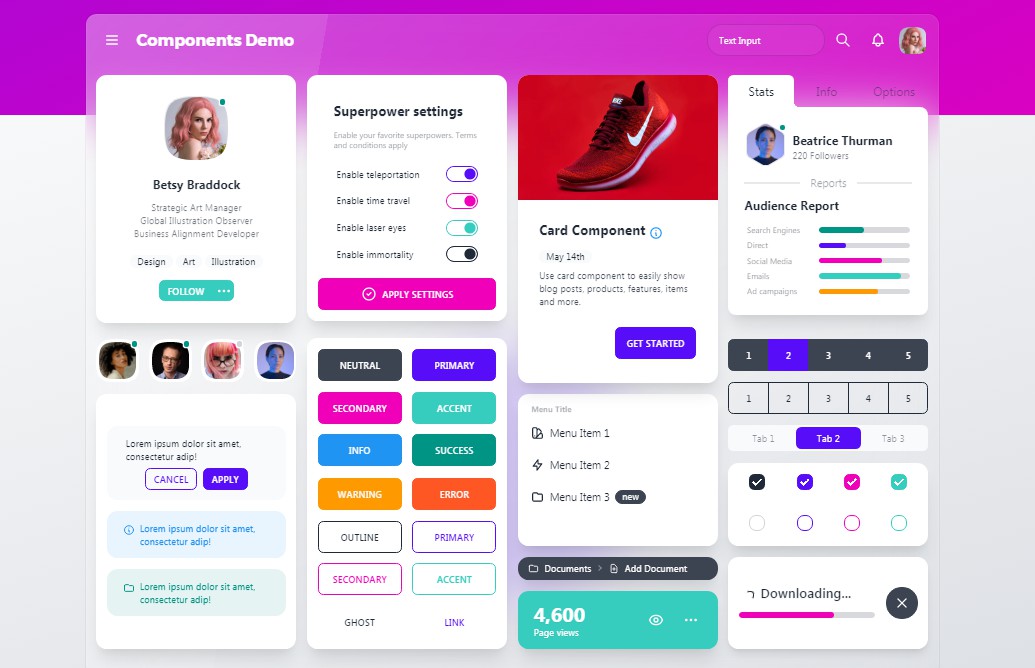
? Use
Use component classes like btn, card, etc… to build your UI.
<a class="btn">Hello!</a>
<div class="shadow card">
  <div class="card-body">
    <h2 class="card-title">Card Title</h2>
    <p>Card text</p>
  </div>
</div>
? Documents + Examples
List of components
- [x] Alert
- [x] Artboard
- [ ] App bar
- [x] Avatar
- [x] Avatar group
- [x] Badge
- [ ] Banner
- [x] Breadcrumb
- [x] Button
- [x] Button group
- [ ] Calendar
- [x] Carousel
- [x] Card
- [ ] Chat bubble
- [x] Collapse (Accordion)
- [ ] Comment
- [x] Countdown
- [ ] Cover
- [x] Divider
- [x] Drawer
- [ ] Empty placeholder
- [ ] Footer
- [ ] Form
- [x] Select
- [x] Text input
- [x] Text area
- [x] Checkbox
- [x] Radio
- [ ] Range slider
- [ ] Rating
- [x] Toggle
- [ ] Upload
- [x] Hero
- [x] Indicator
- [x] Kbd
- [x] Link
- [ ] Loading
- [x] Menu
- [ ] Mockup
- [ ] Browser
- [x] Code
- [x] Phone
- [x] Window
- [x] Navbar
- [x] Mask
- [x] Modal
- [x] Pagination
- [x] Progress
- [x] Stat
- [x] Steps
- [ ] Tag
- [x] Table
- [x] Tabs
- [ ] Timeline
- [ ] Toast
- [x] Tooltip
- [ ] Treeview