Vue Custom Range Input Component
A customizable Vue component for a range slider input. Provides flexibility to use static or dynamic steps, along with additional visual rules for better user experience.
Installation
You can install the component using yarn:
npm install vue-custom-range-inputbash
or
yarn add vue-custom-range-inputbash
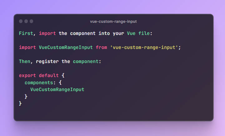
Usage
First, import the component into your Vue file:
import VueCustomRangeInput from 'vue-custom-range-input';
Then, register the component:
export default {
  components: {
    VueCustomRangeInput
  }
}
Now you can use the component in your template:
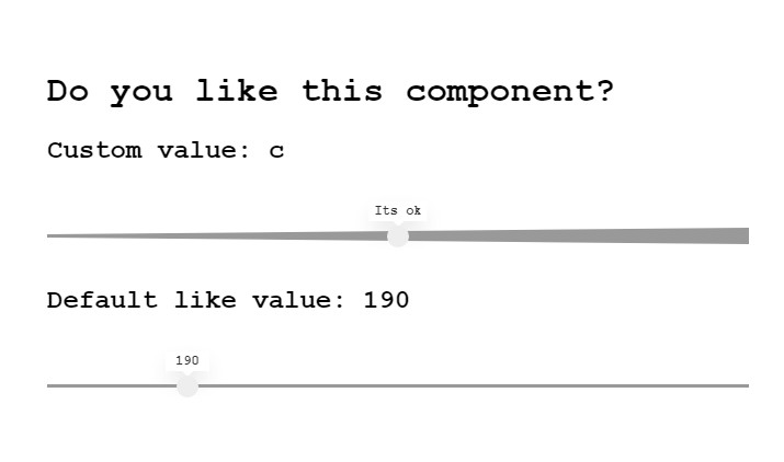
<VueCustomRangeInput v-model="yourValue" :min="minValue" :max="maxValue" :step="stepValue" />
Props
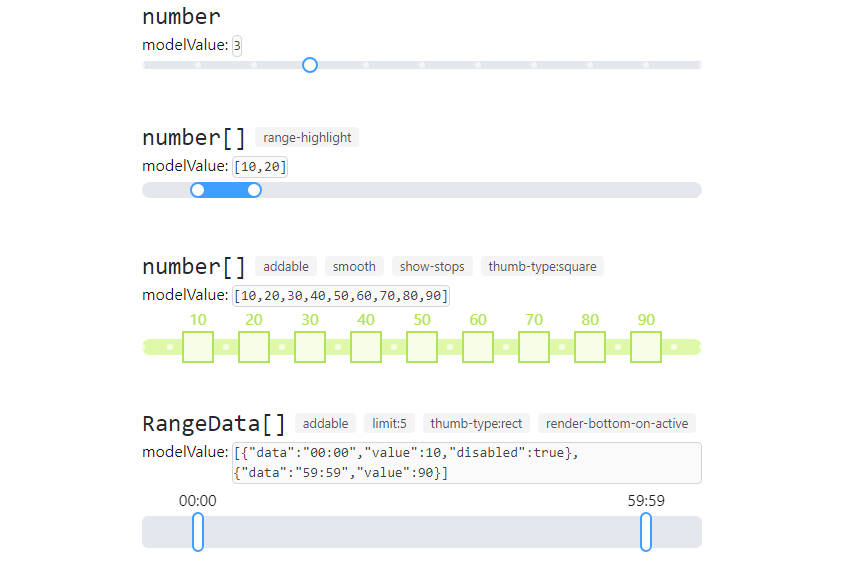
modelValue(required): The value bound to the slider.min(optional, default: 0): The minimum value of the slider.max(optional, default: 100): The maximum value of the slider.steps(optional, default: []): An array of values for discrete steps.step(optional, default: 1): The step interval between values.showRule(optional, default: false): Shows the rule markers when set to true.
Events
update:modelValue: Emits the current value of the slider when it changes.
Slots
label: A slot to customize the label of each step. Receives value as a prop.
Styling
You can style the component by targeting the classes used internally. The component uses SCSS for styling, and the styles are scoped to the component.
Here is an example of how you might override the styles:
<style lang="scss">
.vue-custom-range-input {
  &__labels {
    ul {
      li {
        // your custom styles here
      }
    }
  }
}
</style>
License
This project is licensed under the MIT License.
Author
Viacheslav Angel