vue-custom-range-slider
This is a simple vue-range slider, that supports custom values, labels and more.
The component is based on use with v-model, the value is always a string, for supporting custom values.
Demo
See the slider in action, in this codesandbox
Installation
NPM
npm install --save vue-custom-range-slider
Yarn
yarn add vue-custom-range-slider
Usage examples
Usage like a native range slider
<template>
<div>
<custom-slider min="10" max="50" step="2" raising v-model="slider" />
{{ slider }}
</div>
</template>
<script>
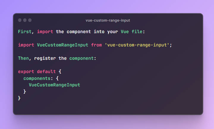
import CustomSlider from "vue-custom-range-slider";
// import the styling, css or scss
import "vue-custom-range-slider/dist/vue-custom-range-slider.css";
export default {
components: {
CustomSlider
},
data() {
return {
slider: "12"
};
}
};
</script>
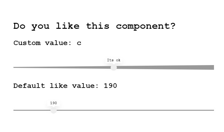
Usage with custom values
<template>
  <div>
    <custom-slider :values="sliderValues" raising v-model="slider" />
    {{ slider }}
  </div>
</template>

<script>
  import CustomSlider from "vue-custom-range-slider";
  // import the styling, css or scss
  import "vue-custom-range-slider/dist/vue-custom-range-slider.css";

  export default {
    components: {
      CustomSlider
    },
    data() {
      return {
        slider: "a",
        sliderValues: [
          {
            label: "Not at all",
            value: "a"
          },
          {
            label: "A tiny bit",
            value: "b"
          },
          {
            label: "Its ok",
            value: "c"
          },
          {
            label: "Its very good",
            value: "d"
          },
          {
            label: "Its AMAZING!",
            value: "e"
          }
        ]
      };
    }
  };
</script>
Properties:
All properties are optional
| Property | Description | Type | Default |
|---|---|---|---|
| values | Pass an array of custom values, with corresponding labels (overrides min/max) | array |
[] |
| min | Sets the minimum value of the slider | string |
'0' |
| max | Sets the maximum value of the slider | string |
'100' |
| step | Sets the stepping interval | string |
'1' |
| hideLabel | Set, if you want to hide the label above the slider | boolean |
false |
| raising | Set if you want a “raising” shape, like: ◁ | boolean |
false |
Events
| Name | Description | Type |
|---|---|---|
| change | Emits the current value on change | string |
Styling
You can easily modify the look of the slider, by overriding the variables in the scss file.
// override variables like this:
$label-color: red;

// import the styling,
@import "vue-custom-range-slider/dist/vue-custom-range-slider.scss";
All variables can be found in the scss file
Roadmap
- Disabled properties
- Name attributes for form handling
- Better styling options
Contribution
If you have suggestions for improvements, dont hesitate to make an issue or pull request. ?
License
MIT