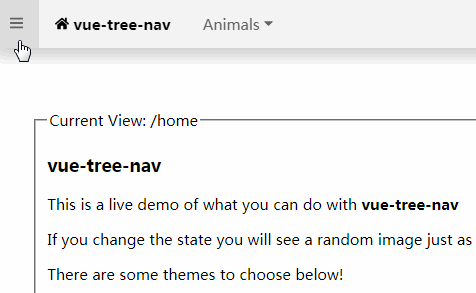
vue-tree-nav
Navigation tree menu component with nice integration with vue-router.
- Ready out of the box!
- Side bar with infinite depth
- Links and dropdows with infinite depth on both right and left side
- Font Awesome icons
- Css transitions
- Beautiful themes to choose
- Complete customizable
Install
npm install --save vue-tree-nav
Usage
  import Vue from 'vue'
  import treeNav from 'vue-tree-nav'

  new Vue({
    components: {
      'vue-tree-nav': treeNav
    },
    data: {
      left: [
        {
          label: 'Home',
          icon: 'home',
          href: '#/home'
        }, {
          label: 'Animals',
          children: [
            {
              label: 'Elephant',
              href: '#/animals/elephant'
            }, {
              label: 'Lion',
              href: '#/animals/lion'
            }, {
              label: 'Bear',
              href: '#/animals/bear'
            }, {
              label: 'Eagle',
              href: '#/animals/eagle'
            }, {
              label: 'Wolf',
              href: '#/animals/wolf'
            }

          ]
        }
      ],
      right: [
        {
          href: 'https://github.com/marcodpt/vue-tree-nav',
          icon: 'brands/github'
        }
      ]
    }
  }).$mount('#app')
  <vue-tree-nav
    :left="left"
    :right="right"
  ></vue-tree-nav>
- If you pass directly your vue-router routes in side, left or right prop it will do some magic, ignoring routes with :variable and redirect for obvious reasons
Props
- side
- type: Array
- default: []
- description: Side navigation menu, see section Items below
- left
- type: Array
- default: []
- description: Top bar on the left, see section Items below
- right
- type: Array
- default: []
- description: Top bar on the right, see section Items below
- location
- type: String
- default: ""
- description: Current location use $route.fullPath with vue-router or window.location.href without
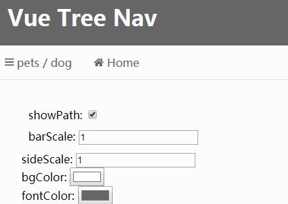
- showPath
- type: Boolean
- default: true
- description: show current path near hamburguer menu
- barScale
- type: Number
- default: 1
- description: scale of icons and font in top bar
- sideScale
- type: Number
- default: 1
- description: scale of icons and font in side bar
- bgColor
- type: String
- default: '#f3f3f3'
- description: background color of top and side bar
- fontColor
- type: String
- default: '#666666'
- description: font color of top and side bar
- hoverColor
- type: String
- default: '#dddddd'
- description: background color in case of hovering any link
- activeColor
- type: String
- default: '#000000'
- description: active font color of top and side bar, active items will change font color
Items of side, left, right
- items (Object):
- label
- type: String
- default: ""
- description: label that appear in the screen
- href
- type: String, Function
- default: ""
- description: string it will be a normal link, otherwise it will call the function
- icon
- type: String
- default: ""
- description: One of Font Awesome Icons
- children
- type: Array
- default: []
- description: Again it is an array of items, in the side menu you can go infinity depth, in the top bar it will ignore, soon we will create a dropdown
- label