vuejs-progress-bar
ProgressBar for vue.js
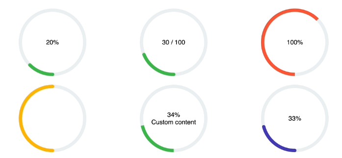
SVG/Vector based
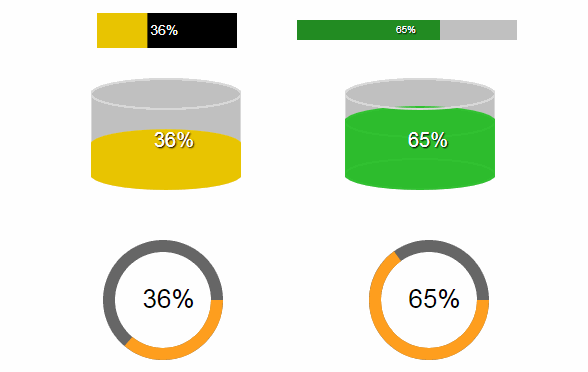
3 modes: Line, Circle and Cylinder
v1.0.8
Do you have questions or want a new feature? Use the "Issues" section :point_left:
Setup
install:
npm install vuejs-progress-bar --save
Import: (in your main.js)
import ProgressBar from 'vuejs-progress-bar'
Vue.use(ProgressBar)
Usage
Use: (in your local .vue file/component, html section)
    <progress-bar
      :options="options"
      :value="value"
      />

<!-- Options struct: -->
options: {
  text: {
    color: '#FFFFFF',
    shadowEnable: true,
    shadowColor: '#000000',
    fontSize: 14,
    fontFamily: 'Helvetica',
    dynamicPosition: false,
    hideText: false
  },
  progress: {
    color: '#2dbd2d',
    backgroundColor: '#C0C0C0'
  },
  layout: {
    height: 35,
    width: 140,
    verticalTextAlign: 61,
    horizontalTextAlign: 43,
    zeroOffset: 0,
    strokeWidth: 30,
    progressPadding: 0,
    type: 'line'
  }
}
Properties
| Name | Type | Default | Description |
|---|---|---|---|
| value | Number | 0 | Value of progressbar % |
| color | String | #FFFFFF | Text color |
| shadowEnable | String | true | Text shadow enable |
| shadowColor | String | #000000 | Text shadow color |
| hideText | Boolean | false | Hide text (%) |
| fontSize | String | 14px | Font size of % text |
| fontFamily | String | Helvetica | Font family text |
| dynamicPosition | Boolean | false | Progress text % follow progress bar |
| color | String | #2dbd2d | Progress color, use hex or rgb |
| backgroundColor | String | #C0C0C0 | Background color, use hex or rgb |
| width | Number | 140 | Width |
| height | Number | 35 | Height, use strok for progress height |
| verticalTextAlign | Number | 61 | Positioning of % text vertical |
| horizontalTextAlign | Number | 43 | Positioning of % text horizontal |
| zeroOffset | Number | 0 | Offset for zero (0%) for line progress bar |
| strokeWidth | Number | 30 | Width of background of progress |
| progressPadding | Number | 0 | Padding between background and progress bar (line only) |
| type | String | line | type of progress bar, line, circle or cylinder |