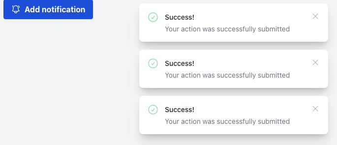
vue-flash-message
The component to display single flash message to user. It has styles presets, but can be easily customized by passing style object as argument.
Setup
npm i @smartweb/vue-flash-message
Configuration
import Vue from 'vue';
import FlashMessage from '@smartweb/vue-flash-message';
Vue.use(FlashMessage);
You can pass configuration object as second argument
Vue.use(FlashMessage, config);
Configuration object
| Property | Type | Description | Default |
|---|---|---|---|
| name | String | It is a name of the component and alias for the EventBus global property. | 'flashMessage' |
| tag | String | Custom tag for the component to use in your application. | 'FlashMesage' |
| time | Number | Duration (in ms) of the message display (can be customized during message call). | 8000 |
| icon | Boolean | If you would like to use icons as default. | true |
Usage
Put the component into your template
<FlashMessage></FlashMessage>
Now you can access it by using global EventBus alias (that is "flashMessage" by default) of your Vue instance
this.flashMessage.show({status: 'error', title: 'Error Message Title', message: 'Oh, you broke my heart! Shame on you!'})
Methods
You also can use shorthands without status property.
this.flashMessage.error({title: 'Error Message Title', message: 'Oh, you broke my heart! Shame on you!'});
this.flashMessage.warning({title: 'Warning Message Title', message: 'Don\'t stop me nooooow....!'});
this.flashMessage.info({title: 'Info Message Title', message: 'Just want you to know, that Vue is so cool'});
this.flashMessage.success({title: 'Success Message Title', message: 'Hoorah, it is my fist npm package and it works!'});
Data Object
The first argument - is data object.
| Property | Type | Description |
|---|---|---|
| status | String | Status of component. Default presets: 'error', 'warning', 'info', 'success' |
| title | String | Title of your message |
| message | String | Text of your message |
| time | Number | Duration (in ms) of the single message display |
| icon | Boolean | If you would like to use icons for this single message |
| flashMessageStyle | Object | style Object for flashMessage block |
| iconStyle | Object | style Object for icon block. You can pass your own icon as 'backgroundImage' |
| contentStyle | Object | Style of content block |
| titleStyle | Object | Styles for title |
| textStyle | Object | Styles for text |
Example:
    methods: {
        deleteTrouble() {
            this.$axios.delete(`/delete/trouble/${trouble.id}`)
                .then( res => {
                    let { status, data, error } = res.data;
                    if(status) {
                        this.flashMessage.success({
                            title: 'Don\'t Warry',
                            message: 'Be Happy!',
                            time: 5000,
                            flashMessageStyle: {
                                backgroundColor: 'linear-gradient(#e66465, #9198e5)'
                            }
                        });
                    }
                    else {
                        this.flashMessage.error({title: error.name || 'Error', message: error.message});
                    }
                })
                .catch(e);
        }
    }
Callbacks
As second argument you can pass object with two properties: "mounted" and "destroyed".
| Property | Type | Description |
|---|---|---|
| mounted | Function | Will be invoked, when flashMessage appears |
| destroyed | Function | Will be invoked, when flashMessage gone |
Example:
<p>{{ text }}</p>
<button @click="clickHandler" type="button" name="button">Show Text!</button>
    methods: {
        showText() {
            this.text = 'Hello from callback!'
        },
        clearText() {
            this.text = 'Bye... 1, ..2, ..3';
            setTimeout( () => this.text = '', 3000);
        },
        clickHandler() {
            this.flashMessage.info({
                title: 'Ooooooops!',
                message: 'Do you see this text? Wtf?'
            },
            {
                mounted: showText,
                destroyed: clearText
            })
        }
    }