Vue Calendar Input
Simple, clean calendar input with single date select, or date range selection.
Installation
yarn add v-cal-input
or
npm install v-cal-input
Usage
<template>
  <div>
    <h1>Selected Date: {{ date }}</h1>
    <date-picker v-model="date"/>
  </div>
</template>

<script>
  import DatePicker from 'v-cal-input'

  export default {
    name: 'Demo',
    components: { DatePicker },
    data() {
      return { date: null }
    }
  }
</script>
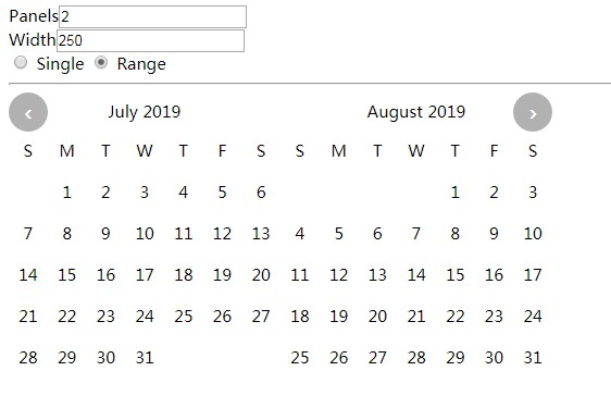
Configuration
props
| name | default | description |
|---|---|---|
| value | null |
the selected date(s) |
| width | 350 |
width of the calendar in px |
| mode | 'single' |
'single' for single date, 'range' for date ranges |
| panels | 1 |
the number of month panels to display |
Styling
v-cal-input is designed to be simple to customize. Here's the entire structure of a calendar panel
<ol class="calendar">
  <li class="go"><!-- previous month button --></li>

  <li class="month-name"></li>

  <li class="go"><!-- next month button --></li>

  <li class="day-name"><!-- one for each day of the week --></li>

  <li class="day-pad"><!-- blank cells until the 1st of the month --></li>

  <li class="day"><!-- one for each day --></li>

  <li class="day-pad"><!-- blank cells to fill out the rest of the month --></li>
</ol>
The .day class has the following additional classes added to it based on component state.
| class | mode | description |
|---|---|---|
| today | both | represents the current date |
| selected | both | currently selected |
| highlighted | range | between the range of selected cells |
| first | range | first selected in a range |
| last | range | last selected in a range |
| in-range | range | inside a selected range |