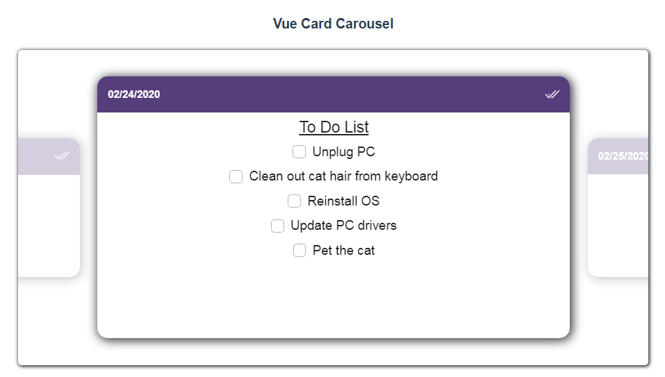
Vue Card Carousel
Sliding card carousel for list viewing.
*Please note this is in active development and subject to change until it is out of alpha versions.
Installation
npm i vue-card-carousel
You can choose to install either globally or locally:
Globally:
import Vue from 'vue'
import App from './App.vue'
import VueCardCarousel from "vue-card-carousel";

Vue.use(VueCardCarousel)

new Vue({
  el: '#app',
  render: h => h(App)
})
or locally to a component:
import { VueCardCarousel } from "vue-card-carousel";

export default {
    components: {
        VueCardCarousel
    }
}
Usage
Most basic usage would be adding the component and passing in the array of items you want displayed. Note you will need to set the minimum height of the component, otherwise it won't display. The width will take up 100% by default. These can be easily configured via CSS.
<template>
  <div id="app">
    <VueCardCarousel class="vcc" :items="listOfTodos" />
  </div>
</template>

<script>
import { VueCardCarousel } from "vue-card-carousel";

export default {
  components: {
    VueCardCarousel
  },
  data() {
    return {
      listOfTodos: [{ id: 1 }, { id: 2 }, { id: 3 }]
    };
  }
};
</script>

<style scoped>
  .vcc {
    height: 50vh;
    width: 60vw;
  }
</style>
However this will be relatively uninteresting. To make the most use of this component, you'll want to add customizations via props and slots like below:
<template>
  <div id="app">
    <VueCardCarousel
      class="vcc"
      :items="listOfTodos"
      :header-options="headerOpt"
      :footer-options="footerOpt"
    >
      <template v-slot:header="slotProps">
        <strong>Header. Id: {{ slotProps.headerProp.id }}</strong>
      </template>
      <template v-slot:default="slotProps">
        <div v-for="n in 5" :key="n">
          {{ slotProps.bodyProp.cMainId }}. Hello from the Parent.
        </div>
      </template>
      <template v-slot:footer="slotProps">
        <strong>Footer. Id: {{ slotProps.footerProp.id }}</strong>
      </template>
    </VueCardCarousel>
  </div>
</template>

<script>
import { VueCardCarousel } from "vue-card-carousel";

export default {
  components: {
    VueCardCarousel
  },
  data() {
    return {
      listOfTodos: [{ id: 1 }, { id: 2 }, { id: 3 }, { id: 4 }],
      headerOpt: { isVisible: true, backgroundColor: "green" },
      footerOpt: { isVisible: false }
    };
  }
};
</script>

<style scoped>
  .vcc {
    height: 50vh;
    width: 60vw;
  }
</style>
Props
| Property | Type | Default | Required | Description |
|---|---|---|---|---|
items |
Array | true | List of items to used to generate the scrollable cards. | |
startIndex |
Number | 0 | false | Index of the card you want to be centered on first. Removes trailing digits if found. |
hideBackdrop |
Boolean | false | true | Shows/hides the backdrop. Akin to a modal backdrop. |
sideCardOpacity |
Number | 0.25 | false | Sets the minimum opacity for the cards on either side of the center card. |
headerOptions |
Object | false | See details below for available properties. | |
footerOptions |
Object | false | See details below for available properties. |
headerOptions
| Property | Type | Default | Required | Description |
|---|---|---|---|---|
isVisible |
Boolean | true | Controls whether or not the header is displayed. | |
backgroundColor |
String | false | Any valid CSS color. |
footerOptions
| Property | Type | Default | Required | Description |
|---|---|---|---|---|
isVisible |
Boolean | true | Controls whether or not the footer is displayed. | |
backgroundColor |
String | false | Any valid CSS color. |
Slots
Scoped slots are exposed for each sub-section of the card: header, body, and footer. Each slot has slot props which give access to the individual item from the list that was passed in through the items property, so you can use that data to fully customize the card.
| Name | Description | Scope |
|---|---|---|
header |
Individual item from the list passed in through the items prop. |
headerProp |
default |
Individual item from the list passed in through the items prop. |
bodyProp |
footer |
Individual item from the list passed in through the items prop. |
footerProp |
In the above example, we have named the object containing all our slot props slotProps, but you can choose to call this anything. More info can be found here: https://vuejs.org/v2/guide/components-slots.html#Scoped-Slots