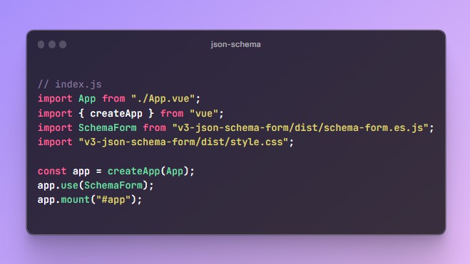
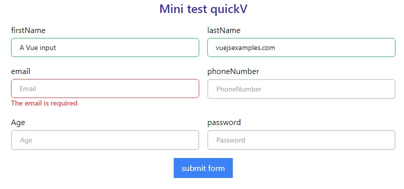
vee-validate
vee-validate is a template-based validation framework for Vue.js that allows you to validate inputs and display errors.
Being template-based you only need to specify for each input what kind of validators should be used when the value changes. The errors will be automatically generated with 40+ locales supported. Many rules are available out of the box.
This plugin is inspired by PHP Framework Laravel's validation.
Features
- Template based validation that is both familiar and easy to setup.
- ? i18n Support and error Messages in 40+ locales.
- ? Async and Custom Rules Support.
- ? Written in TypeScript.
- No dependencies.
Installation
yarn
yarn add vee-validate
npm
npm i vee-validate --save
CDN
vee-validate is also available on these CDNs:
When using a CDN via script tag, all the exported modules on VeeValidate are available on the VeeValidate Object. ex: VeeValidate.Validator
Getting Started
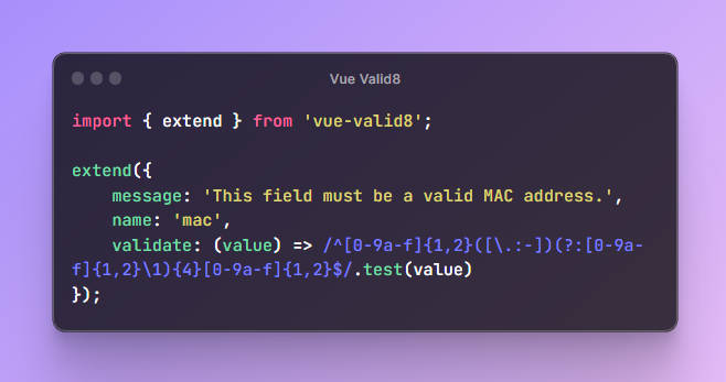
Install the rules you will use in your app, we will install the required rule for now:
import { extend } from 'vee-validate';
import { required, email } from 'vee-validate/dist/rules';

// Add the required rule
extend('required', {
  ...required,
  message: 'This field is required'
});

// Add the email rule
extend('email', {
  ...email,
  message: 'This field must be a valid email'
});
Import the ValidationProvider component and register it:
Global Registration
import { ValidationProvider } from 'vee-validate';

// Register it globally
// main.js or any entry file.
Vue.component('ValidationProvider', ValidationProvider);
Local Registration
import { ValidationProvider } from 'vee-validate';

export default {
  components: {
    ValidationProvider
  }
};
All the JavaScript work is done. Next in the template add the inputs you want to validate them:
<ValidationProvider name="email" rules="required|email">
  <div slot-scope="{ errors }">
    <input v-model="email">
    <p>{{ errors[0] }}</p>
  </div>
</ValidationProvider>
The validation provider accepts two props: rules which is in its simplest form, a string containing the validation rules separated by a | character, and a name prop which is the field name that will be used in error messages.
and That's it, your input will be validated automatically, notice that the ValidationProvider uses scoped slots to pass down validation state and results.
Compatibility
This library uses ES6 Promises so be sure to provide a polyfill for it for the browsers that do not support it.
