vuemodoro
SFC Vue component implementing a Pomodoro timer.
Vuemodoro is a Vue Single File Component implementing a countdown timer, intended to provide a Pomodoro countdown in your Vue applications. It comes with a set of properties making the component customizable for your needs. For example, you can customize either the duration of the countdown or the labels of the buttons for interacting with the component.
Moreover, you can choose between different styles for your Vuemodoro look and feel. ?
Properties
If you need to customize the Pomodoro timer behavior, you can use one of the following optional properties.
| Properties | Default | Description | Type |
|---|---|---|---|
| minutes | 25 |
sets the minutes of the countdown | Number |
| seconds | 0 |
sets the seconds of the countdown | Number |
| pomodoro-label | Pomodoro Timer |
adds a descriptive label to the timer container | String |
| start-label | Start |
adds a descriptive label to the start button of the timer | String |
| pause-label | Pause |
adds a descriptive label to the pause button of the timer | String |
| reset-label | Reset |
adds a descriptive label to the reset button of the timer | String |
| muted | false |
defines if the timer must play a sound when the countdown ends. | Boolean |
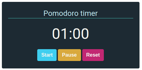
| theme | dark |
defines the styles of the timer. It comes with three different styles. bare, light and dark are the available options. |
String |
Installation
You can install Vuemodoro using npm:
npm install --save vuemodoro
Alternatively, you can import vuemodoro via <script> tag in the browser directly, avoiding the NPM installation:
<script src="https://unpkg.com/vue"></script>
<script src="https://unpkg.com/vuemodoro"></script>
Usage
Once installed, it is easy to use it.
Importing the component
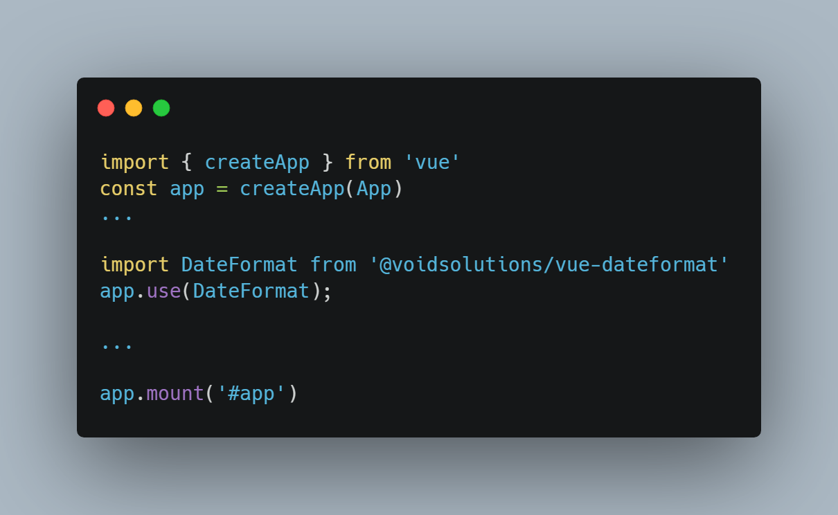
First, you need to import vuemodoro in your files. You can do that in different ways. For example, it can be imported into a build process for use in full-fledged Vue applications:
import Pomodoro from 'vuemodoro';

export default {
  components: {
    Pomodoro,
  },
  // rest of the component
}
Using the component
Once imported, you can use your component as follows:
<Pomodoro/>
Themes
Vuemodoro comes with a theme prop. It allows to modify the look and feel of the component. The available options are:
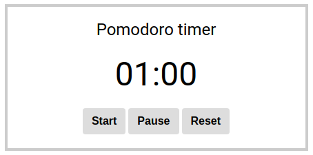
bare, it is a minimal look and feel, intended for customization:
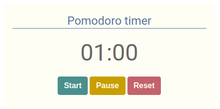
light, it is the light theme of Vuemodoro:
dark, it is the dark theme of Vuemodoro: