vue-css-percentage-circle
Vue CSS Percentage Circle.
Getting Started
npm install --save vue-css-percentage-circle
Usage
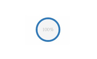
<PercentageCircle :percent="50" />
Theming
<PercentageCircle :percent="50" active-color="blue" complete-color="green"/>
<PercentageCircle :percent="50" active-color="green" complete-color="orange"/>
<PercentageCircle :percent="50" active-color="orange" complete-color="blue"/>
Animated
<PercentageCircle :percent="50" :animate="true"/>
Dark Mode
<PercentageCircle :percent="50" :dark-mode="true" />
API
percentage-circle
props
-
percentNumber (optional)Percentage of progress (0-100)
-
sizeString (optional)default: 'small'Size of percentage circle [micro, small, big]
-
active-colorString (optional)default: 'blue'Color when active. [blue, green, orange]
-
complete-colorString (optional)default: ''Color when complete. [blue, green, orange]
-
animateBoolean (optional)default: falseAnimate percentage changes.
-
refresh-rateNumber (optional)default: 5Only applicable when animated is set to true. Speed in which animation changes happen
-
dark-modeBoolean (optional)default: falseToggle between normal and dark themes
events
-
clickClick event.
Testing
Storybook used for testing. To run storybook, run:
npm run dev
or
npm run storybook