Accordion Component for VueJS and GSAP
Accordion component, written in VueJS. The animations are done with GSAP.
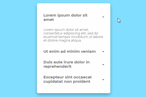
How it works
Let's just style an accordion on however you want it. You may make it colourful, or simple.
The only difference is the caret. I did not do it like how you commonly do the triangle thing by CSS. I tried to make my own (ugly, and for modern browsers only) way.
.accordion-caret {
  background-image: linear-gradient(to top right, transparent 50%, #727272 50%);
  width: 0.5rem;
  height: 0.5rem;
  transform: rotate(-45deg);
}
The Vue VM
Because I can't put a real-world data on my pen, I just put a static data to be supplied. It must be placed on the VM.
var app = new Vue({
  el: '#app',
  data: {
    // 'title' is for the header. The area that you can see.
    // 'description' is for the content. It will show after you expand an accordion menu
    // 'active' is for the flag, if the content is shown or not.
    contents: [{
      title: "'Lorem ipsum dolor sit amet',"
      description: "'Lorem ipsum dolor sit amet, consectetur adipiscing elit, sed do eiusmod tempor incididunt ut labore et dolore magna aliqua.',"
      active: false
    }, {
      title: "'Ut enim ad minim veniam',"
      description: "'Ut enim ad minim veniam, quis nostrud exercitation ullamco laboris nisi ut aliquip ex ea commodo consequat.',"
      active: false
    } // ...
    ]
  }
});
Template
I just looped the passed props from the VM to the component, to display the template or the design of the accordion.
<div class="accordion">
  <!-- Looping of the props. -->
  <div
    class="accordion-item"
    v-for="content, i in contents"
    v-bind:class="{ 'accordion-active': content.active }"
  >
    <div class="accordion-header">
      <!-- The click event of each accordion menu -->
      <a href="#" v-on:click="expand(event, i)">
        <div class="accordion-header-div">{{ content.title }}</div>
        <div class="accordion-header-div">
          <div class="accordion-caret"></div>
        </div>
      </a>
    </div>
    <!-- We need the ref to get the DOM of the body. -->
    <div class="accordion-body" v-bind:ref="'accordion-body-' + i">
      <div class="accordion-content">{{ content.description }}</div>
    </div>
  </div>
</div>
Author
Takane Ichinose
Demo
See the Pen Accordion Component for VueJS and GSAP by Takane Ichinose (@takaneichinose) on CodePen.