vue-simple-accordion
A simple, easily configurable accordion for Vue 2.x.
Installation
npm install --save vue-simple-accordion
or
yarn add vue-simple-accordion
Import
import {
  VsaList,
  VsaItem,
  VsaHeading,
  VsaContent,
  VsaIcon
} from 'vue-simple-accordion';
import 'vue-simple-accordion/dist/vue-simple-accordion.css';

export default {
  // ...
  components: {
    VsaList,
    VsaItem,
    VsaHeading,
    VsaContent,
    VsaIcon
  }
  // ...
}
or
import VueSimpleAccordion from 'vue-simple-accordion';
import 'vue-simple-accordion/dist/vue-simple-accordion.css';

Vue.use(VueSimpleAccordion, {
  // ... Options go here
});
Basic Usage
<vsa-list>
  <!-- Here you can use v-for to loop through items  -->
  <vsa-item>
    <vsa-heading>
      This is the heading
    </vsa-heading>

    <vsa-content>
      This is the content
    </vsa-content>
  </vsa-item>
</vsa-list>
With the default options, the html will be generated as:
HTML structure
<dl
  id="vsa-list-{list_id}"
  class="vsa-list"
  data-vsa-list="{list_id}"
>
  <div
    id="vsa-item-{item_id}"
    class="vsa-item vsa-item--is-active"
    data-vsa-list="{list_id}"
    data-vsa-item="{item_id}",
    data-vsa-active="true"
  >
    <dt
      class="vsa-item__heading"
      {data_attrs}
    >
      <button
        class="vsa-item__trigger"
        type="button"
        aria-expanded="true"
        aria-controls="vsa-panel-{item_id}"
        {data_attrs}
      >
        <span
          class="vsa-item__trigger__content"
          {data_attrs}
        >
          This is the heading
        </span>
        <span
          class="vsa-item__trigger__icon vsa-item__trigger__icon--is-active"
          {data_attrs}
        >
        </span>
      </button>
    </dt>
    <dd
      id="vsa-panel-{item_id}"
      class="vsa-item__content"
      role="region"
      aria-labelledby="vsa-item-{item_id}"
      {data_attrs}
    >
      This is the content
    </dd>
  </div>
</dl>
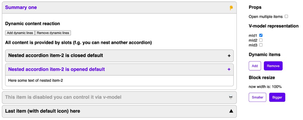
Available Options
All user options or component props if not set (or are undefined) will automatically fallback to these default values:
Default Options
{
  tags: {
    list: "dl",
    list__item: "div",
    item__heading: "dt",
    heading__content: "span",
    heading__icon: "span",
    item__content: "dd"
  },
  roles: {
    presentation: false,
    heading: false,
    region: true
  },
  transition: "vsa-collapse",
  initActive: false,
  forceActive: undefined,
  autoCollapse: true,
  onHeadingClick: () => {},
  navigation: true
}
Component Props
vsa-list
| Props | Type | Description |
|---|---|---|
| tags | Object | Define the html tags for the current list (check the default options for details) |
| roles | Object | Define the html roles for the current list (check the default options for details) |
| transition | String | Name of the entering/leaving transition effects for items |
| initActive | Boolean | Expand the list by default or not |
| forceActive | Boolean | When set, this will force the whole list to be expanded or collapsed |
| autoCollapse | Boolean | When an item is active (expanded), the other items of the list will automatically collapse |
| navigation | Boolean | Enable ↑ ↓ Home End navigation while focusing on a heading |
vsa-item
| Props | Type | Description |
|---|---|---|
| transition | String | Name of the entering/leaving transition effects for the curren item |
| initActive | Boolean | Expand the current item by default or not |
| forceActive | Boolean | When set, this will force the current item to be expanded or collapsed |
| level | String | Number | Identify aria-level while using heading: true |
| onHeadingClick | Function | A function will be called automatically when the trigger button is clicked with the arguments contain data of the list and that item |
Priotiry: Item > List > Default
Styling
If you import the css, these CSS variables are available in .vsa-list:
--vsa-max-width: 720px;
--vsa-min-width: 300px;
--vsa-text-color: rgba(55, 55, 55, 1);
--vsa-highlight-color: rgba(85, 119, 170, 1);
--vsa-bg-color: rgba(255, 255, 255, 1);
--vsa-border-color: rgba(0, 0, 0, 0.2);
--vsa-border-width: 1px;
--vsa-border-style: solid;
--vsa-heading-padding: 1rem 1rem;
--vsa-content-padding: 1rem 1rem;
--vsa-default-icon-size: 1;