vue-swipe-actions
iOS style swipe actions for Vue.js.
Installation
npm install vue-swipe-actions
import { SwipeList, SwipeOut } from 'vue-swipe-actions';

export default {
  components: {
    SwipeOut,
    SwipeList
  }
};
Props
| Prop | Data Type | Required | Description |
|---|---|---|---|
items |
Array | true | Your array with data |
transition-key |
String | Your key for :key when list is v-for-ed, default (id) | |
transitionString |
String | Your transition-group string name, default (swipe-list-item) |
Basic Usage
<swipe-list class="card" :items="mockSwipeList" transition-key="id" @swipeout:contentclick="contentClick" @swipeout:click="itemClick" @swipeout:doubleclick="itemDblClick">
<template slot-scope="{ item, index, revealLeft, revealRight, close }">
<!-- item is the corresponding object from the array -->
<!-- index is clearly the index -->
<!-- revealLeft is method which toggles the left side -->
<!-- revealRight is method which toggles the right side -->
<!-- close is method which closes an opened side -->
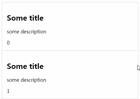
<div class="card-content">
<!-- style content how ever you like -->
<h2>{{ item.title }}</h2>
<p>{{ item.description }}</p>
<span>{{ index }}</span>
</div>
</template>
<template slot="left" slot-scope="{ item }">
<!-- left swipe side template and slot-scope="{ item }" is the item clearly -->
<!-- remove <template slot="left" slot-scope="{ item }"> if you dont wanna have left swipe side -->
<div class="swipeout-action action-panel-left">
<div>
<!-- place icon here or what ever you want -->
<i class="fa fa-cloud"></i>
</div>
<div>
<!-- place icon here or what ever you want -->
<i class="fa fa-file"></i>
</div>
</div>
</template>
<template slot="right" slot-scope="{ item }">
<!-- right swipe side template and slot-scope="{ item }" is the item clearly -->
<!-- remove <template slot="right" slot-scope="{ item }"> if you dont wanna have right swipe side -->
<div class="swipeout-action action-panel-right">
<div>
<!-- place icon here or what ever you want -->
<i class="fa fa-heart"></i>
</div>
</div>
</template>
<div slot="empty">
<!-- change mockSwipeList to an empty array to see this slot in action -->
list is empty ( filtered or just empty )
</div>
</swipe-list>
components: {
  SwipeOut,
  SwipeList,
},
data() {
  return {
    mockSwipeList: [
      {
        id: 0,
        key1: 'key1',
        key2: 'key2',
        key3: 'key3',
        key4: 'key4',
      },
      {
        id: 1,
        key1: 'key1',
        key2: 'key2',
        key3: 'key3',
        key4: 'key4',
      },
      {
        id: 2,
        key1: 'key1',
        key2: 'key2',
        key3: 'key3',
        key4: 'key4',
      },
    ],
  };
},
methods: {
  contentClick(e) {
    console.log(e, 'content click');
  },
  itemClick(e) {
    console.log(e, 'item click');
  },
  itemDblClick(e) {
    console.log(e, 'item double click');
  },
  fbClick(e) {
    console.log(e, 'First Button Click');
  },
  sbClick(e) {
    console.log(e, 'Second Button Click');
  },
},
SCSS style requires
npm install sass-loader node-sass --save-dev
<style lang="scss">
@import url("https://cdnjs.cloudflare.com/ajax/libs/font-awesome/4.7.0/css/font-awesome.min.css");

.swipeout-list {
	display: flex;
	flex-direction: column;
}
.swipeout-action {
  display: flex;
  > div {
    display: flex;
    align-items: center;
    padding: 0 3rem;
    cursor: pointer;
  }
  &.action-panel-right {
    > div {
      background-color: dodgerblue;
      color: white;
      &:hover {
        background-color: darken(dodgerblue, 5%);
      }
    }
  }
  &.action-panel-left {
    > div:nth-of-type(even) {
      background-color: darkorchid;
      color: white;
      &:hover {
        background-color: darken(darkorchid, 5%);
      }
    }
    > div:nth-of-type(odd) {
      background-color: dodgerblue;
      color: white;
      &:hover {
        background-color: darken(dodgerblue, 5%);
      }
    }
  }
}
.swipeout-list-item {
	flex: 1;
	border-bottom: 1px solid lightgray;
	&:last-of-type {
		border-bottom: none;
	}
}
.card {
  width: 100%;
	background-color: white;
	border-radius: 3px;
	box-shadow: none;
	border: 1px solid lightgray;
}
.card-content {
  padding: 1rem;
}
</style>