Notify
A simple button that displays progress. Compatible with Vue 2.x
Install
$ npm install vue-progress-button --save
Usage
Inside your component:
To get the most basic version of a progress button
<progress-button>Button</progress-button>
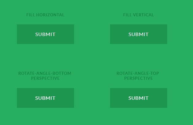
The progress can be configured with another filling color. Simply add the fill-color property to the progress button element and give a color to it.
<progress-button name="fillColor" class="btn btn-primary mr-1 mb-1" fill-color="#fff">Other fill color</progress-button>
The progress also be modified in terms of duration of the progress, position of the progress line
<progress-button name="duration" class="btn btn-info mr-1 mb-1" :duration="10000">10 second animation</progress-button>
<progress-button name="bottom" class="btn btn-success mr-1 mb-1" :height="5" position="bottom">Bottom fill</progress-button>
<progress-button name="bottom" class="btn btn-warning mr-1 mb-1" :height="5" position="top">Top fill</progress-button>
import Button from 'vue-progress-button'

export default {
  components: {
    'progress-button': Button
  }
}
Configuration options
| Option | Type | Default | Description |
|---|---|---|---|
| fillColor | String | '#555' | The color of the progress bar filling the button |
| duration | Number | 2000 | The duration of the progress bar filling the entire button in milliseconds |
| height | Number | 100 | The height of the progress bar in px |
| position | String | 'fill' | The position of the progress bar in the button, currently possible: top, bottom. Defaults to fill that fills the entire button |